-
AuthorPosts
-
October 23, 2014 at 11:49 am #340008
Hello!
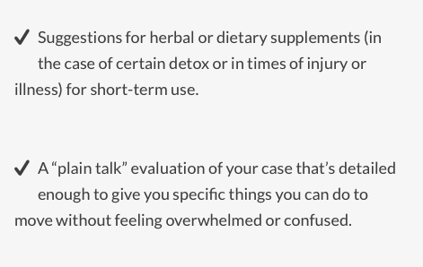
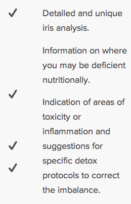
I am using the icon element in the text editor and adding text after the icon. As you can see in the example below, the first 2 lines of text are spaced/ indented correctly and then the 3rd lines jumps forward. Can you please tell me how to correct this so the 3rd line matches 1 and 2?
Thank you!
 October 23, 2014 at 12:52 pm #340050
Hey onegirlrtw!
Can you post the link to your page where we can see the example please?
Regards,
YigitOctober 23, 2014 at 1:43 pm #340081This reply has been marked as private.October 27, 2014 at 3:19 am #341300Hey!
Thank you for the link.
Please separate the text and the icon using the column shortcodes. The 1/4 and 4/5 column might work best.
Best regards,
IsmaelOctober 27, 2014 at 11:30 am #341427Hi Ismael,
Thanks for this suggestion! I’m not sure that this is a viable solution; as you can see the separating of columns creates a large gap between the icon and the text and using </br> s to try to match them horizontally seems to be a spacing gamble.
In my original example, I am using the icon with text in a text box. If the second line of text is indented, then there has to be a way to code the third line of text to match (I would think?). Or, an alternative method to use text and icon that I haven’t thought of?
 October 28, 2014 at 11:01 am #342123
Hey!
Please create a test page using the columns then we’ll remove the column margins using css. If possible, enclosed the content on a container with unique css class or id. Something like this:
<div class="icon-text-combo">
ICON TEXT CONTENT HERE
</div>
Forgive me for the class name. :)
Best regards,
IsmaelOctober 28, 2014 at 3:10 pm #342245This reply has been marked as private.October 30, 2014 at 2:08 pm #343401Hi!
Please don’t separate all columns with the icon-text-combo container. Just create a single container with the class then insert all column content there. We have to do this so that we can specify the columns inside the icon-text-combo from any other column elements. Also, use 1/5 column layout for the icon and 4/5 column layout for the text. Note that you can generate the column shortcode on a separate post or page using the shortcode wand then copy it on the text block. The structure should look like this:
<div class="icon-text-combo">
[av_one_fifth first]ICON SHORTCODE HERE[/av_one_fifth][av_four_fifth]TEXT HERE[/av_four_fifth]
[av_one_fifth first]ICON SHORTCODE HERE[/av_one_fifth][av_four_fifth]TEXT HERE[/av_four_fifth]
[av_one_fifth first]ICON SHORTCODE HERE[/av_one_fifth][av_four_fifth]TEXT HERE[/av_four_fifth]
[av_one_fifth first]ICON SHORTCODE HERE[/av_one_fifth][av_four_fifth]TEXT HERE[/av_four_fifth]
</div>
Add this on Quick CSS or custom.css:
.icon-text-combo .flex_column.av_four_fifth {
margin: 0;
}
Best regards,
IsmaelOctober 30, 2014 at 5:45 pm #343495This reply has been marked as private.November 1, 2014 at 4:50 pm #344608Hey!
Try this in Quck CSS, maybe it is a solution which is alright for you:
.av_font_icon {
display: flex;
}
Otherwise could you please provide us admin access? Post it here as a private reply
Best regards,
AndyNovember 1, 2014 at 6:54 pm #344685This reply has been marked as private.November 3, 2014 at 8:42 pm #345499Hi!
replace my code above with that one:
[data-av_icon]:before {
display: flex !important;
display: -webkit-box;
display: -moz-box;
display: -ms-flexbox;
display: -webkit-flex;
}
This should help.
Best regards,
AndyNovember 4, 2014 at 8:40 am #345756Hi Andy, Thank you!
The new code above is left justifying icons that used to be next to text in buttons and also messing up icons in icon lists (used on other pages in the site like /momo/disclaimer).
November 5, 2014 at 10:58 pm #346831Hey!
We should handle this differently I think.
I had a look into you WordPress backend for page http://healthybliss.net/momo/consultations/iridology/
In Avia Layout Builder you created a single full width element for “Here’s What You’ll Get:”. Why not separate icons, text and image into THREE different columns? This way it would be easier I think and you could separate icons from text.Cheers!
AndyNovember 6, 2014 at 2:35 pm #347085Hi Andy, We tried that already – see above. This was my response – I’m not sure that this is a viable solution; as you can see the separating of columns creates a large gap between the icon and the text and using </br> s to try to match them horizontally seems to be a spacing gamble. (I also included a screen shot so you can see what I am talking about.)
I thought to keep all in one column to minimize spacing. The whole point of using an icon next to text is to have it next to the text. It seems that using icons next to text only works well when the text is 1-2 lines and not more. There is simply no easy solution.
November 7, 2014 at 8:46 am #347565Hi!
I don’t think you can accomplish this with just css. You need to manually code the structure of the icons and the text. The suggestions above is the easiest way to do it. For further modifications, please visit Envato Studio or Werkpress.
Best regards,
IsmaelNovember 7, 2014 at 10:01 am #347605Sababa, Thank You!
-
AuthorPosts
- The topic ‘Icon with text not spacing correctly after 3 lines of text’ is closed to new replies.
