
-
AuthorPosts
-
March 17, 2017 at 4:06 pm #762556
Hi I’m having a strange problem. I have two enfold sites and they both have the same issue lately in the last few updates.
On every page with a full width portfolio grid when you first open the page there are massive gaps between the rows… but as soon as you resize the browser window even just a tiny bit, just tweak the corner and move they all move into place and responsive. It happens on mobiles and ALL browsers so seems to be a enfold issue.Here is a screen shot of the problem before and after
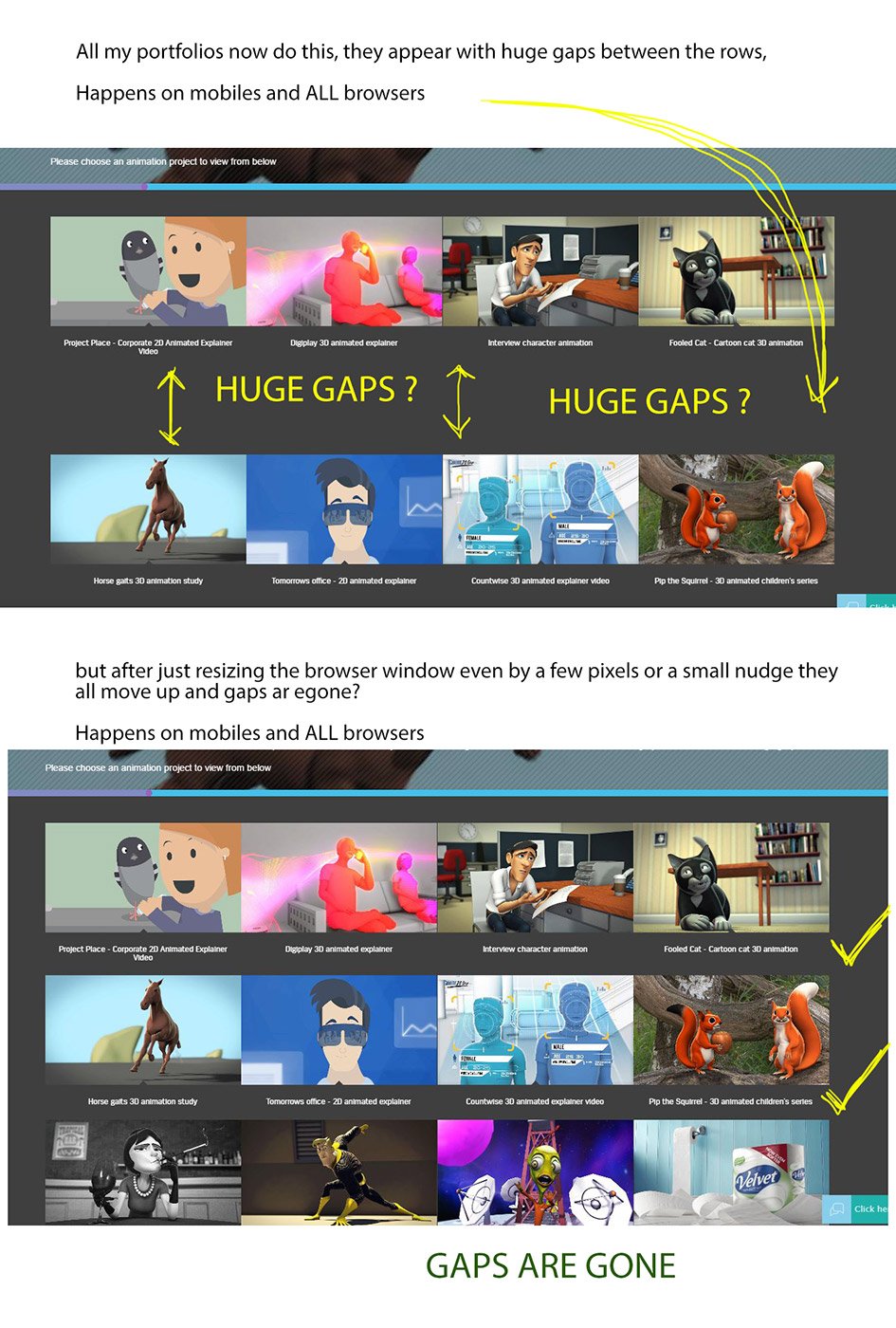
Both my sites have this issue, an example on each could be http://fullrotation.com/motion-design/
and http://www.davidmattock.co.uk/portfolio/3d-animation/Many thanks
March 22, 2017 at 8:11 am #764634Hey David,
I think it’s the srcset attribute or the lazyload script that is causing the issue. The image selection is delayed so it displays the original image before selecting the appropriate one for the current screen or device, hence miscalculating the size of the portfolio items. Did you install a plugin for the images? Please add this in the functions.php file:
add_action('wp_footer', 'ava_auto_resize');
function ava_auto_resize(){
?>
<script>
(function($){
	var int = window.setInterval(function(){
		$(window).trigger('resize');
	}, 2000);

	$(window).load(function () {
		setTimeout(function() {
			clearInterval(int);
		}, 2000);
	});
})(jQuery);
</script>
<?php
}
Best regards,
IsmaelMarch 22, 2017 at 10:47 am #764688Thank you so much Ismael for working that out! … I turned off image lazy load in my WP rocket caching plugin and all is fixed. Sorry to have taken up your time with this.
brilliant thanks :)March 23, 2017 at 6:02 am #765154 -
AuthorPosts
- You must be logged in to reply to this topic.