
-
AuthorPosts
-
February 4, 2025 at 10:30 am #1476306
Hello everyone,
I have read Guenni’s post but unfortunately I haven’t been able to make a sticky column.
Need help please.
From Guenni’s advices, I understood that there should be a parent container, like a color section.
But if I set a color section, I loose the right sidebar and I’d like to keep it that way.
On that sand-box post, I would like the left column (titles) remains sticky, while the main column scrolls.
That would be a bonus option if the right sidebar could remain sticky as well.
I can’t wait to try your css code…-
This topic was modified 1 year, 2 months ago by
rvga. Reason: mispelling correction
February 4, 2025 at 10:57 am #1476308see here the example page for sticky sidebar with code : https://webers-testseite.de/sticky-sidebar/
Try to make a screenshot of your enfold layout you like to have. Or describe it better.
On your sandbox the parent element is the entry-content-wrapper
now you like to have the first column to be sticky and the second one scrolls. The sidebar on the right should scroll away too?February 4, 2025 at 11:06 am #1476310so for that page:
.responsive body#top.postid-335 {
    overflow-x: visible;
}

#top.postid-335 #wrap_all {
    overflow: visible;
}

@media only screen and (min-width: 768px){
  #top.postid-335 .entry-content-wrapper {
    display: flex;
    justify-content: space-around;
    align-items: flex-start;
  }

  #top.postid-335 .entry-content-wrapper .flex_column.first{
    position: -webkit-sticky !important;
    position: sticky !important;
    top: 100px;   /*** depends on your header-height after scrolling ***/
    min-width: 120px;  /*** you can have here absolute or relative Values ***/
  }
}
to be more selectiv using custom classes on some elements.
and keep in mind, that the element is sticky only in its parent container. If the parent container is the same height as the f.e. color-section it looks like the sticky element is fixed inside that container:
https://webers-testseite.de/sticky-elements/
PS: if you break your columns at 990px you had to adjust that media query inside the snippet.February 4, 2025 at 11:28 am #1476311you can have both – column sticky and sidebar sticky
.responsive body#top.postid-335 {
    overflow-x: visible;
}

#top.postid-335 #wrap_all {
    overflow: visible;
}

@media only screen and (min-width: 768px){
  #top.postid-335 .entry-content-wrapper {
    display: flex;
    justify-content: space-around;
    align-items: flex-start;
  }

  #top.postid-335 .entry-content-wrapper .flex_column.first{
    position: -webkit-sticky !important;
    position: sticky !important;
    top: 100px;   /*** depends on your header-height after scrolling ***/
    min-width: 120px;  /*** you can have here absolute Values  ***/
  }
  #top.postid-335 #main div > .container {
    display: flex;
    justify-content: space-around;
    align-items: flex-start;
  }

  #top.postid-335 .sidebar{
    position: -webkit-sticky !important;
    position: sticky !important;
    top: 60px;   /*** depends on your header-height after scrolling ***/
    width: 30% !important; /*** you can have here different width than on global settings of Enfold ***/
  }
}
February 4, 2025 at 12:20 pm #1476316Hi Guenni,
Thx for all your tips.
Please remember I’m not a developer ;)
Sorry if I was unclear in the previous description of the layout of the sandbox-post I gave.
Let me say it again:
1. there is no color section on that post.
2. the first column (1/5 – blue title and subtiles) is sticky
3. the main colum (4/5 – lorem text) scrolls away
4. the right sidebar (green text) is sticky (which is a bonus, I’ll see if I keep it sticly or not)
5. I just gave names to custom css class to the 2 columns
5.1 the blue-left column : submenu-col
5.2 the lorem-main column : main-colI have implemented all of your css code.
It works for the left-green column (it is sticky now) but not for the sidebar.
I tried to adapt your code given on your demo page, but couldn’t make it.
At last, I didn’t use ccs class names, because I don’t know how to adapt your ccs code with these css class.Hope it’s clearer now and that you can help me finish this layout.
Sandbox-postFebruary 4, 2025 at 12:54 pm #1476318I messed around in the css code you gave me.
I rewrite and clean it and now both the left column and the sidebar are sticky.
It’s cool ;)
One last thing Guenni, I still don’t use the css class i’ve setup previously.
Can you help me adapt your code so it uses my css class, please ?Also is there a way to use the real name of the post (or page) instead of its id?
Cause with the time being, i’m afraid i loose the fact that postid-335 is about the sandbox-post.
It’ll be clearer to me if I can use the real name or slug of the post…-
This reply was modified 1 year, 2 months ago by
February 4, 2025 at 3:28 pm #1476325because of there is only a layout with columns.
So please go and set a 1/1 column below that – to see how enfold handles the rest.the first column now can be select via:
#top.postid-335 .entry-content-wrapper .submenu-col instead of #top.postid-335 .entry-content-wrapper .flex_column.firston your layout there is no parent element that you can give a custom class to. So we had to work with page/post IDs
If you have that on all single posts – than we can select more global as f.e.: single-post etc.PS : there is no slug of the post on default enfold.
February 4, 2025 at 3:40 pm #1476328you can have on child-theme functions.php :
function add_slug_body_class( $classes ) {
global $post;
  if ( isset( $post ) ) {
    $classes[] = $post->post_type . '_' . $post->post_name;
  }
  return $classes;
}
add_filter( 'body_class', 'add_slug_body_class' );
then a post/portfolio/page will have on body (#top) an additional class f.e.
post_name-of-my-post
portfolio_name-of-my-post
page_name-of-my-postmaybe that helps you to better select.
On your example page it will then be : post_sand-box-postwhy do i include to that class the post-type? because it might be that you have post and a page with same slug – then you can differ between them
if you do not need that – remove the instertion of the post-type:function add_slug_body_class( $classes ) { global $post; if ( isset( $post ) ) { $classes[] = $post->post_name; } return $classes; } add_filter( 'body_class', 'add_slug_body_class' );February 4, 2025 at 4:46 pm #1476329As a test, I’ve added 1 fullwidth (1/1 – red border) column below the first 2 ones.
The new ‘red’ column scrolls away like the ‘lorem text’ one.
And it has stretched the ‘lorem’ column… :(
Since I have no intention to keep that red column, I will delete it.
But in case I’d like to keep it, what should I do to make sure that red column goes underneath the 2 first columns?Also I’ve added 2 color sections, one yellowish above and one blue underneath.
Why the sidebar is displayed underneath the blue color section?
How can I make sure that the sidebar remains sticky AND at the same level it use to be before?Thanks for the code to insert into the child function.php
I won’t use it, I do understand its purpose but I don’t handle it, it’s beyond my skills.
I’ll keep calling the page-post-id instead.-
This reply was modified 1 year, 2 months ago by
February 4, 2025 at 10:38 pm #1476361this will hard to get i see:
https://webers-testseite.de/sandy/
because all three columns are inside the same parent container – the stick will not end when the 1/1 column reaches the top.________
but you can have a page/post without sidebar and use then color-sections – the sidebar then is shown as content element : widget area:
click to enlarge the preview:
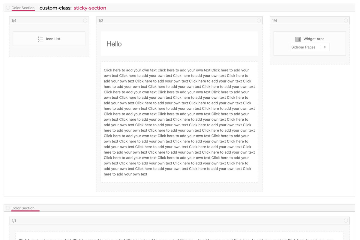
see code and example page:
https://webers-testseite.de/sandy-2/February 10, 2025 at 10:49 am #1476814thank you Guenni for all of your information
I’m now able to do it myself.
You can close this thread. -
This topic was modified 1 year, 2 months ago by
-
AuthorPosts
- The topic ‘How to set a sticky column ?’ is closed to new replies.