Tagged: centered, icons, side by side
-
AuthorPosts
-
March 26, 2017 at 5:21 pm #766984
Dear Kriesi Team,
I want to place two social icons side by side in one 1/3 column.
Both Icons should have a fixed distance to each other and should be always centered – also in the narrowed mobile view.
It’s actually easy to put two icons in one column, but it’s hard to control their positioning.
In my current version, the tumblr icon was set to left align and the twitter icon to right align, to ensure that both will be shown side by side (and not one below the other).
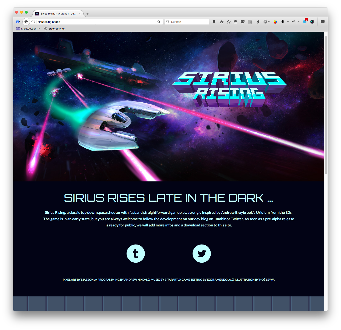
The distance to each other is far to big for my liking (see attached image 01).
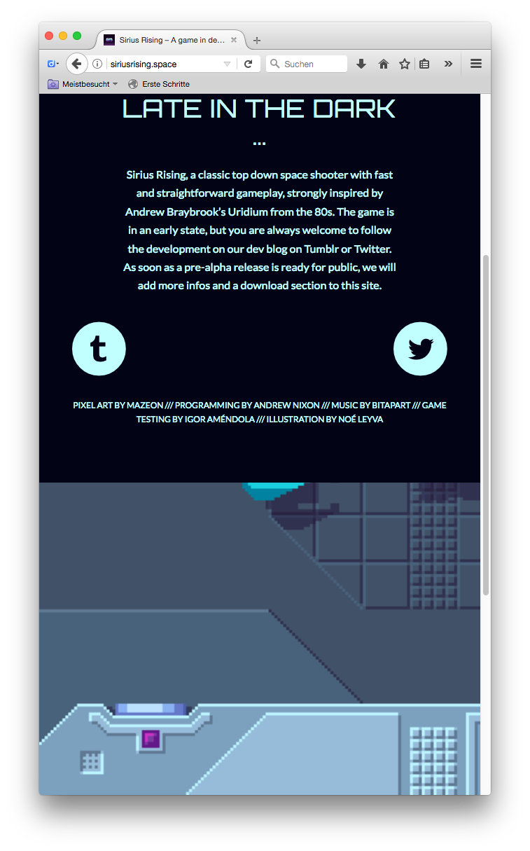
In addition, as soon as the browser window will be narrowed, both icons jump to the outer borders and aren’t centered anymore (see attached image 02)How do I place these two icons side by side in one column in a centered, fixed position?
Thanks in advance.
Image One:

Image Two:

-
This topic was modified 9 years ago by
4farben.
March 26, 2017 at 5:53 pm #766997Hey 4farben,
Try this code in the General Styling > Quick CSS field:div .av_one_third.avia-builder-el-6 { margin-left: 8vw !important; width: 20% !important; } @media only screen and (max-width: 989px) and (min-width: 768px){ div .av_one_third.avia-builder-el-6 { margin-left: 5vw !important; width: 30% !important; } } @media only screen and (max-width: 767px) { div .av_one_third.avia-builder-el-6 { margin-left: 16vw !important; width: 60% !important; } }Best regards,
MikeMarch 26, 2017 at 8:43 pm #767039Dear Mike,
thanks so much for your quick response!
I implemented your code and figured out that the two icons are not centered accurately.
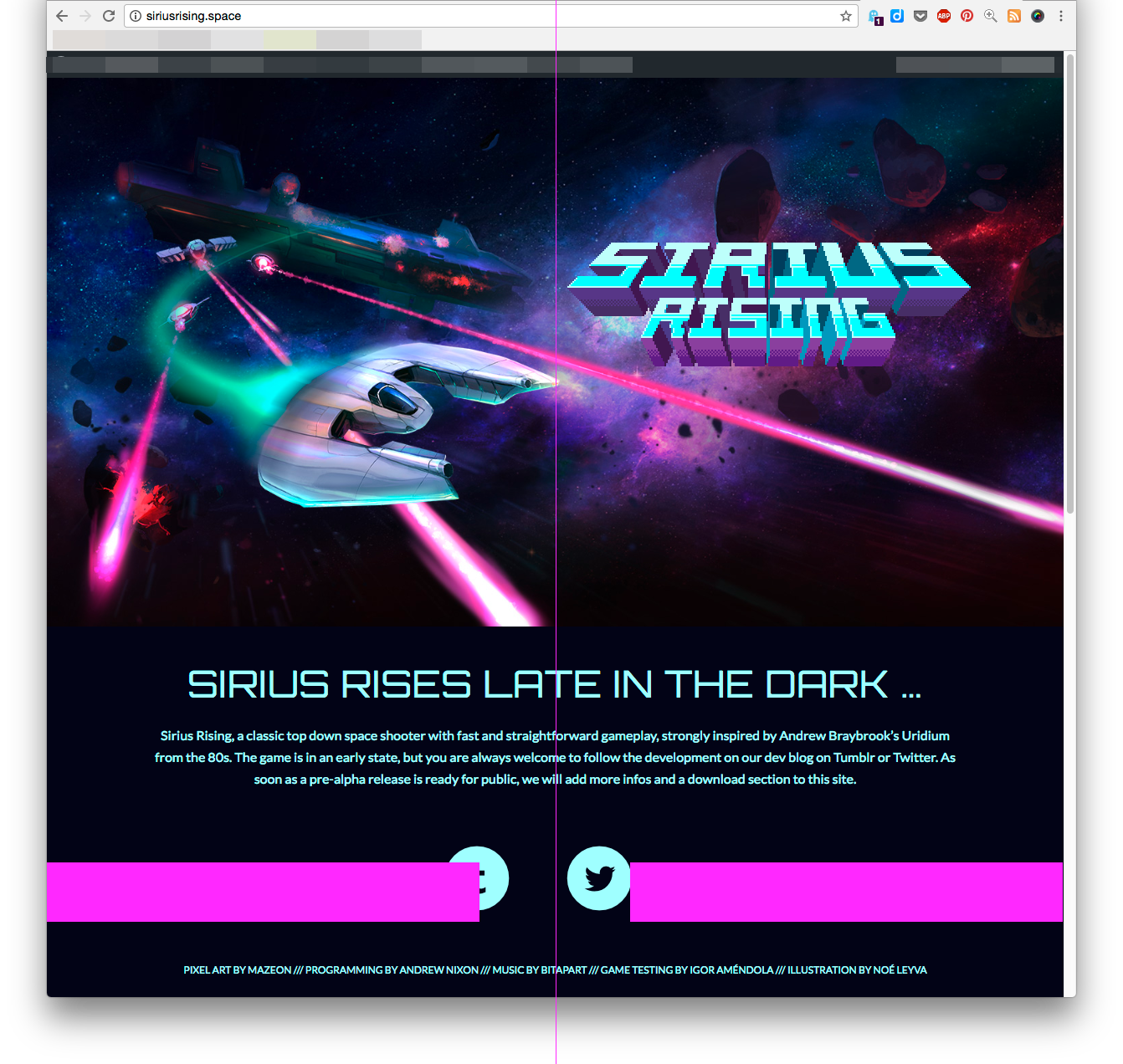
To give you a better view, I created a screenshot with a centerline (Image 03).I tried to adjust the values to make the two Icons accurately centered, but failed constantly.
Is it possible to make both icons more accurately centered?
I would be happy if there is another solution, even if I would have to change a lot of things.Thanks in advance.
Image 03:
 March 26, 2017 at 9:29 pm #767065
Hi,
Can you please include a admin login in the private content area so we can take a closer look.Best regards,
MikeMarch 26, 2017 at 9:42 pm #767068Hi Mike,
wow – what a service! :)
Please find all necessary data in the private content area.March 26, 2017 at 11:09 pm #767091Hi,
OK, I moved your icons inside of one full width element, and then centered :)
This is the code I added in the General Styling > Quick CSS field:@media only screen and (max-width: 767px) { .avia-icon-pos-left { display: inline-block; margin-left: 20vw !important; } .avia-icon-pos-right { display: inline-block; margin-right: 20vw !important; }} @media only screen and (min-width: 768px){ .avia-icon-pos-left { display: inline-block; margin-left: 30vw !important; } .avia-icon-pos-right { display: inline-block; margin-right: 30vw !important; } }Best regards,
MikeMarch 26, 2017 at 11:43 pm #767096Hi Mike,
thanks a lot for your great support!
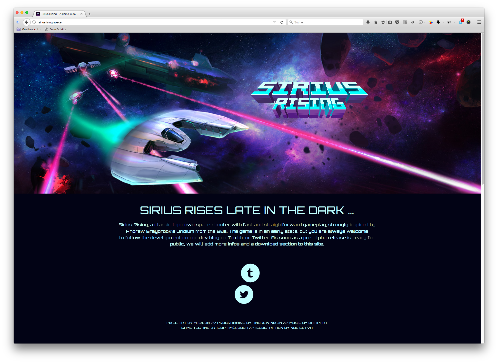
It works like a charm – until a specific browser width is exceeded: then the icons get funky (image 04).
I feel a bit bad now, since you put so much effort in these icons and it’s still not 100%. :-/The issue with larger browser windows could be solved with another max-width limitation, right?
A brief hint would be nice … Anyway, I’ll try my best to solve it on my own.Best regards and thanks again!
Image 04:
 March 28, 2017 at 4:34 pm #768275
Hi,
I can’t see the issue when I shrink browser screen. Which screen size are you using to get those results?
However, basically you need to adjust the media queries of Mike’s code and then you can play with different margin-left values, until it fits for you.
Best regards,
AndyMarch 28, 2017 at 6:31 pm #768372Hi Andy,
thanks a lot for your reply!
Meanwhile the issue was fixed by a friend of mine, therefore you can’t see the issue anymore. ;)
I’m happy with the current state and you can close this thread, if you like.Greetings to Mike, which support was really great …
Cheers!March 29, 2017 at 3:02 pm #768848Hi,
Glad Mike could help!
Please take a moment to review our theme and show your support https://themeforest.net/downloads
To know more about enfold features please check – http://kriesi.at/documentation/enfold/
Thank you for using Enfold :)Best regards,
Andy -
This topic was modified 9 years ago by
-
AuthorPosts
- The topic ‘How to place two icons side by side in one column in a centered position’ is closed to new replies.


