-
AuthorPosts
-
September 19, 2019 at 9:00 pm #1140036
See example here:
I am referring to the red, black and grey icon box below the topbanner. I’d love to understand how to implement that. Please advice. THANKS in advance.
September 19, 2019 at 10:00 pm #1140053Hey Marijke82,
You can add a column grid to achieve that look. You add the iconbox within the columns.
Best regards,
Jordan ShannonSeptember 20, 2019 at 4:32 pm #1140244Great! Thanks. But what then? How/ where can I set a different color for each of the blocks, as in the example? Can I do this for these blocks separately or can this only be done via Enfold Child > Website styling > Main content and Alternate content? Please advise. Thanks again!
September 20, 2019 at 4:49 pm #1140247Hi,
We can provide css to color them. If you are able to get the section up and then link us to it we can give you the accurate css.
Best regards,
Jordan ShannonSeptember 22, 2019 at 5:47 pm #1140657OK cool, I think I know found out how to color them (see example below)…. the only thing is that those are still blocks with white space around it (despite the fact that I applied the full screen mode with no borders). How can I change that so there’s no white space and colored blocks are exactly next to each other.
September 22, 2019 at 8:38 pm #1140750Hi Marijke82,
Could you please give us a link to your website, we need more context to be able to help you.
Best regards,
VictoriaSeptember 23, 2019 at 8:46 am #1140870This reply has been marked as private.September 23, 2019 at 9:43 am #1140912Great! Thanks. But what then? How/ where can I set a different color for each of the blocks, as in the example? Can I do this for these blocks separately or can this only be done via Enfold Child > Website styling > Main content and Alternate content? Please advise. Thanks again!
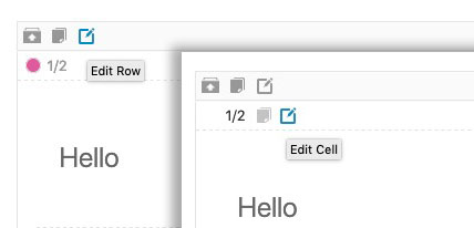
yes you can hover the edit buttons on that element – it has two : one for the row and one for the cell:
 September 24, 2019 at 5:59 am #1141216September 28, 2019 at 12:34 pm #1142986
@Rikard and @guenni007: thanks for your help… still I have got the white borders on each side of the outer boxes though… (box 1 and 3 on my website if you like) whereas in the Gym example the boxes are covering the entire page and don’t show any white space on the side? Probably I am missing something… but what? Can’t get my head around it. Sorry!
September 30, 2019 at 10:20 am #1143263Hi Marijke82,
Can you give us temporary admin access to your website in the private content box below, so that we can have a closer look?
Best regards,
VictoriaOctober 2, 2019 at 8:15 pm #1144255See reply in private content box
October 7, 2019 at 3:39 am #1145598 -
AuthorPosts
- You must be logged in to reply to this topic.
