
-
AuthorPosts
-
November 8, 2025 at 8:41 am #1491041
Dear Sirs,
I have a gallery set up with 3 columns with images closer together and centralised as in https://wayneandersonart.com/gallery/. I have set up 3 columns and trying to get them closer together. I have set the row layout to have no space between columns it says (not used when fullwidth breakpoint active) not sure I understand this. where is this set ?
if you see https://peter-test1.co.uk/gallery/ our development site this is the current set up
I am trying to achieve reduced column space of the three images that are central like https://wayneandersonart.com/gallery/ can you help.I have set up access to the development site. Can you help please.
Many Thanks
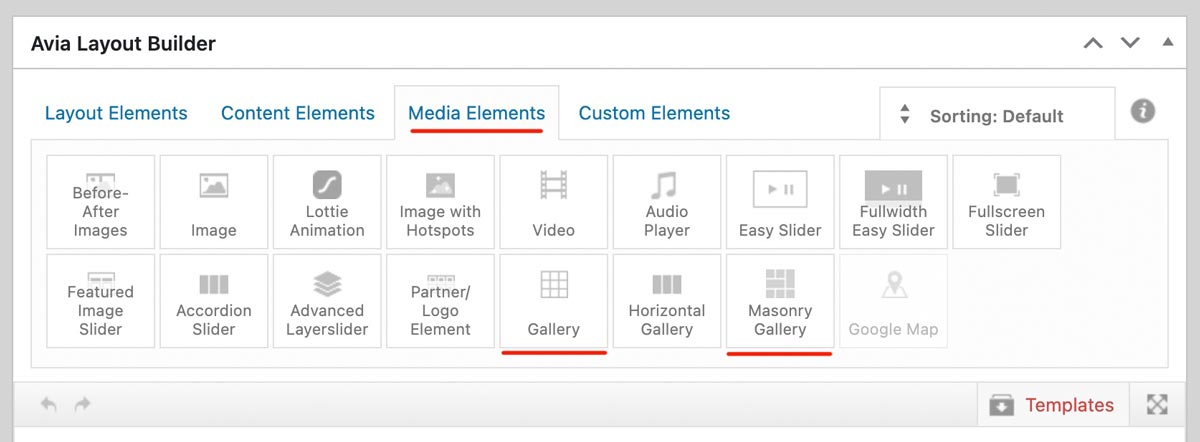
PeterNovember 8, 2025 at 9:17 am #1491044why don’t you use the gallery or masonry gallery element?
 November 8, 2025 at 9:44 am #1491045
We dont want to use gallery as images come up too big when only set to three columns width. https://peter-test1.co.uk/gallery/
-
This reply was modified 4 months, 3 weeks ago by
condonp.
November 8, 2025 at 10:17 am #1491047Assign a custom class to this gallery – and reduce the value for the maximum width – as on blog pages. e.g: 800px
.avia-gallery.your-custom-class {
  max-width: 800px;
  margin: 0 auto;
}
you can decide to show on grid a smaller version of your images – and in light-box to show the full image. On masonry-gallery you can set to have different column-counts on responsive case.
November 8, 2025 at 11:19 am #1491049Many thanks,
Works fine thank you
November 8, 2025 at 12:52 pm #1491050ok – i think you should use not the nextgen gallery images for that – In that case, you would not have taken advantage of the lightbox, which displays an enlarged version of your images. Instead, use the original uploaded files.
Why not try the Masonry gallery? It offers even more configuration options. – The css code is on my testpage
November 8, 2025 at 1:38 pm #1491057 -
This reply was modified 4 months, 3 weeks ago by
-
AuthorPosts
- You must be logged in to reply to this topic.