-
AuthorPosts
-
July 24, 2024 at 9:19 am #1462829
Hi,
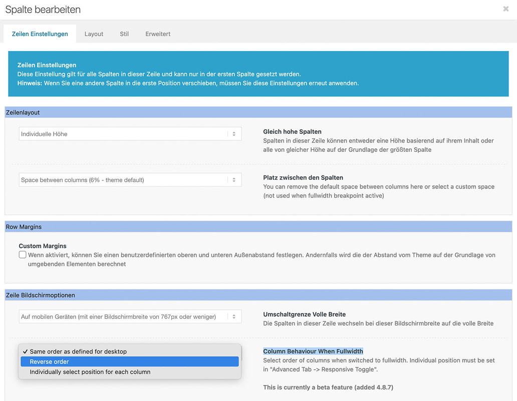
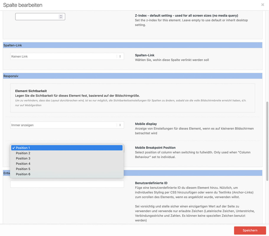
i would like to change the columns order for responsive view.
How can i do that?
kind regards
Jak-
This topic was modified 1 year, 8 months ago by
Jak73.
July 24, 2024 at 9:35 am #1462831July 24, 2024 at 10:44 am #1462835Hi Guenni,
thank you. I’ll try this.
kind regards
JakJuly 24, 2024 at 10:57 am #1462842July 24, 2024 at 11:16 am #1462850Hi Guenni,
works great, but the 3 position breaks below?
https://img.savvyify.com/images/2024/07/24/responsive-positions.jpg
kind regards
JakJuly 24, 2024 at 12:01 pm #1462852this is your slideshow test 2 page?
responsive on enfold means: the columns goes to 100% width. Then the order is determine by the mentioned above.
if you like to reach that of your screenshot – you had to place these 3 columns best in an extra color-section. That is easier to handle.
Then best a custom class is added to that color-section to better select that columns. A custom flex layout should then be set by css.
Means – after first responsive break – the one flex-item will have 100% – the others will have 50% width.If it will be a slideshow – you like to have an event on those arrows under the image? what is the function of that X in the middle ? – and on the right side the counter should count the images automatically?
see here with a possible css code : https://webers-testseite.de/slideshow-test2/
July 24, 2024 at 12:51 pm #1462855Hi Guenni,
yes it’s the page i sended to you, but without the “test” before the domain and after the /gallerie-test1-2/.I made the coulor-section below, with the 3 elements. Seems there is the same behavior.
Yes left button is previous picture right is next. X-button should be to the gallery overview.
kind regards
JakJuly 24, 2024 at 6:28 pm #1462873Hi,
now it works. Many thanks!
kind regards
Jak-
This reply was modified 1 year, 8 months ago by
Jak73.
July 24, 2024 at 7:29 pm #1462884Hi,
Thanks for the update. Please let us know if you should need any further help on the topic, or if we can close it.
Best regards,
RikardJuly 24, 2024 at 8:08 pm #1462893Hi Rikard,
you can close it.
kind regards
Jak
p.s. Thank you Guenni -
This topic was modified 1 year, 8 months ago by
-
AuthorPosts
- The topic ‘How to change columns order in responsive view?’ is closed to new replies.


