Tagged: sections
-
AuthorPosts
-
November 22, 2021 at 5:14 pm #1330000November 23, 2021 at 5:52 am #1330070
Hey advteksol,
Thanks for the screenshots. Could you post a link to where we can see the actual elements as well please?
Best regards,
RikardNovember 23, 2021 at 9:36 am #1330083the p tag got a top/bottom margin of 0.85em
p {
    margin: 0.85em 0;
}
even if you set this to Zero – there will be a litle distance.
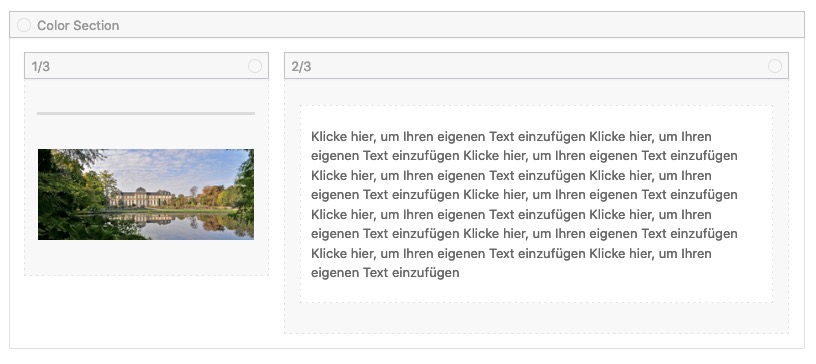
But what if you place a separator/whitespace line above the image with a height of 0.85em ?

and on responsive case – that text under the image – you can set the whitespace to hide on smaller screens.
November 23, 2021 at 2:27 pm #1330134November 29, 2021 at 11:05 pm #1330895That solution sorta works, but it doesn’t seem like the best way. Here’s a page link you can view:
November 30, 2021 at 6:46 am #1330933Hi,
You can target the paragraph which you are looking to align if you add a class to it:
<p class="my-class">Content</p>Then add this CSS in Quick CSS:
p.my-class {
    margin-top: 0;
}
Best regards,
RikardDecember 1, 2021 at 12:07 am #1331050That doesn’t work – the top of the paragraph still doesn’t align with the image to the left.
December 1, 2021 at 12:05 pm #1331134Hi,
Did you add this in Quick CSS?
p.my-class {
    margin-top: 0;
}
Best regards,
RikardDecember 2, 2021 at 11:49 pm #1331365Yes, as per your instructions.
December 3, 2021 at 4:15 am #1331383Hi,
It’s not applying on your site. If you need further help, then include admin WordPress login details in private.
Best regards,
RikardDecember 3, 2021 at 9:14 pm #1331508Info below.
December 4, 2021 at 5:51 am #1331522Hi,
You had invalid CSS in Quick CSS:
#top .social_bookmarks li {margin: 0 8px;};I fixed that for you, and the CSS I sent is now applying.
Best regards,
RikardDecember 6, 2021 at 4:26 pm #1331733Thanks, it works!
-
AuthorPosts
- The topic ‘How to align Text to match picture with two sections’ is closed to new replies.


