-
AuthorPosts
-
December 16, 2019 at 10:58 pm #1166602
I am trying to figure out how to make the Grid Row elements responsive on tablets like the IPad Pro
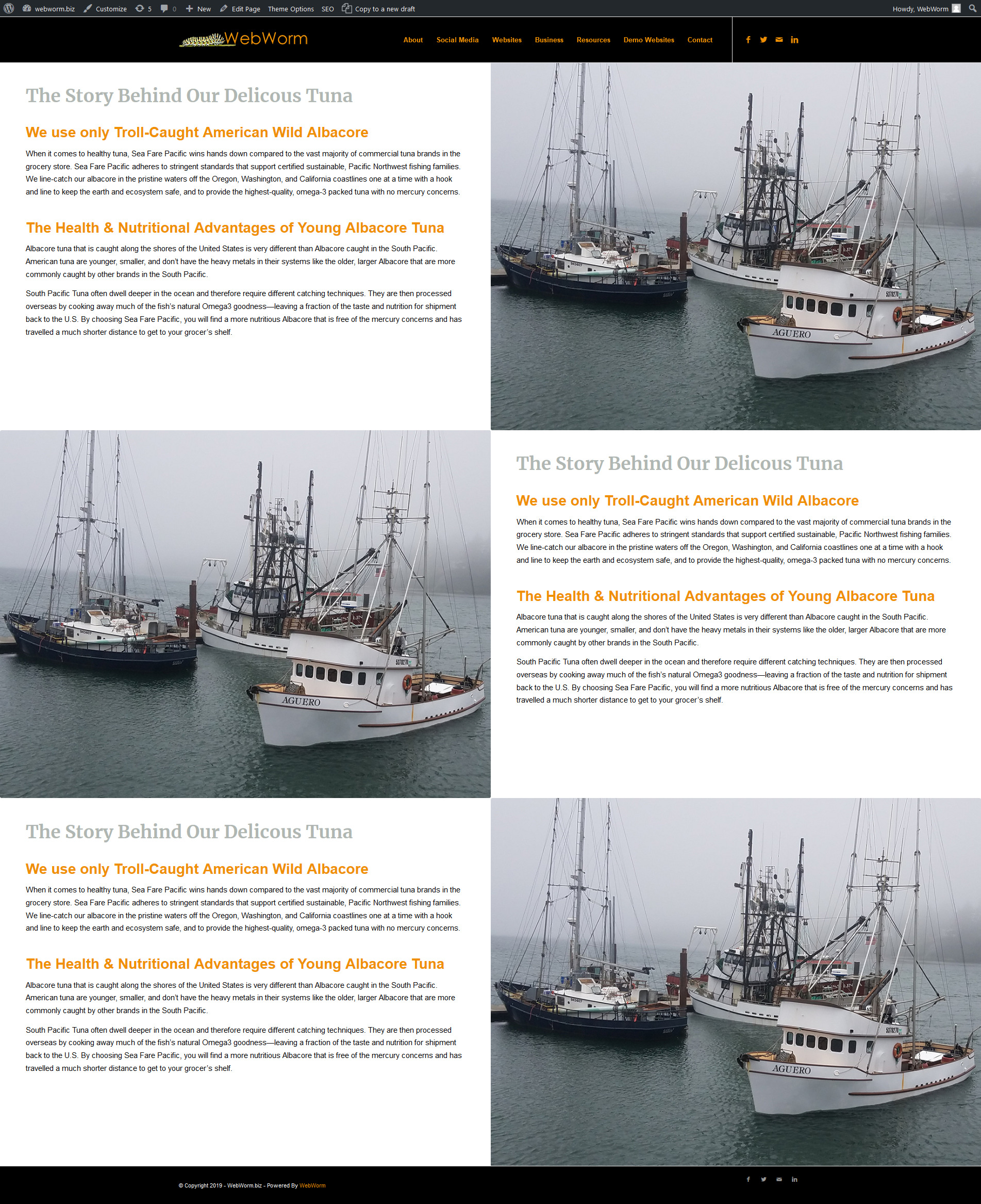
The screen shot below shows how it looks on a wide screen desktop 1920 pixels wide. There are 3 elements each using the Grid Row 1/2 and 1/2
Here is the live demo page as well https://webworm.biz/sf/

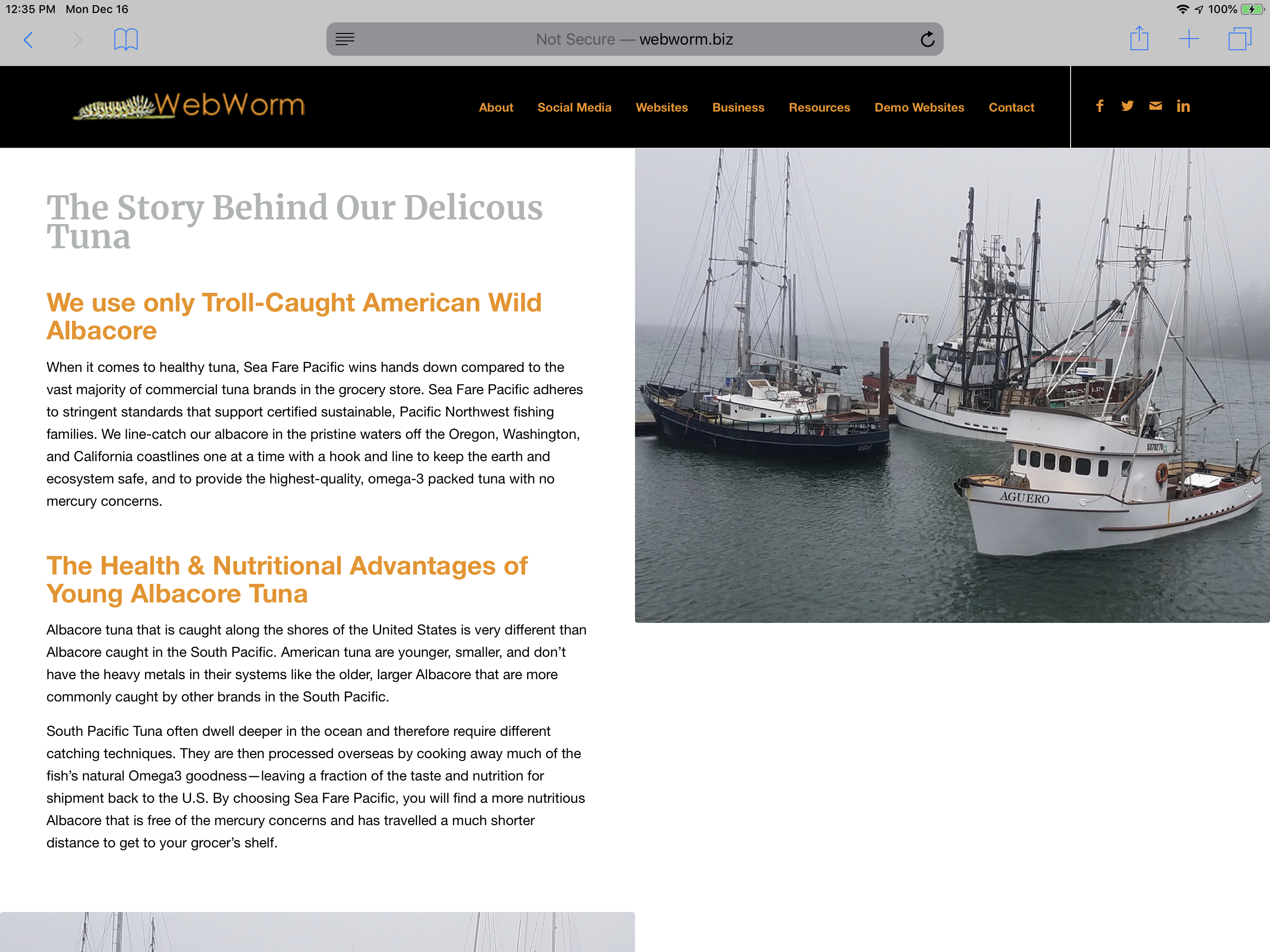
Below is a screen shot from an IPad Pro in landscape mode of the same page. As you can see the text does not shrink down to fit the screen size/element area. Is it possible to make these elements responsive ?

-
This topic was modified 6 years, 3 months ago by
webworm72.
December 18, 2019 at 8:06 pm #1167475Hey webworm72,
There is too much text for the grid rows to stay within the height of the image. You need to either remove the text or use images and have more vertical aspect ratios and would fill all the vertical space.
Best regards,
VictoriaDecember 19, 2019 at 11:36 am #1167683so there is no way to have the text smaller depending on the device , isn’t that what the “Screen Options” are for in each element ?
so you can set the text sized based on the device ?
Under “Screen Options” it says
Font Size
Set the font size for the element content, based on the device screen size
I tried using
Font Size for medium sized screens (between 768px and 989px – eg: Tablet Landscape)however it doesn’t do anything , Isn’t the IPad pro considered a tablet ?
December 19, 2019 at 2:45 pm #1167753Yes – but first with such an amount of text it would have to be so small that you could not read it clearly. Because you break the grid on 768px and even if you do it on 990px the font-size will be too small.
Then – your setting is not the normal usage of grid-row element. If you could insert your images as grid-cell background you can choose that the image fills the cell- but then, of course, it gets cut.Maybe you are satisfied if the images are vertical aligned in the middle – there is an option to do so for grid-cell positioning in each cell.
-
This reply was modified 6 years, 3 months ago by
Guenni007.
December 19, 2019 at 8:48 pm #1167923Hi webworm72,
The text font is already quite small, if you make it smaller it will be not readable. We can try to reduce the vertical margins and the headers font size but it will not solve the issue all the way.
Best regards,
VictoriaDecember 20, 2019 at 3:23 am #1168001Good input Victoria , Guenni007
I will investigate further, Yes I don’t need to use all of the text , I was just showing you an example of what I was trying to do.
Below is my inspiration site Guenni007 , I think this is what your suggesting when your saying “you could insert your images as grid-cell background”
correct, something along those lines ?
https://www.openblue.com/On another site I had the same issue and Mike gave me some input on post #1110875 on the use of media queries , see his response below.
However I was not quite sure how to implement, and had to move on as I was under a time constraint. If it’s possible using media queries to set the font size by percentages as Mike suggest any input would be great as far as a step by step how to implement.
I do have custom classes enabled for this site , I see the field at the bottom of each element I.m not sure what to do from there.
Thank you any input is greatly appreciatedMikes Response Below
=====================
Hey webworm72,
You can use these media queries:/* ———– iPad Pro ———– */
/* Portrait and Landscape */
@media only screen
and (min-width: 1024px)
and (max-height: 1366px)
and (-webkit-min-device-pixel-ratio: 1.5) {}
/* Portrait */
@media only screen
and (min-width: 1024px)
and (max-height: 1366px)
and (orientation: portrait)
and (-webkit-min-device-pixel-ratio: 1.5) {}
/* Landscape */
@media only screen
and (min-width: 1024px)
and (max-height: 1366px)
and (orientation: landscape)
and (-webkit-min-device-pixel-ratio: 1.5) {}
Try adding a custom class or ID to the text area and then we can set the size in percentages like:
font-size: 70% !important;Best regards,
MikeDecember 20, 2019 at 7:23 pm #1168277Hi webworm72,
Yes, it is better to use the images as the grid cell background as Gunter suggested and this way they will be more responsive. Please copy the page but use images as background and we can help you with that.
Best regards,
Victoria -
This topic was modified 6 years, 3 months ago by
-
AuthorPosts
- You must be logged in to reply to this topic.
