
-
AuthorPosts
-
August 13, 2019 at 2:21 pm #1127231
Hi support,
How do I make a 3/5 container/column float in the top/left of the first color section?
I have giving the container/column this name in Custom Css Class: forvirksomhederbox
The container/column is placed in the top color section as the only container.I have been trying with this code:
.forvirksomhederbox .flex_column.av_three_fifth.flex_column_div.av-zero-column-padding.first.avia-builder-el-1.avia-builder-el-no-sibling {
float: left !important;
position: relative !important;
top: 25% !important;
left: 25% !important;
transform: translate(-25%, -50%) !important;
}The test site/page is located here: http://web19.lexodoc.dk/for-virksomheder/
Thanks :-)
/OKEIwebbureau
August 13, 2019 at 6:35 pm #1127346Hey OKEIwebbureau,
Could you please attach a mockup of what you’re trying to achieve?
Best regards,
VictoriaAugust 14, 2019 at 9:04 am #1127525Here is the mockup:
http://web19.lexodoc.dk/wp-content/uploads/2019/08/forvirksomheder-mockup.jpg
I want the content of the container/column to float in the top/left corner.
Thanks :-)
/OKEIwebbureau
August 14, 2019 at 9:21 am #1127532is ti your page: virksomhed – you found a solution though?
Why are you using a different slider? the fullwidth easy slider of enfold got all you need
a Caption with subheading and the possibility to have one or two buttons. This will react responsive too !https://webers-testseite.de/lexoforms/
and you can have overlay color aswell.
August 14, 2019 at 12:41 pm #1127592Hi Guenni007,
Great idea with the easy slider – I will give it a try :-)
How did you get the caption container placed at the top in the left side?However I would also like, if possible, a solution without the fullwidth easy slider.
Thanks :-)
/OKEIwebbureau
August 14, 2019 at 6:51 pm #1127700you can do it via quick css f.e. to overwrite the vertical align : middle instruction
.page-id-35534 .slideshow_align_caption {
    vertical-align: top;
    top: 5vw;
}
on responsive case i go away from 100% container for caption and set it to:
.responsive #top.page-id-35534 .slideshow_caption {
    width: 60%;
}
( i did it only for that page )
August 14, 2019 at 7:57 pm #1127717Thank you very much, Guenni007 :-)
/OKEIwebbureau
August 14, 2019 at 7:58 pm #1127718@supportteam: Still I would also like, if possible, a solution without the fullwidth easy slider.
Thanks :-)
/OKEIwebbureau
August 14, 2019 at 8:40 pm #1127726just one moment – i did’t saw the test link in your starting thread.
To have a responsive Color-Section – you have to have a responsive Content ! – otherwise it will go out of the container.
Your bg-image is 1600/768 so an aspect ration of 48%so you have to set your background-image to “contain” the image – but the height of the color-section should be 48% of width:
in responsive Case the 3/5th container should stay in this width or should be adjusted to your needs – enfold goes to have the containers under each other at a responsive width so to speek on 100% width:see here the test page: https://webers-testseite.de/responsive-color-section/
.page-id-35548 #av_section_1 {
  width: 100vw;
  height: 48vw !important;
}

.page-id-35548 .flex_column.av_three_fifth {
  width: 58vw !important;
}

.page-id-35548 .flex_column.av_three_fifth .av-special-heading h1 {
  font-size: 4vw !important;
  line-height: 6vw !important;
}

.page-id-35548 .flex_column.av_three_fifth .av-special-heading .av-subheading {
  font-size: 3vw !important;
  line-height: 4vw !important;
}

.page-id-35548 .avia-button .avia_iconbox_title {
    font-size: 2.5vw !important;
}

.page-id-35548 .flex_column.av_three_fifth .av-special-heading h1 {
	font-size: 3.2vw !important;
	line-height: 5vw !important;
}
.page-id-35548 .flex_column.av_three_fifth .av-special-heading .av-subheading {
	font-size: 2vw !important;
}
August 14, 2019 at 8:51 pm #1127728Please take a look at this screenshot from the controlpanel:
http://web19.lexodoc.dk/wp-content/uploads/2019/08/Enfold-Page-ID-37.pngThanks Guenni007 :-)
/OKEIwebbureau
August 14, 2019 at 10:44 pm #1127764the thing is not that the 3/5 container does not what you like to have the point is that the background-image and the container does not do what you intend to have.
The above gives you the possibility to have a responsive Color-section – but you have to make adjustments to have content that fits into the smaller sectionso my recommendation : use the fullwidth easy slider – it starts from the beginning with responsiveness. – and even the content is prepared for that.
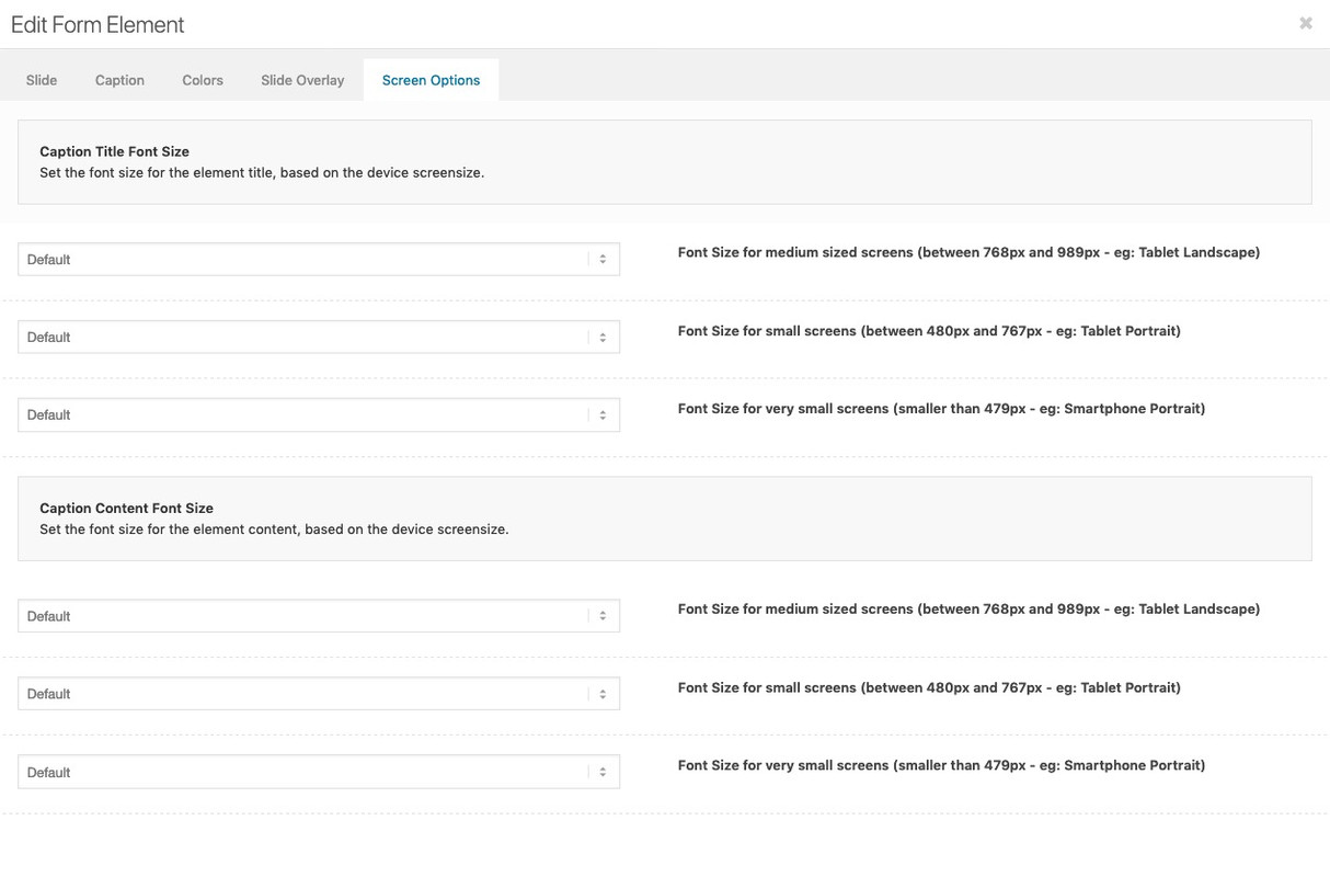
you don’t need to find a relative font-size like the code above does with screen width relation – each slide got his own screen behavior to adjust for smaller screens :
 August 16, 2019 at 7:16 pm #1128335
Hi,
Let us know if this is helpful and enough for you
Best regards,
BasilisAugust 19, 2019 at 9:42 am #1128846Hi Basilis,
Please give me a solution for this (also posted earlier..):
http://web19.lexodoc.dk/wp-content/uploads/2019/08/forvirksomheder-mockup.jpg
I want the “.flex_column.av_three_fifth” in “#av_section_1” to float in the top/left corner.
Margin-top: 15%.
Margin-left: 15%.Thanks :-)
/OKEIwebbureau
August 20, 2019 at 8:32 am #1129153I found a solution that nearly did it:
.page-id-37 #av_section_1 .flex_column.av_three_fifth {
position: relative !important;
top: 25% !important;
left: 10% !important;
transform: translate(-25%, -50%) !important;
}It works pretty good on desktops and tablets, but not on mobile.
/OKEIwebbureau
August 22, 2019 at 4:14 am #1129830Hi,
Thank you for the update. Glad that you’ve found a solution.
Try to wrap it inside a css media query so that it doesn’t affect the mobile view.
@media only screen and (min-width: 989px) {
  /* Add your Desktop Styles here */
  .page-id-37 #av_section_1 .flex_column.av_three_fifth {
    position: relative !important;
    top: 25% !important;
    left: 10% !important;
    transform: translate(-25%, -50%) !important;
  }
}
Best regards,
IsmaelAugust 22, 2019 at 9:09 am #1129884Good idea, thanks :-)
Please close.
/OKEIwebbureau
August 22, 2019 at 10:13 am #1129926Hi OKEIwebbureau,
Glad we could help :)
Closing this one.
Best regards,
Victoria -
AuthorPosts
- The topic ‘How do I make a 3/5 container/column float in the top/left?’ is closed to new replies.