
-
AuthorPosts
-
April 19, 2023 at 8:40 pm #1404989
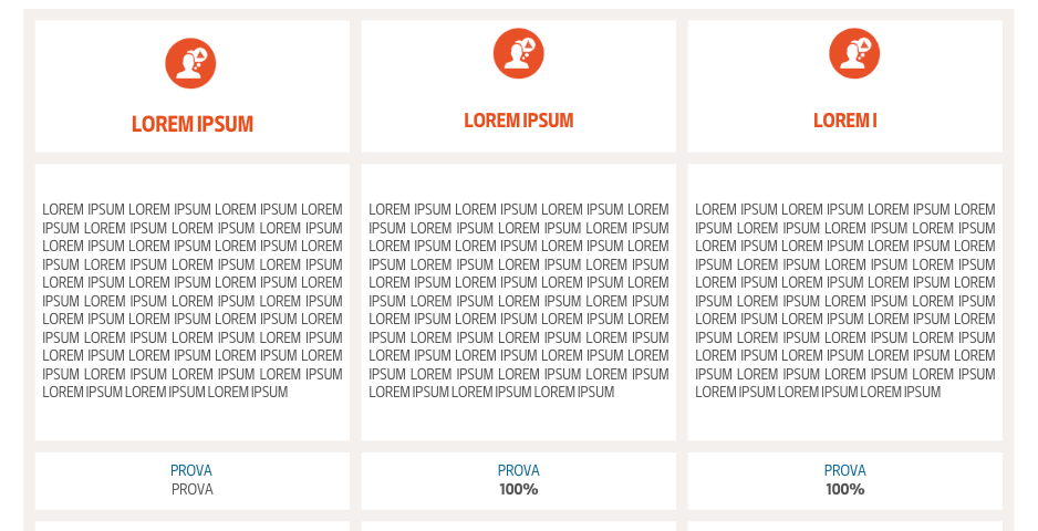
I’m trying to reproduce a table like this with the enfold tools, just can’t seem to get there. If I use the row grid I get something like this with a colored background and white columns where inside I add the icon text functions etc. The problem is that the grid row reaches the margin of the page and is not included in the container size. If I only use the columns, obviously I can’t get the external beige background with the white interior but I get the width of the container. If I use the color section I always have the problem that the width is at the margin of the page and instead I would like it to be container width. I don’t know if it’s possible to achieve something like this with the functions I have available…
 April 19, 2023 at 9:37 pm #1404994
you can do that with grid-rows one after the other.
The Grid-row is on default a full-width element – but with a bit of script you can force it to be not:
give a custom class to your grid-row – f.e.: grid-notfull
this comes to child-theme functions.php:function grid_layout_notfull(){ $responsive_size = avia_get_option('responsive_size'); ?> <script> (function($){ $('.av-layout-grid-container.grid-notfull' ).each(function() { var notfullID = $(this).attr('id'); $(this).hasClass('main_color') ? $(this).wrap('<div class="main_color notfullsize '+notfullID+'"></div>') : ''; $(this).hasClass('alternate_color') ? $(this).wrap( '<div class="alternate_color notfullsize '+notfullID+'"></div>') : ''; }); $('.notfullsize').css({"clear": "both", "width": "100%" , "float": "left" , "position": "static" , "min-height": "100px" }); $('.grid-notfull').css({"max-width": "<?php echo $responsive_size; ?>" , "margin": "0 auto" , "padding": "0 50px"}); })(jQuery); </script> <?php } add_action('wp_footer', 'grid_layout_notfull');you can see what the snippet does: it wraps the grid-row element to a div container with the settings for a “color-section” ,
and the grid-row element itself gets the porperties of a color-section container. ( max-width, padding and min-height )
the max-width is taken from the option setting of enfold dialog.see here a layout with 3 grid-rows : https://webers-testseite.de/grid-rows/
the wrap-container got the class from the grid-row ID – so you can select better each grid-row.
Means: if the grid-row got ID: av-layout-grid-1 – the div container wrapping that grid-row will have the class: av-layout-grid-1April 20, 2023 at 4:23 pm #1405059wow! Thanks!
April 20, 2023 at 10:31 pm #1405092nice thing to have – because the grid-row is a mighty thing to nest columns – see example page again.
April 21, 2023 at 2:15 am #1405115 -
AuthorPosts
- You must be logged in to reply to this topic.