-
AuthorPosts
-
September 4, 2019 at 1:11 am #1133584
Hi!
My site is: https://www.moneyprodigy.com/
I would really like to center the certification logo, the social media profiles, and the two columns better (at least move the 2nd column to the right and spread out the first column text further right). How can I do this?
Thanks,
AmandaSeptember 4, 2019 at 7:27 am #1133633first try this in quick css:
@media screen and (min-width:768px) {
  #footer .widget {
    overflow:visible !important;
  }
  #text-4 div > img {
      position: relative;
      left: calc(50% + 25px);
      overflow: visible !important;
  }
}
But has the disadvantage that on responsive case the sign is inbetween the two blocks.
__________________
Alternative:another quick and dirty way ( because all your background-color on #footer and #socket are equal) could be to insert the image to the copyright info field:
delete the image from your widget area.put this to your copyright input field of Enfold Options:
<img class="aligncenter" src="https://www.moneyprodigy.com/wp-content/uploads/2017/01/Certification-for-Footer-transparent.png" alt="" width="300" height="211" /><br>© Copyright - Money Prodigy <a href="/terms">Terms</a> & <a href="/privacy-policy">Privacy Policy</a> [nolink]Advantage is that in responsive case the sign is under all widgets – just over your copyright info.
September 4, 2019 at 2:14 pm #1133851Hi,
Thanks for helping out @guenni007. Did you try the suggestions out and did you have any luck with them @algkent?
Best regards,
RikardSeptember 4, 2019 at 6:51 pm #1134029Thank you both…I was hoping for a more user-friendly and easy way to fix this.
September 5, 2019 at 5:21 pm #1134536Well more userfriendly than a whole code – only to copy and paste into the copyright input field?
Ok – glad we had talking about.Good luck to you.
September 5, 2019 at 8:11 pm #1134599Haha–yes I was hoping it was an element I could edit, like the others.
I just put your code in, Guenni, thanks! It’s not all centered though.
September 6, 2019 at 1:16 am #1134676But if I look at your page, you have also not been able to understand the above mentioned.
The one method to put the html code into the input field at Copyright is really a very fast uncomplicated method.
If you have done that – we can give you advice to absoluteley center it in perfection.
________________i don’t know if you are ready to generate an additional second footer widget area ?
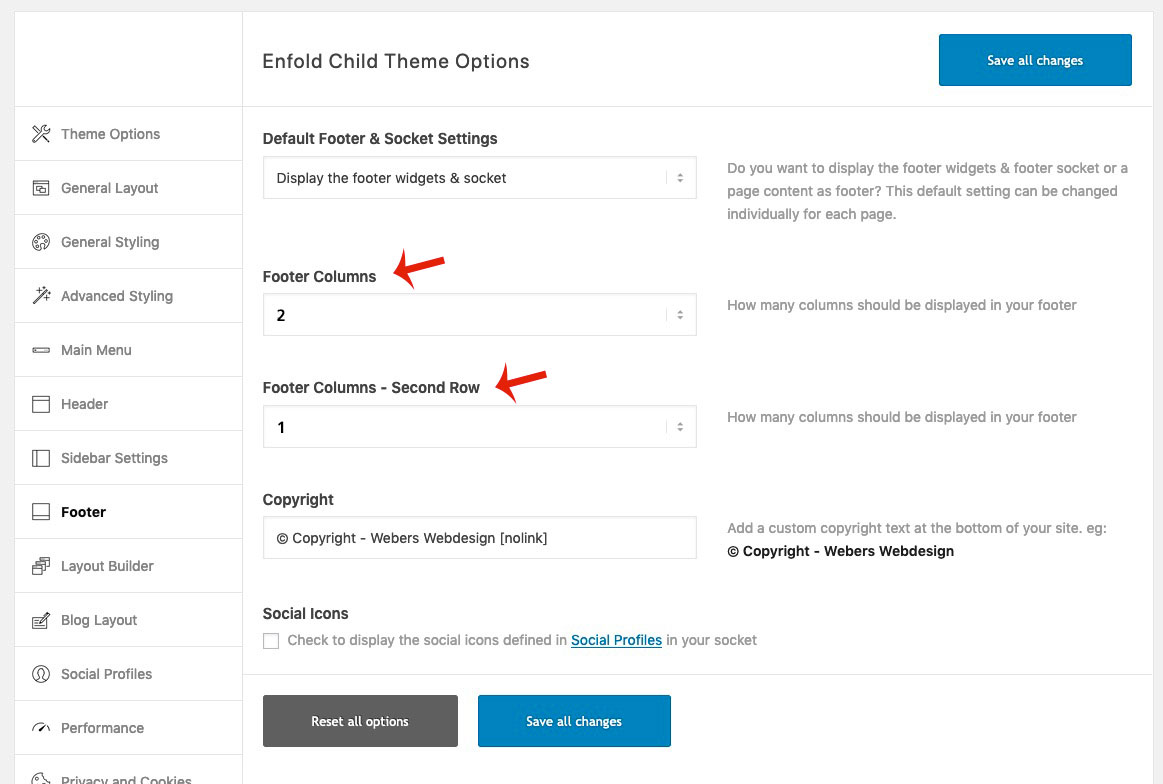
then everything is easy for you (afterwards) you have in enfold then two footer rows.
You can set the first to 2 columns and the last to one column. see here result: https://webers-testseite.de/guenni/you will have on Enfold Options-Dialog then this:

If you like to know – i can show you how to.
September 6, 2019 at 1:28 am #1134678you see here the result in a little film when i add the code above in developer tools to your site:
September 6, 2019 at 9:33 am #1134842so now it looks good – but i guess 35px to add is better – then you see with your socket text its in the middle.
it seems to be not centered because your category list is left to the widget area and does not fill the whole space to the right.You can change that by centering that area (unordered list) by:
#footer .widgettitle {
    text-align: center;
}

#top #footer .widget ul {
  width: auto;
  display: inline-block;
  left: 50%;
  transform: translateX(-50%);
  position: relative;
}
_________________________________________
another elegant different method ( you then had to get rid of the css from above ) is only with quick css
set your footer to 3 columns and use the flexbox modell – put your image in the last footer column.@media only screen and (min-width: 767px) { #footer .container { display: flex; flex-flow: wrap row; justify-content: center; } #footer .flex_column { flex: 0 1 46%; margin: 2%; padding: 0; } }Result: https://webers-testseite.de/guenni/
-
This reply was modified 6 years, 7 months ago by
Guenni007.
September 7, 2019 at 7:52 am #1135257 -
This reply was modified 6 years, 7 months ago by
-
AuthorPosts
- You must be logged in to reply to this topic.
