
-
AuthorPosts
-
March 4, 2025 at 9:42 am #1478553
Hello,
I need help with the header Layout on the mobile
On my phone it looks like this:
https://www.imghippo.com/i/Za3018sJc.pnghowever, I need it to look like this:
https://www.imghippo.com/i/ak6129BLI.jpeg
Widget left, Menu. right on the top
Logo belowPlease send code how to do this
March 4, 2025 at 1:30 pm #1478578Hey ausgesonnen,
Please try the following in Quick CSS under Enfold->General Styling:
@media only screen and (max-width: 990px) {
.av-logo-container {
  height: 300px !important;
}

.html_header_sticky #top .main_menu ul:first-child > li a {
  line-height: 0 !important;
}
}
Best regards,
RikardMarch 4, 2025 at 6:18 pm #1478600does not work. please send another solution
March 5, 2025 at 6:44 am #1478634Hi,
The screenshots from imghippo are not loading on our end. Please try to use imgur or dropbox.
Best regards,
IsmaelMarch 5, 2025 at 9:37 am #1478645Sorry – it was carnival here in the Rhineland (Germany) until yesterday, and that’s basically a public holiday week.
Next: it would be nice if you could disable merging in the Enfold settings until all your goals are met. It’s hard to review and give advice without using devtools.
Do you / your customer realy want that narrow content width vor desktop view?
It’s hard enough to reconcile this, but with such a narrow content area, as you’ve noticed yourself, very long menu items quickly become two-liners.March 5, 2025 at 9:55 am #1478649Ok. Welcome back. Hope you had a nice time :) I also love carnival.
I have now disabled both CSS and Javascript file compression. Right?
Have set the container width back to 1130px. Is that what you meant?
The 2 liner in the menu is intentional. The client wants it like this.
I will be out now until this afternoon and not do anything on the page. ;)Thanks for fixing the mobile header problem above.
-
This reply was modified 1 year, 1 month ago by
ausgesonnen.
March 5, 2025 at 9:56 am #1478652there are older css rules inside that are not needed – so i could not find where f.e. the after pseudo-container of the hamburger is gone.
this is what it seems to get your style:
#top #header #header_main .container.av-logo-container .inner-container > * {
  align-self: center
}

.html_header_top.html_header_sticky #top #wrap_all #main {
  padding-top: 300px !important;
}

@media only screen and (max-width: 989px) {
  .responsive #top #header #header_main .container.av-logo-container .inner-container {
    height: inherit;
    position: relative !important;
    flex-flow: row wrap;
    justify-content: center;
    padding: 0;
  }

  .responsive #top #header #header_main .inner-container .logo {
    flex: 1 1 100% !important;
    order: 3;
    max-width: 100%;
    height: unset !important;
  }

  .responsive #top #header #header_main .inner-container .logo a {
    align-self: flex-start
  }

  .responsive #top #header #header_main .inner-container .main_menu,
  .responsive #top #header #header_main .inner-container .widget {
    flex: 1 1 48%;
    height: 120px !important;
    align-items: center
  }

  .responsive #top #header #header_main .inner-container .main_menu {
    order: 2;
  }

  .responsive #top #header #header_main .inner-container .widget {
    order: 1;
  }

  .html_header_top.html_header_sticky #top #wrap_all #main {
    padding-top: 350px !important;
  }
  #top #header #header_main .container.av-logo-container .inner-container .logo a img {
    max-height: 200px;
  }
}
March 5, 2025 at 10:04 am #1478655Could you please clear this up?
March 5, 2025 at 10:17 am #1478657container width is all up to you / your customer – but i just asked if this is what he likes to have.
You should clarify this somehow before you have then to rewrite a whole series of css rules.PS : please refresh after merging switch off the cache. On performance – “Delete Old CSS And JS Files?”
btw: https://kriesi.at/support/topic/burger-menu-12/
Why? – Look at opened burger menue.maybe this is better instead:
(remove that display none for burger after container and add this rule instead).responsive:not(.av-burger-overlay-active) .av-hamburger-inner:after { display: none; }March 5, 2025 at 1:14 pm #1478676Ok have changed the code for the burger menu.. It also works. The client wants 2 lines. was not able to talk hi out of it. He insists he likes it better with 2 lines.
Now back to the original problem above. The layout of the header on the mobile is completely wrong.
On my phone it looks like this:
https://www.imghippo.com/i/Za3018sJc.pngbut i should be like this.
https://www.imghippo.com/i/ak6129BLI.jpeg
Widget left, Menu. right on the top
Logo belowCan you please fix this?
March 5, 2025 at 2:27 pm #1478679Ok have changed the code for the burger menu.. It also works. The client wants 2 lines. was not able to talk hi out of it. He insists he likes it better with 2 lines.
yes – but on the opened hamburger with the original css rule the hamburger only get one line (looks like a slash)
with my code the burger got on closed burger menu 2lines and on opened burger too.you did not change the burger setting – it is still one line on opened burger menue.
enter on your quick css now the rules of: https://kriesi.at/support/topic/header-layout-in-mobile-view-needs-help/#post-1478652
March 5, 2025 at 3:06 pm #1478680Ok, I see now it didn’t save it. Sorry. Now its in. I see what you mean with the cross only having had one line. Not good. Thanks for that.
Could you please see the layout of the header in the mobile view now? Far more pressing issue. Please go in with the login I provided. I have not used css other than under quick css. Except for styling the form on the start page which is not relevant here. I also don’t see what the size of the content on desktop has to do with the header on the mobile? Did you see the mobile view? Can we please get the this problem?
I will not work on the site today so there is no interference with your work. Just that you know.
-
This reply was modified 1 year, 1 month ago by
-
This reply was modified 1 year, 1 month ago by
-
This reply was modified 1 year, 1 month ago by
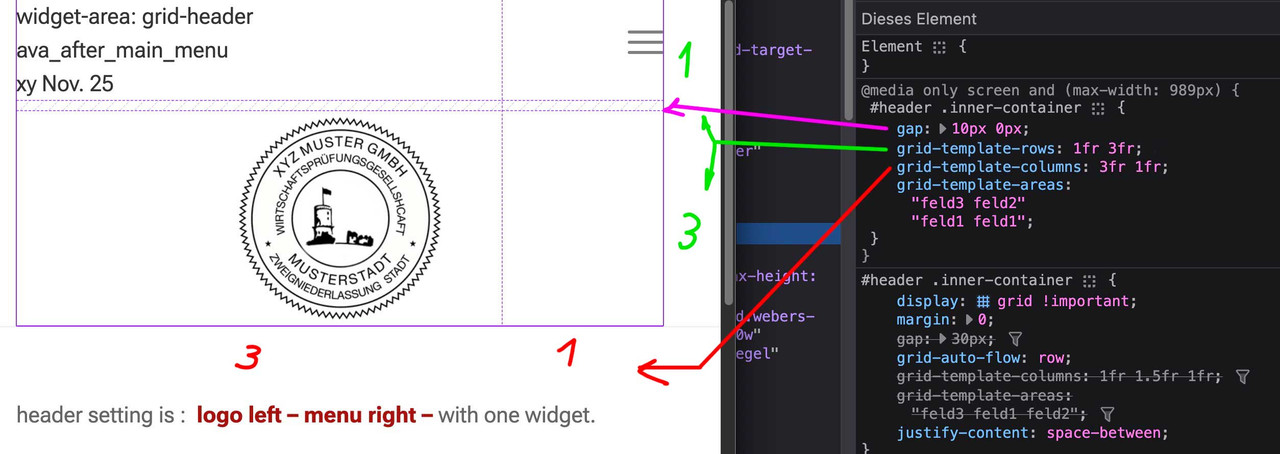
March 6, 2025 at 12:17 pm #1478756ich glaube nicht, das es mit einem shrinking header leicht zu realisieren sein wird. Man stößt auch mit dem flex layout an Grenzen.
Daher habe ich mal hier eine Seite erstellt, die ein grid layout nutzt. ( Viele der Einstellungen überschreiben die in dieser Installation mit einem shrinking header standard Einstellungen. Wenn du in den Optionen direkt das Shrinking abstellst, dann sind einige der Einstellungen überflüssig)
____I don’t think it’s going to be easy to do with a shrinking header. Even with the Flex layout there are limits.
So here is a page that uses a grid layout. (Many of the settings will overwrite the default settings in this installation with a shrinking header. If you disable shrinking directly in the options, some of the settings will be superfluous)https://enfold.webers-webdesign.de/grid-header/
Du kannst hier sehen, wie es dann responsive gesetzt wird ( fr = fraction)
You can see here how it is then set responsive ( fr = fraction)
 March 6, 2025 at 3:53 pm #1478769
Sorry, this is far more than my knowledge of CSS can comprehend. I really don’t understand what you are talking about. All I want is the layout of the header on the mobile view to function. The Desktop view is ok.
Could you please be so kind to rewrite and replace the complete CSS file on the site directly then?-
This reply was modified 1 year, 1 month ago by
-
This reply was modified 1 year, 1 month ago by
March 7, 2025 at 9:40 am #1478840Hallo, I would really like to solve this issue and am dependant on your support. I would really appreciate if you could fix this quite soon. Thank you.
March 8, 2025 at 6:15 am #1478880ich habe dir jetzt zwei wege aufgezeigt.
zum Einen könntest du mit dem bisher erreichten ja den Code von Link mal einsetzen.Dann sieht die seite so aus:

zum Anderen – und ja klar wäre das ein Neuansatz – die Lösung über das Grid Layout.
Dazu wäre dann nötig den bisherigen Code zu entfernen, und den neuen Ansatz auszuprobieren.March 8, 2025 at 7:03 pm #1478915Its getting better. Mine looks like this now.
I want t to look like yours. Please let me know where the mistake is in my css.
March 8, 2025 at 8:30 pm #1478918Hi,
I adjusted the items order, please clear your browser cache and check.

Best regards,
MikeMarch 9, 2025 at 4:25 am #1478922if you like – please send me your login data for that site via e-mail.
All data you can get via Profile linkMarch 10, 2025 at 6:26 am #1478987Du könntest nun durch Ändern dieser Regelsatzes noch nach Bedarf die Logo Größe ändern:
(jeweils dann auch für die media-queries anpassen – momentan ist es auf 200px eingestellt)#header .inner-container .logo a, #header .inner-container .logo img { height: 240px !important; max-height: 240px !important; width: auto; }durch Ändern der Einstellung auf start werden die grid-items ( widget, logo, nav) dann oben bündig angeordnet:
(momentan steht align-self auf center – bedeutet die vertikale Zentrierung)#header .inner-container > * { align-self: start; width: auto !important; position: relative; }March 11, 2025 at 11:23 am #1479072Great. Thank you.
March 11, 2025 at 4:27 pm #1479092Hi,
Glad Guenni007 could help, thank you Guenni007, if you have any further questions please create a new thread and we will gladly try to help you. Thank you for using Enfold.Best regards,
Mike -
This reply was modified 1 year, 1 month ago by
-
AuthorPosts
- The topic ‘Header Layout in mobile view needs help’ is closed to new replies.