
-
AuthorPosts
-
October 9, 2025 at 9:22 pm #1489987
My problem is that the full width easy slider is not seen as accessible by our Accessibility vendor, as it presents as a list item.
https://www.integralrecoveries.com/leadership-copy/
Per the team:
Lists: Remove List HTML
Content that does not function as a list should not be coded as such.
The header thumbnail image is coded as being a part of a list when it should not be.Remediation Recommendation
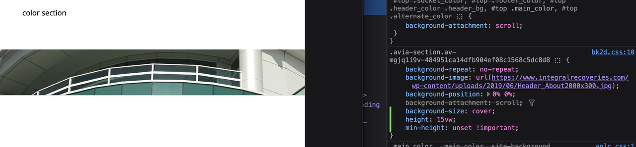
Ensure this content is not coded as a list. Generally, this will mean removing <ol>, <ul>, <dl>, <dt>, <dd>, or <li> elements that are holding this content.Here is a snippet of the code displaying the Full width easy slider:
Here is the code snippet I'm referring to '''<li class="avia-slideshow-slide av-juo9jzkl-8700c68c0f38de355eb6ad66836a0d85__0 av-single-slide slide-1 slide-odd next-active-slide active-slide" style="visibility: visible; opacity: 1; transition: none; transform: translateZ(0px);"><div data-rel="slideshow-1" class="avia-slide-wrap "><img decoding="async" fetchpriority="high" class="wp-image-621 avia-img-lazy-loading-not-621" src="https://www.integralrecoveries.com/wp-content/uploads/2019/06/Header_About2000x300.jpg" width="2000" height="300" title="Header_About2000x300" alt="" itemprop="thumbnailUrl" srcset="https://www.integralrecoveries.com/wp-content/uploads/2019/06/Header_About2000x300.jpg 2000w, https://www.integralrecoveries.com/wp-content/uploads/2019/06/Header_About2000x300-300x45.jpg 300w, https://www.integralrecoveries.com/wp-content/uploads/2019/06/Header_About2000x300-768x115.jpg 768w, https://www.integralrecoveries.com/wp-content/uploads/2019/06/Header_About2000x300-1030x155.jpg 1030w, https://www.integralrecoveries.com/wp-content/uploads/2019/06/Header_About2000x300-1500x225.jpg 1500w, https://www.integralrecoveries.com/wp-content/uploads/2019/06/Header_About2000x300-705x106.jpg 705w, https://www.integralrecoveries.com/wp-content/uploads/2019/06/Header_About2000x300-450x68.jpg 450w" sizes="(max-width: 2000px) 100vw, 2000px" style="left: 0px;"></div></li>'''I’ve tried several options:
The image is set as 2000px x 300px btw.
1) Displaying as an image (no scaling, original width & height) – why doesn’t this work, it would solve many problems.
2) Color section – I’ve tried all options under Section Height including – Minimum Custom height in % based on browser windows width (responsive). However, it is not responsive (using 15% custom height for example). When you minimize for phone, it just blows up the left portion of the image height and does not adjust horizontally.
3) full width easy slider – This is what I’ve been using on all pages, which is responsive and is being rejected by the accessibility team as it uses a list element to display.
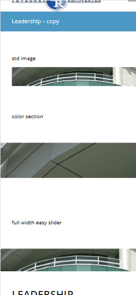
I’ve setup the following test page to show the differences of the three approaches with text headers
https://www.integralrecoveries.com/leadership-copy/
Inspect the page and display as an iphone 14 Max and you will see what happens. See attachment below
How can I fix this? I’m just trying to display a page header that is not coded as a list.
Thank you very much in advance!
-
This topic was modified 5 months, 3 weeks ago by
hostworks. Reason: Forgot to present code per your editing window requirements
October 9, 2025 at 11:44 pm #1489992choose your color-section and set for minimum height option your aspect-ratio in percent.
F.e. your image with 300/2000 means min-height 15%.
As long as your content inside your color-section does not grow bigger than the 15% height. The bg-image will react responsive, If you have set the bg-image is set to cover the background.PS: for small screen you have to get rid of min-height option for color-sections (100px on default)
 October 9, 2025 at 11:58 pm #1489993
Thank you. However, if you look at the middle image, three options example look what it does to the image.
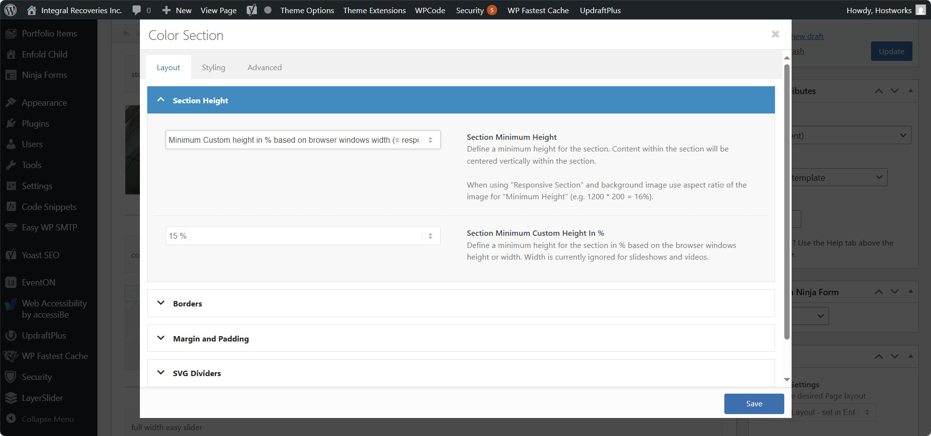
These are the settings I’m using for the color section example.
color section settingsThe third image is the full width slider, which operates as I would expect, but I can’t us that. I need the color section background to work as advertised.
I have no content going on top of this element. I’m just trying get an image to display full width.
October 10, 2025 at 7:34 am #1490006Hi,
Thank you for the inquiry.
Have you tried setting the Styling > Background Image > Background Repeat option to Scale to fit? This should constrain the image and allow it to display fully within the container. Please refer to the screenshot below.

Screenshot: https://ibb.co/N67XKWpc
Best regards,
IsmaelOctober 10, 2025 at 8:06 pm #1490030Ismael,
You are a genius! I wish I had known that was there. It must have been added in a release. This works great.
Current accessibility standards are causing havoc with many themes. This was a big one as it is a big problem with the full width slider as it presents as a list item, which is incompatible with accessible readers. Now, I have to figure out how to add landmarks to the pages. Another big accessibility issue.
Thanks again!
October 10, 2025 at 8:51 pm #1490036Yikes, I spoke too soon. the header image vanishes on an actual phone. I dumped the cache on the site. it looks great using on inspect view, but does not on the actual device.
October 12, 2025 at 6:17 pm #1490080if it is the about/leadership page – there is no background-image at all – not even on mobile!
If you don’t have any content, why use a color section? The easiest option is to use a full-width slider. If you don’t want slider controls, you can adjust the options accordingly.
but my solution with declaring the background-size: cover and set the color-section height to aspect-ratio of your image will work properly.
https://webers-testseite.de/hostworks/October 12, 2025 at 7:53 pm #1490081I’m sorry, I’m getting frustrated.
If you read my very first post, I cannot use the fullwidth easy slider, as it is not accessible because of how it presents content. It presents as a list item for some reason, which is not correct for accessible readers. I have no idea right now why the color section, which just has a background image is not displaying right now. It was working two days ago, but we’ve been trying to get it to scale responsively for mobile, now nothing is showing.
October 12, 2025 at 9:21 pm #1490082Ok, I’ve got it working again on all responsively.
How do I get rid of the grey line below the color section now?
Noticeable on mobile and tablet views.
https://www.integralrecoveries.com/about-us/leadership/October 13, 2025 at 7:12 am #1490089Hi,
Thank you for the update.
Looks like you’ve already found the border options. If not, please edit the color section element, then go to Layout > Borders panel. Let us know if you need more info.

Best regards,
IsmaelOctober 13, 2025 at 6:07 pm #1490145Ismael,
Thank you for your thought. I had checked that, but these are set to no as default. I found multiple support tickets looking for the same issue, and they all had various ideas, of which I tried them all. Because of a caching plugin, I was not getting an accurate return to diagnose, so I need to take some time to figure out which one I need. I surely don’t need all:
/* removes grey line under color sections */
.container_wrap { border-top: none !important; }
.container_wrap { border-bottom: none !important; }.avia-section {
border-top: 0px;
}#after_section_1 {
border-top-width: 0 !important;
}/*
.avia-section {
border-bottom:10px solid white;
}
*/————-
It would sure be nice if the layout/ border setting would actually work as designed with the border set to off as default, because I can’t imagine why someone would need that function. Just a thought.
Thanks
October 14, 2025 at 5:37 am #1490155Hi,
Thank you for the info.
The color section has no border, even when we toggle or disable your custom css modifications. The borders are already removed by this css rule.
#top #wrap_all #main .avia-no-border-styling {
    border: none;
}
Best regards,
IsmaelOctober 14, 2025 at 11:42 pm #1490226You can close this. This actually worked;
.container_wrap { border-top: none !important; }
.container_wrap { border-bottom: none !important; }
October 15, 2025 at 8:19 am #1490234 -
This topic was modified 5 months, 3 weeks ago by
-
AuthorPosts
- The topic ‘Having trouble with a full width image header that scales responsively’ is closed to new replies.