-
AuthorPosts
-
September 21, 2022 at 7:30 pm #1365908
Dear Team,
on my draft page below I have a mix of standard link items Level1 plus L2 (“e.g. “Gewerbe”) plus mega menu (“Wohnungswirtschaft”) with addtl. L3 items. I would like to get a similar appearance for all, but I am struggling with those, also after trying with several advanced styling options:
– L2 items are smaller vs. L1 and L3
– L2 need a grey mouseover bakcground, too
– by clicking on Home/logo, the L1 item “ETH” always appears black, whereas this should only be on active itemsAs always, thx in advance for your great support / best regards, Tilman
September 22, 2022 at 9:53 am #1365948Hey Tilman,
Thank you for the inquiry.
The main menu seems to be displaying fine on our end. Would you mind providing a screenshot of the issue? You can use imgur, savvyify or dropbox for the screenshot. Thanks.
Best regards,
IsmaelSeptember 22, 2022 at 10:07 am #1365952Hey Ismael.
sure:second pic is mouseouver L2 – no grey background
browser: chrome Mac
-
This reply was modified 3 years, 7 months ago by
oestersund.
September 22, 2022 at 10:23 am #1365957Hi,
Thank you for the screenshot.
Do you want to change the background of the active L2 item? This css should help.
#top #header .avia_mega_div > .sub-menu > li > ul li.current-menu-item {
    background: gray;
}
Best regards,
IsmaelSeptember 22, 2022 at 10:35 am #1365960thx – but this does not fix the issue – same appearance. also if I take grey instead of gray
PS: font size L2 i was able to fixe, so only the grey background for L2 items is still missing.
thx & cheers Tilman
-
This reply was modified 3 years, 7 months ago by
oestersund.
-
This reply was modified 3 years, 7 months ago by
oestersund.
September 23, 2022 at 9:37 am #1366064Hi,
Thank you for the update.
We adjusted the css code a bit.
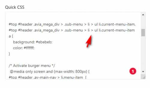
#top #header .avia_mega_div > .sub-menu > li > ul li.current-menu-item, #top #header .avia_mega_div > .sub-menu > li > ul li.current-menu-item a {
    background: #ebebeb;
    color: #ffffff;
}
Let us know if this one works.
Best regards,
IsmaelSeptember 23, 2022 at 9:58 am #1366070Hi Ismael,
no effect on my end. The complete quick CSS see below – maybe this helpsthx again / Tilman
September 23, 2022 at 10:43 am #1366082Hi,
Thank you for the update.
The css looks correct. Can we access the dashboard? Please provide the login details in the private field.
Best regards,
IsmaelSeptember 23, 2022 at 11:06 am #1366088Sure, pls find below
September 24, 2022 at 11:50 pm #1366237September 25, 2022 at 12:52 pm #1366257HiMike,
thx for fixing & your hint re. mail copy :-)But the 4 mega menu items below “Wohnungswirtschaft” / i.e. Menu Level 2 do still not show the grey background on mouseover. -> “Entsorgungslösungen”, -> “Abfallmanagement” etc
This was and is the goal, too (pls see my first entry of this post)
thx again & best regards Tilman
September 25, 2022 at 5:54 pm #1366271Hi,
Please try this css to add the background color to them on hover#top #header .mega_menu_title a:hover { background: #ebebeb; }After applying the css, please clear your browser cache and check.
Best regards,
MikeSeptember 26, 2022 at 12:09 pm #1366333cool – thx a lot Mike :-)
Have a good week / cheers, Tilman
September 26, 2022 at 12:42 pm #1366347Hi,
Glad we were able to help, if you have any further questions please create a new thread and we will gladly try to help you. Thank you for using Enfold.Best regards,
Mike -
This reply was modified 3 years, 7 months ago by
-
AuthorPosts
- The topic ‘harmonize background and size of menu links’ is closed to new replies.


