-
AuthorPosts
-
October 19, 2022 at 4:28 pm #1369427
Hi,
I am trying to change the order on the grid rows on mobile, but it doesn’t change. I have also tried withing the columns to set the position, but nothing happends. Have also tried cache.I also struggle with z-index on several columns in mobile when I use overlapping. I can’t get the column above other content no matter how high i put the z-index value.
Please help!!
I love the new features, just need it to work on all screens.Look in private content for login.
Kindly regards, Mathilde
October 20, 2022 at 4:50 am #1369535Hey mofix,
Thank you for the inquiry.
Would you mind providing a screenshot of the issue? You can use imgur, savvyify or dropbox for the screenshot. Thanks.
To adjust the padding or the offset of the first column in the page, you have to edit this css code.
.flex_column.av-l9fksxym-0f755ebd5692410fa0fdc2b51cd5636a {
    position: relative;
    top: -250px;
    z-index: 99999;
    padding: 40px 40px 40px 40px;
}
Or use the css code below to override it.
@media only screen and (max-width: 767px) {

  /* Add your Mobile Styles here */
  .flex_column.av-l9fksxym-0f755ebd5692410fa0fdc2b51cd5636a {
    position: relative;
    top: 0;
    z-index: 99999;
    padding: 20px 20px 20px 20px;
  }

}
Best regards,
IsmaelOctober 20, 2022 at 11:13 am #1369560Hi Ismael,
Thanks for your reply and codes. Still it’s under: https://www.dropbox.com/s/7al3356a5i3vy2s/IMG_9277.PNG?dl=0I thought I could change the position in the column itself here: https://www.dropbox.com/s/sziw1l94dnm0i2i/IMG_9279.HEIC?dl=0 but it doesn’t seem to work on mobile? It works okay on desktop when I make overlapped columns.
Regarding Grid on mobile, I found in the main grid to reverse the order, I tried in the cell and columns, but then I didn’t see any change. So that’s okay. But that one also doesn’t get over the other columns/grids. How much can I take the z-index?
Look private content.
Thanks, kindly regards, Mathilde
October 21, 2022 at 8:55 am #1369689Hi,
You may need to set the overflow to visible to make sure that the elements with offset are still visible. Please try this css code.
.responsive #top #wrap_all .av-flex-cells .no_margin {
    height: auto !important;
    overflow: visible !important;
}
Result: https://1drv.ms/u/s!AjjTfXSRbKTvyTa8jlkO1VSikgY4?e=zCamDC
Best regards,
IsmaelOctober 21, 2022 at 10:55 am #1369709Ismael is totaly right – the overflow is the crux.
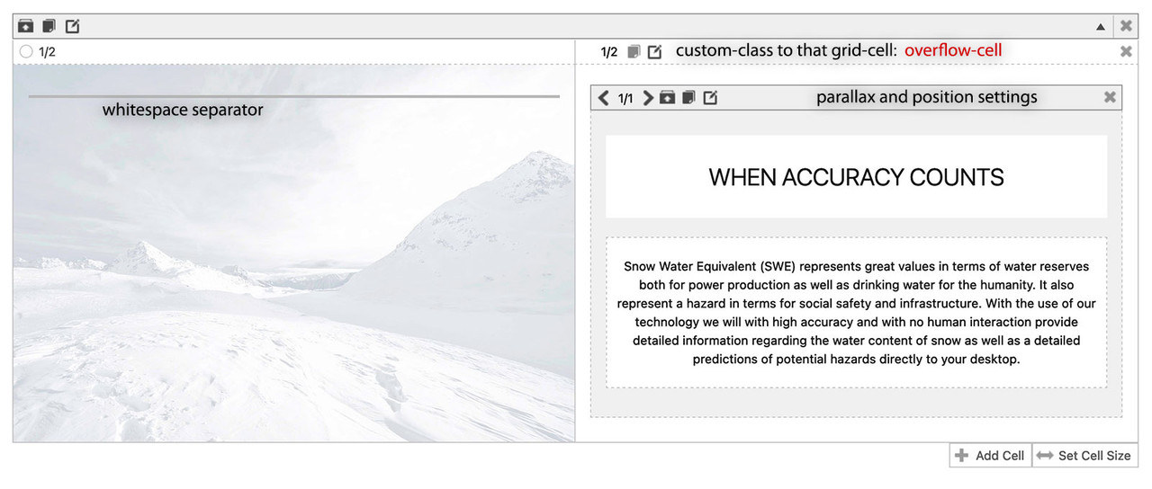
If you are working with grid-row – you don’t need to change the order of the cells. They are only the containers for your columns. But you want to have the column inside the second flex-cell to be positioned over the first cell.

.responsive #top #wrap_all .av-flex-cells .flex_cell.overflow-cell {
  overflow: visible;
}
now the column itself – you can play with that combination of parallax and position.
you had to know that the first screen indicates the default values for all screen width – then the different screen-width are styled ( you can read on what px-range on the right side )

Because you break your cells on 989px – i only would set the parallax rule for screens wider than 990px and set only the position to absolute and for all screen width a z-index a bit higher (5).
For screens smaller than the 989 you better deactive the parallax rules ( or change to bottom to top – with less parallax ratio ) and beginn to set the absolute positioning for those smaller screens. ( absolute top: -150px)
October 22, 2022 at 6:30 pm #1369807Hi,
Thanks to you both for the code and help. It worked now :-)
I still have a lot of problems when I set the positions and padding for mobile and tablet in Enfold, doesn’t seem to work the new way. So I code with css instead.
On my iPad it gets the same look like laptop, and it doesn’t fit right. When I edit the positions with paddings/margins in px on desptop version, it works on desktop, but then it seems like it’s stuck like that on mobile and tablet as well even if I edit it all different when I press the mobile and tablet etc icon to det the positions?. Maybe a bug?Another problem is that when I get the css for a content with specific code like: #top .av_textblock_section.av-1o8x9-95bc785c2e9fb80ef953c8d68d0a55a9 .avia_textblock {
color: #ffffff;
}
It works perfectly, but after I have edited a bit on the text or something else in enfold in that same content, the code number changes, and I have to get a new one for each time. Anything I can do to keep it?Thanks and kindly regards, Mathilde
October 22, 2022 at 9:35 pm #1369822Hi,
I would recommend not using any css classes like .av_textblock_section.av-1o8x9-95bc785c2e9fb80ef953c8d68d0a55a9 these classes change every time the page elements change, instead add a custom class in the advanced tab under “developer settings”.

don’t include the “dot” before the custom class.Best regards,
Mike -
AuthorPosts
- You must be logged in to reply to this topic.
