Tagged: seo
-
AuthorPosts
-
April 30, 2021 at 1:44 am #1297440
I’ve received one of those messages from Google Search Console regarding this new site which is only one page. https://felanmarine.com.au
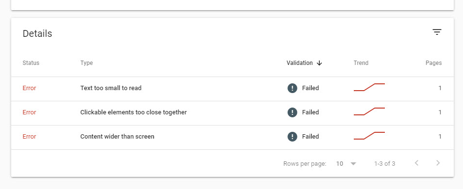
This is a screenshot of the message:

Text too small to read: Body text is set to 16px
Clickable elements too close together: There is no navigation and the only clickable element is the SEND button on the form.
Content wider than screen: Looks ok on testing that I’ve done. Maybe I’ve overlooked something.When I received the first report I thought it was just one of those Google console things that happens with new sites so when I responded that the issues had been fixed I thought it would be ok. Failed validation.
Any thoughts guys?
May 3, 2021 at 6:20 am #1297876Hey mediaapps,
They seems to be sending that to almost every site owner, as it’s not theme or platform dependent. Are there any elements on your site which are too small to read, too close together, or wider than the screen? If not, then you can ignore those messages.
Best regards,
RikardMay 3, 2021 at 7:57 am #1297923When it comes to things like SEO Google usually knows what they’re talking about as we all know. It’s frustrating that this is happening. Occasionally I have had fails on other websites but when I implement the recommendations the issue is fixed.
This is the first time that I haven’t been able to resolve this.
May 4, 2021 at 6:34 am #1298162Hi,
Thanks for the update. I’m sure Google is doing a great job, but we can’t really fix this for you unless we know which elements are the problem on your actual site.
Best regards,
RikardMay 4, 2021 at 7:49 am #1298186This reply has been marked as private.May 5, 2021 at 5:02 am #1298408Hi,
Thank you for the update.
clickable elements too close
It might be referring to the links below the contact form. Try to add this css code to create more space between the contact form button and the links below.
#top .avia_ajax_form .av-google-badge-message {
    padding: 30px 0 0 0;
    line-height: 1.8em;
}
We also increased the line height to separate the links even more.
Best regards,
IsmaelMay 5, 2021 at 11:23 am #1298497I added that code. Let’s see what happens after the next crawl. Thank you.
May 8, 2021 at 6:05 am #1299058 -
AuthorPosts
- You must be logged in to reply to this topic.
