-
AuthorPosts
-
October 21, 2019 at 4:28 pm #1149902
Hi.
Pretty new to this stuff so bear with me please. We’re trying to integrate some Adsense ads onto our site. We’ve set up two ad units so far in the Adsense. One with a set size, the other responsive:
After setting up Adsense we can get the ads to display no problem by pasting the supplied code into a code block.
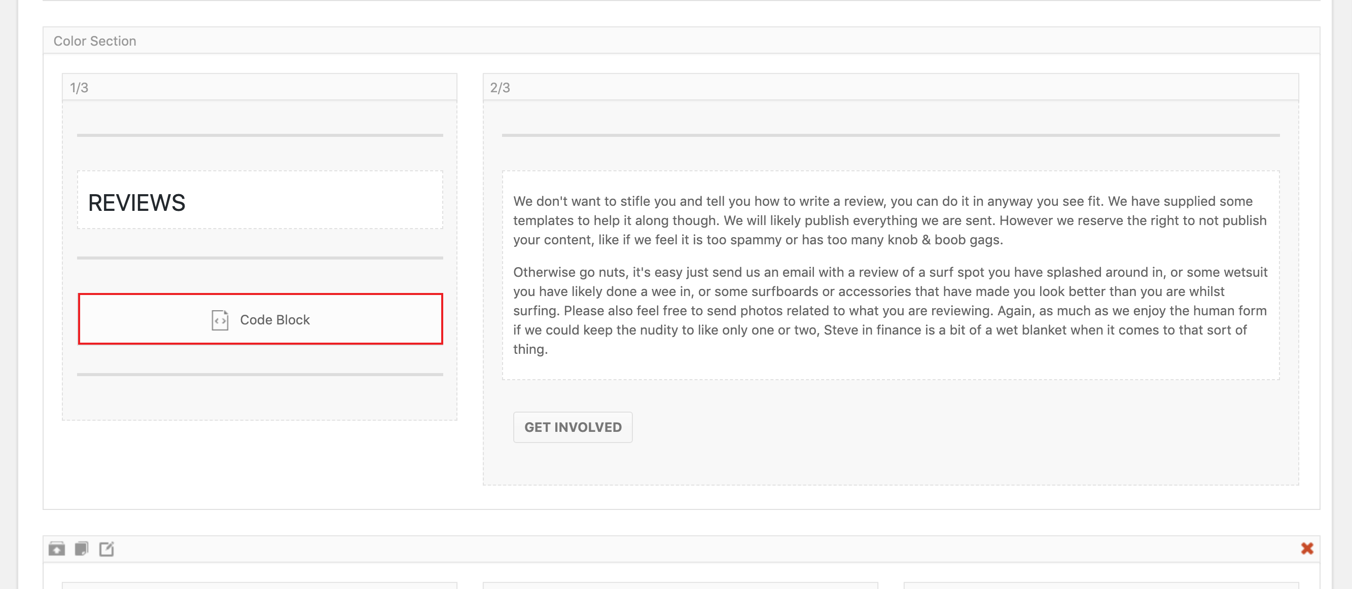
The layout we want them to fit into is a 1/3 column next to a 2/3 column. We placed the code block with the code for the set size ad in the 1/3 column. However, the ad isn’t responsive (obviously, it being a set size) so we we set up a responsive ad and pasted the code for this in, thinking it’d display the ad in the column.
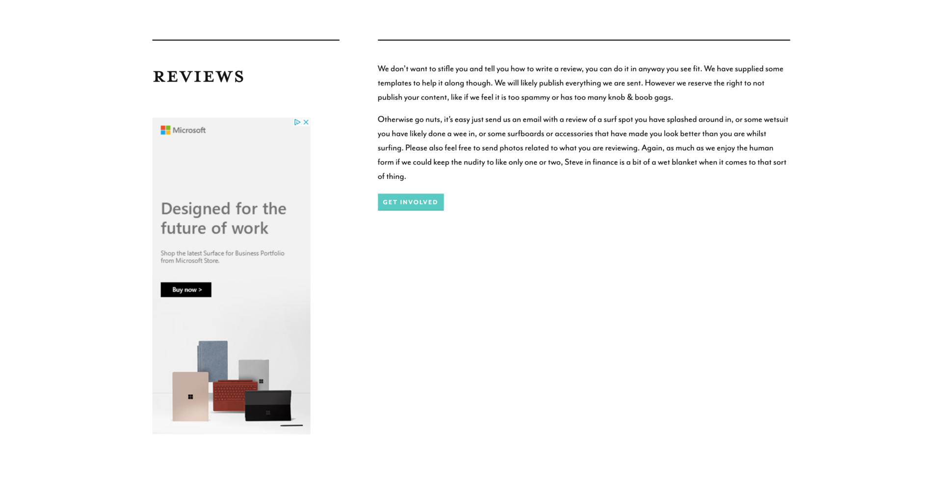
However, the ad seems to ignore the 1/3 container and just make the ad the whole width of the site, running it over text we have in the 2/3 column. I had a quick search around for how to make the ad fit a specific container but I couldn’t find a solution. Basically, we’d like an ad in the 1/3 column that is responsive and doesn’t break the layout.
Is there some css that’ll fix this? Or is there a better way to insert the code than in the code blocks? Or is this a case of use setting up the Adsense units badly?!
Any help would be appreciated.
Thanks
October 22, 2019 at 4:51 am #1150030Hey alecmjoynes,
Google ads have fixed layout dimensions as far as I know, so I’m not sure if there is a CSS solution. But send us a link to where we can see the problem in question and we’ll have a closer look at it.
Best regards,
RikardOctober 22, 2019 at 10:24 am #1150102Thanks Rikard,
You got an email and I can send you some temp log in details?October 23, 2019 at 3:35 am #1150350Hi,
Please provide all necessary details in the private content box of your reply here in the thread, otherwise it won’t be available to all moderators.
Best regards,
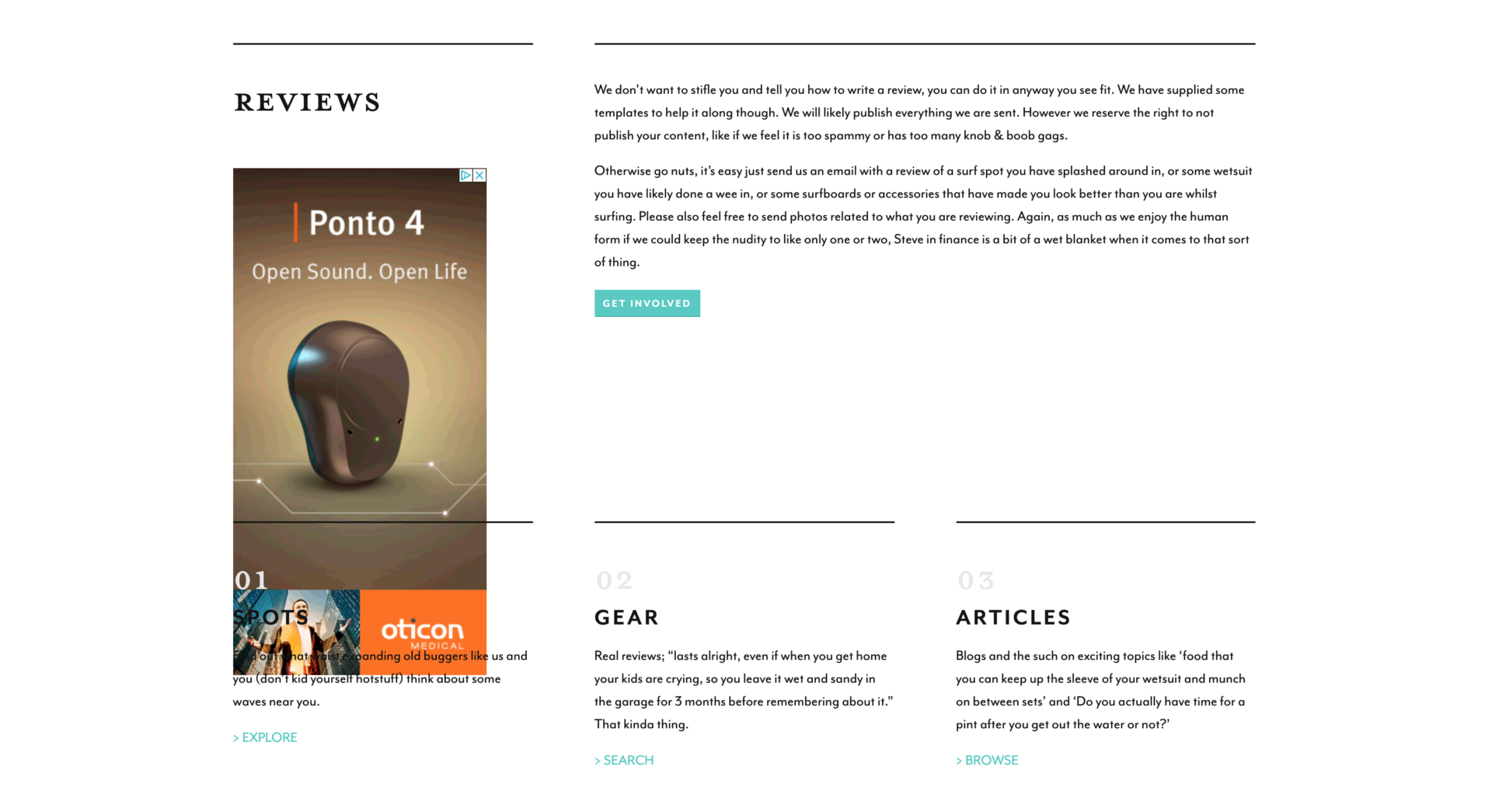
RikardOctober 23, 2019 at 12:14 pm #1150475I’ve put div tags around the code in the code blog and added some CSS, which appears to have sorted out the width issue. However it seems to ignore any height, meaning on the homepage the 1/3 width ad under the word ‘reviews’ often runs over content below.
…Any ideas?
October 24, 2019 at 3:46 am #1150717Hi,
Thanks for the update and login details, I can’t see any ads on the front page though. Where can we see the problem?
Best regards,
RikardOctober 24, 2019 at 10:28 am #1150810
Under the word ‘REVIEW’, roughly half way down the page. (There’s another one at the bottom, but that’s full width and doesn’t interfere with other content.)
Thanks for your patience so far.
October 24, 2019 at 10:37 am #1150815
Thought it might help to show you what you’re looking for in the ALB.
October 24, 2019 at 10:40 am #1150817
This shows the issue. More often than not, refreshing the page fixes the issue.
October 25, 2019 at 4:13 am #1151052Hi,
Thanks for the clarification, I’m not able to reproduce the problem using Chrome though. Please see screenshot in private. Is this happening in a specific browser only maybe?
Best regards,
RikardOctober 25, 2019 at 10:38 am #1151143Hi.
No, it’s happening on chrome and safari. I guess it’s good you can’t see it in a way…
October 26, 2019 at 4:35 am #1151311 -
AuthorPosts
- You must be logged in to reply to this topic.
