
-
AuthorPosts
-
January 22, 2026 at 12:02 pm #1494177
Hi,
I would like create a floating header like this:
https://base44.comI try to create it I don´t know what is the best idea to create it. Start with a transparent header and add the white banner or star with the regular header. Could you help me?
Thanks advance!BR,
Antonio.
January 24, 2026 at 9:12 pm #1494276Hey Antonio,
Thanks for your patience, try this css:.header_color .header_bg { background-color: transparent; } .html_header_top.html_header_sticky #top #wrap_all #main { padding-top: 0; } .av-logo-container .inner-container { border: 1px solid #e6e6e6; border-radius: 100px; box-sizing: border-box; background-color: #fff; margin-top: 20px; } .logo.avia-standard-logo { padding-left: 20px; } .template-page.content { padding-top: 150px; }This is how it should look:

Best regards,
MikeJanuary 25, 2026 at 8:03 pm #1494295Hi Mike,
Great! The issue is there are a white space at the top.
I have add this code:
.html_header_top.html_header_sticky #top #wrap_all #main {
padding-top: 0px !important;
}
But the content are now bellow the header.Could yo help me to create the same header in mobile size?
Many thanks,
BR,
Antonio.
January 27, 2026 at 5:08 am #1494353Hi,
Thank you for the update.
Try to add this css code to push the content further below the header.
.html_header_top.html_header_sticky #top #wrap_all #main .template-page.content {
    padding-top: 150px;
}
Let us know the result.
Best regards,
IsmaelJanuary 27, 2026 at 9:25 am #1494362Hi Ismael,
Great, could you help me to do the same floating header in mobile?
Thanks advance,BR,
Antonio.
January 28, 2026 at 5:21 am #1494405Hi,
Thank you for the update.
You can start with this css code to make the header sticky on mobile view.
@media only screen and (max-width: 767px) {

  /* Add your Mobile Styles here */
  .responsive #top #wrap_all #header {
    position: fixed;
  }

  .responsive #top .av-logo-container .inner-container {
    padding: 0 20px;
  }

  .responsive #top #wrap_all .main_menu {
    top: 0;
    height: 80px;
    right: 25px;
  }
}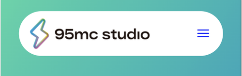
Best regards,
IsmaelJanuary 28, 2026 at 10:47 am #1494423Hi Ismael,
Works perfect, many thanks.
BR,
Antonio.
-
AuthorPosts
- You must be logged in to reply to this topic.