
-
AuthorPosts
-
July 11, 2025 at 3:51 pm #1486663
The flip box grid is not working the way I would expect it to. Normally, you could upload a square image, and it would shrink down to the size of the original square. It doesn’t. I’m just seeing the corner of the image I uploaded.
Then, as you shrink the page, all the squares should stay squares. But they do not do that. They squeeze in. Then, when the grid has fewer columns, the squares turn into wide rectangles. (Or, if the image is too small, it just leaves white space to the right of each image.) These should be square all the time and should adjust in size according to the number of columns. Can you help please? This looks terrible the way it is.
The first two images at this link are large squares. They should be showing the whole image, not just a corner. Then, when the page shrinks down, those squares should expand into two columns and still be squares! They should not change into rectangles.
July 14, 2025 at 6:17 am #1486721Hey earthnutvt,
Thank you for hte inquiry.
Make sure the aspect ratio of the images is square. Remove any text from the image and use it instead as the Grid Item Title of the icon flipbox item. If that’s not possible, you can add the following css code to make sure the entire image is visible, but the image size may not stay proportional to the flipbox content.
#top .avia-icon-grid-container .avia-icongrid-flipbox .avia-icongrid-wrapper .avia-icongrid-front.bg-img:before {
    background-size: contain;
}
Best regards,
IsmaelJuly 17, 2025 at 9:49 pm #1486947How do I change the aspect ratio of the squares?
July 18, 2025 at 6:49 am #1486963Hi,
You can use an image editor like Photoshop or any available online tool, then upload the images again to your media library. Let us know the result.
Best regards,
IsmaelJuly 18, 2025 at 11:52 am #1486975Now, please could you explain how this is supposed to work with a responsive layout, where the width of the grid cells changes according to the width of the screen?
The size of the Flipbox depends on your content, not the images (as these are defined as background images).Firstly, please explain where the images are located. Are they on the front or back? It is also important to specify which element should be displayed first. You also have the option of displaying the back first and then the front on hover.
What options did you choose on background-image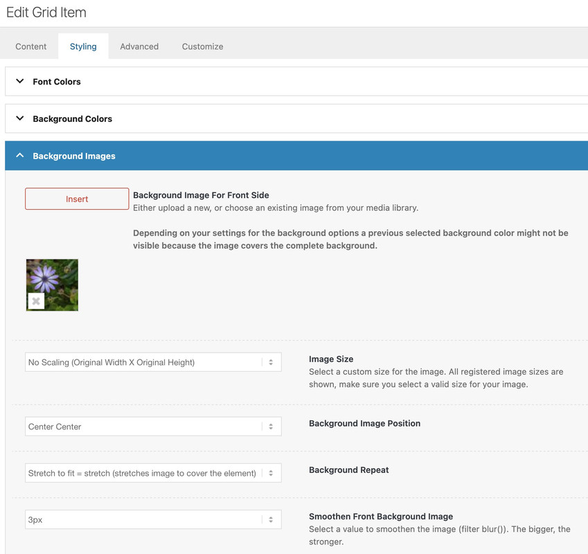
maybe you can make the link public – that even me and other participants can inspect the problem.
July 18, 2025 at 12:04 pm #1486976see here an example page with different scenarios.
on the centered flipbox there is backside first ! so you can see what the height of the flipbox determines ( if you have not choosen a min-height on the options).
See on the last flipbox – what happens if you have a big original image inserted – but with no-repeat – no stretch.July 18, 2025 at 3:48 pm #1486982This is what happens when the page shrinks. All these images are square images. But when I shrink the page, they are no longer squares.
 July 18, 2025 at 3:53 pm #1486983
If I keep stretching the page, then it makes them wide instead of tall. How can I make them squares all the time?
 July 18, 2025 at 3:54 pm #1486984
I did change the settings you suggested, but that only works when they are on a full screen. As soon as I start shrinking the page, they stop being squares.
July 18, 2025 at 4:19 pm #1486985So, what it should do is keep everything as squares. Then when the page gets to a certain size, it would go down to two columns of squares. And then when it gets smaller, it would be one column of squares.
July 19, 2025 at 9:30 am #1487008see again that example page with a possible solution. Using display: grid seems to be the best for that.
Read carefully – you had to give the Icon/Flipbox Grid a custom class. The css code you need is on that page.But – If the text is very long, it could cause problems on narrow screens when the site becomes responsive.
July 21, 2025 at 5:18 am #1487057Hi,
Thank you for the update.
Looks like you’ve already detached the title from the image as suggested — it does look better now. Have you tried adding the css we recommended earlier? It will force the image to display fully but the layout might look slightly off if the flipback content is taller than the image.
#top .avia-icon-grid-container .avia-icongrid-flipbox .avia-icongrid-wrapper .avia-icongrid-front.bg-img:before {
    background-size: contain;
}
Best regards,
IsmaelJuly 21, 2025 at 5:44 pm #1487076I implemented that code, but if you go look, when I shrink it down, the square does not fill the full space, and the flip side is still wide. Somehow the square isn’t going to the full width of fhe column but the flipside is.
July 21, 2025 at 7:35 pm #1487078have you seen my page: https://webers-testseite.de/gridflip/
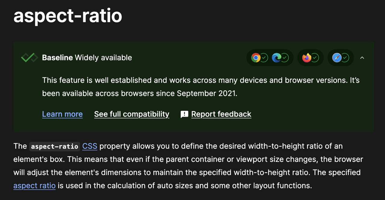
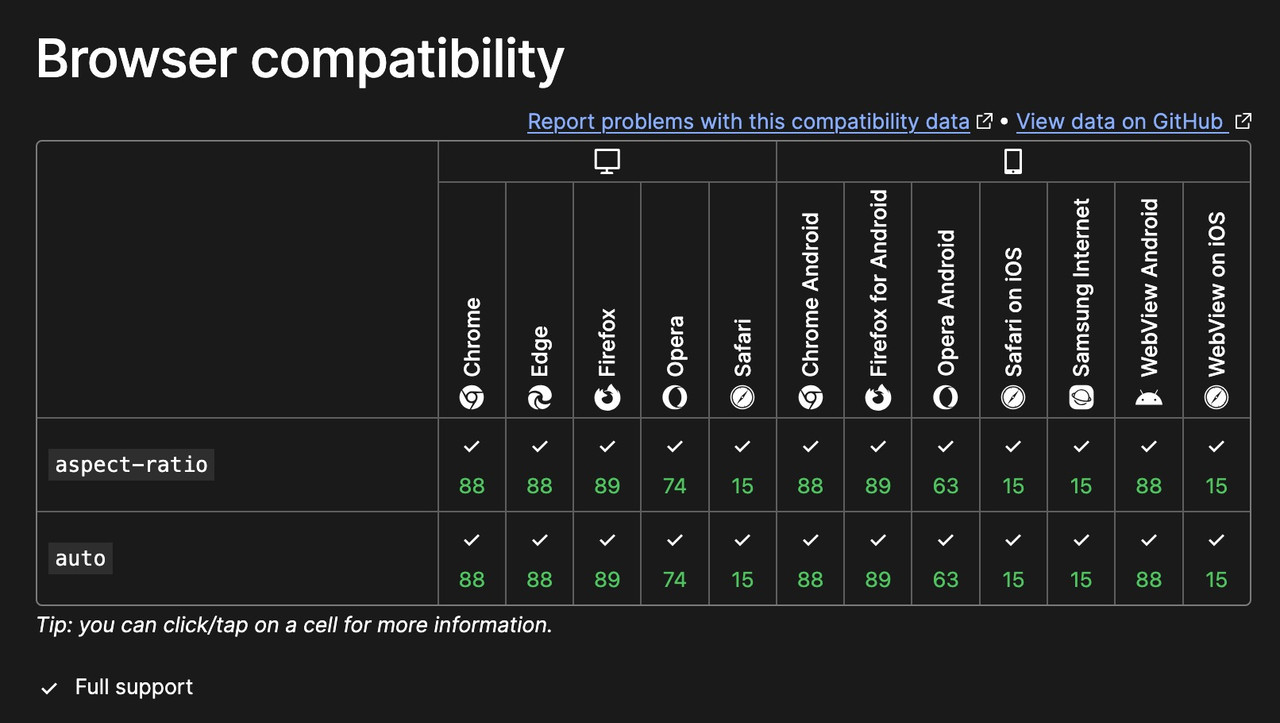
July 21, 2025 at 9:47 pm #1487084Yes, and I copied the code, but it isn’t working. I don’t think that code is right for the actual code in the theme. I mean, firstly, “aspect-ratio:1” is definitely not correct CSS because it’s showing up red in my code editor. There’s no element called “aspect-ratio”.
July 22, 2025 at 12:39 am #1487089have you set the custom class on the element?
the element (Icon/Flipbox Grid) itself got that custom class: gridded-flipbox
and if aspect-ratio does not exist, why does it work on my site? (Enfold 7.1.1)
there is a porperty : aspect-ratio – see:https://developer.mozilla.org/en-US/docs/Web/CSS/aspect-ratio
btw: the declaration is :
aspect-ratio: width/height;
but there is a shortform – that if there is no height value – height is 1so :
aspect-ratio: 1/1 can be written as aspect-ratio: 1All is based on the square source images – grid layout and – background-size: contain.
July 22, 2025 at 5:31 am #1487092Hi,
On smaller screens, you could adjust the width of the grid items to make sure they don’t split into four columns and become unnecessarily tall compared to the aspect ratio of the images.
@media only screen and (max-width: 1024px) {

  /* Add your Mobile Styles here */
  .avia-icon-grid-container.av-mb13nabo-2b6695789b3fe0e5c148dc94e76998ee li.av-icon-cell-item {
    flex-basis: calc(50% - 18.75px) !important;
  }
}
Result:
Try toggling the previous css from “contain” to “cover” and see which one works best for your layout.
Best regards,
IsmaelJuly 22, 2025 at 3:30 pm #1487123This almost works, but the flip sides are not square, even at full size. When the screen is like 1100px wide, the flip sides are really tall, even though the front images are still square. As soon as it switches to two columns, everything looks perfect now. It’s only with four columns that there’s an issue.
July 22, 2025 at 6:55 pm #1487125i found your site – and i see that you have set the min-height option – remove that
See on the element on Styling – Grid Styling – “Minimum Height – For Flipbox Only”Unfortunately, few of my fellow participants have the courage to publicly post links to their websites here. Otherwise, it would surely have been resolved by now.
you only had to adjust that one rule:
#top .gridded-flipbox .avia-icongrid-wrapper, #top .gridded-flipbox .article-icon-entry {
  width: 100%;
  height: 100%;
  min-height: unset !important;
}
and maybe you set the gap a bit smaller than 30px
July 22, 2025 at 7:21 pm #1487126so first try this in addition to my code from example page:
#top .gridded-flipbox .avia-icongrid-wrapper,
#top .gridded-flipbox .article-icon-entry {
  width: 100%;
  height: 100%;
  min-height: unset !important;
}

@media only screen and (min-width: 990px){
  #top .gridded-flipbox .avia-icongrid-flipback  .avia-icongrid-inner {
    padding: 10px !important;
  }
  #top .gridded-flipbox .avia-icongrid-flipback p {
    hyphens: auto
  }
}
July 22, 2025 at 8:08 pm #1487129and in addition – some magic of “container-type” property and font-size adjust via cqi
to have more legible font sizes!@media only screen and (max-width: 989px){ #top .gridded-flipbox .avia-icongrid-flipback .avia-icongrid-inner { padding: 20px !important; } #top .gridded-flipbox .avia-icongrid-flipback { container-type: inline-size; } #top .gridded-flipbox .avia-icongrid-flipback p { hyphens: auto; font-size: 9cqi; line-height: 1.5em } }July 23, 2025 at 7:52 am #1487144Hi,
When the screen is like 1100px wide,
In the recent css code that we provided, try to adjust this line:
@media only screen and (max-width: 1024px) {Set the max-width value from 1024px to 1366px.
Let us know the result.
Best regards,
IsmaelJuly 23, 2025 at 10:13 am #1487146by the way – is it intentional that you have both menu-items and burger menu icon – on large screens?
it is much easier to have multiline main menu on displaying it as flex box.July 24, 2025 at 10:44 am #1487183could you please insert the needed Rest of css Code :
https://kriesi.at/support/topic/flip-box-behavior-all-wrong/#post-1487126
July 24, 2025 at 4:38 pm #1487190OK, I think it is probably as good as it’s going to get. I really appreciate your help.
This should really be the default for this function. A grid is a grid, and most people will want it to be either squares or masonry. I had to add 100 lines of CSS in Customizer to get it to act like most other grid functions do.
Yeah, their menu is way too long. On a really big screen, I don’t see the burger. I’m trying to get them to shorten their menu. Then I can work on the formatting. I’m not sure why the burger menu is showing up on medium screens. Their site is really old, and I only took it over about a year ago. There have been A LOT of things to fix!
July 25, 2025 at 7:08 am #1487218only one thing : the one ruleset inside the media query (see Link ) : the hyphens: auto had to be set to !important
hyphens: auto !important;July 28, 2025 at 7:21 am #1487275 -
AuthorPosts
- The topic ‘Flip box behavior all wrong’ is closed to new replies.