-
AuthorPosts
-
April 13, 2021 at 5:44 pm #1294196
Hello,
I was wondering if it is possible to create a column layout in Enfold where one column can extend further down the screen than 2 or more columns to the side of it, as in the sample here: https://i.imgur.com/PUs0z7l.jpg – maybe through ‘nesting’ layout elements? I’ve tried, but can’t get it to work…
Thanks :)
-
This topic was modified 5 years ago by
Niels.
April 16, 2021 at 4:50 am #1294668Hey Niels,
That should be possible if you are adding your content manually, and if you use 1/2 + 1/4 1/4 elements. If you need further help, then please post a link to where you want to implement this, and which content element you would like to use.
Best regards,
RikardApril 16, 2021 at 6:16 pm #1294821Thanks for that Rikard :)
I’m just trying to set the following type of grid/layout using Layout Elements with Text and Image Blocks, but can’t avoid the 1/4 columns (3, 4, 5, and 6) falling below the taller left hand 1/2 column.
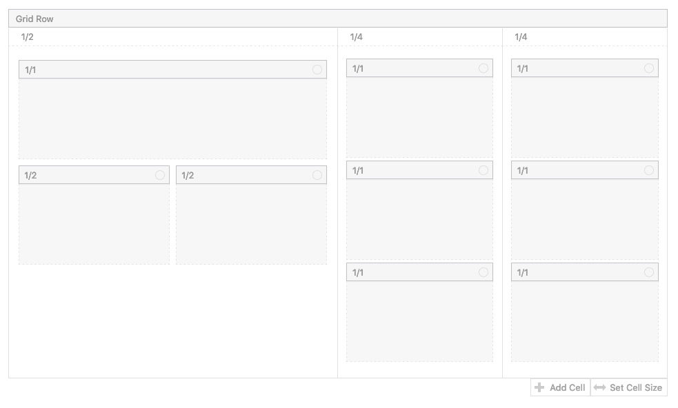
April 16, 2021 at 6:26 pm #1294822This reply has been marked as private.April 16, 2021 at 11:58 pm #1294849The grid-row element is a drag and drop element for other elements.
so insert a grid-row and click on add cell to have three cells. – Now click on “Set cell size” and choose : 1/2 1/4 1/4:
( click to the images to enlarge)

Now you can pull 1/1 containers to those cells f.e.:

you see you can nest those columns then.One disadvantage is that the grid-row is a full-width container.
If it has to have the sam width as the other containers there is a script solution for that.this to child-theme functions.php:
/******** Gridlayout not fullsize - give a custom-class to the grid-row element:  "grid-notfull" *********/
/**** adjust the 1310px in the code here  to your setting on enfold - general Layout - dimensions ****/
function grid_layout_notfull(){
?>
<script>
(function($){
    $('.av-layout-grid-container.grid-notfull' ).wrap( '<div class="main_color notfullsize color1"></div>');
    $('.notfullsize').css({"clear": "both", "width": "100%" , "float": "left" , "position": "static" , "min-height": "100px" });
    $('.grid-notfull').css({"max-width": "1310px", "margin": "0 auto" , "padding": "0 50px"});
})(jQuery);
</script>
<?php
}
add_action('wp_footer', 'grid_layout_notfull');
see here an example page – on top full-width on the bottom with custom-class: grid-notfull
https://webers-testseite.de/grid-row-alb/April 19, 2021 at 9:55 am #1295192Hi,
Thanks for helping out @guenni007, did you try that out and did you have any luck with it @niels?
Best regards,
RikardApril 19, 2021 at 8:41 pm #1295348Many thanks for your help @guenni007 – and the notes within the code, much appreciated :)
I’m going to give that a try later this week and report back here.
I know creating a Child theme is the right thing to do, but presumably the code will work if I put it in functions.php?
Also, I see the last line reads:add_action(‘wp_footer’…
I was just wondering what the reference to the footer was?
Thanks :)-
This reply was modified 5 years ago by
Niels.
April 21, 2021 at 1:10 pm #1295792 -
This topic was modified 5 years ago by
-
AuthorPosts
- You must be logged in to reply to this topic.
