-
AuthorPosts
-
July 17, 2020 at 12:22 pm #1231228
Hi, I love your theme and use it for all my clients. I am working on a new website, and when I tried to make fixed background on some of the color section, it doesn’t work like it uses to. I see no effect of it at all. Can you please help me to se what it can be? I have the newest version og Enfold and WordPress. Look private content for login. I have tried to make the grey section on the frontpage fixed, also the footer (made in color section) and the map section.
Thanks. kindly regards, MathildeJuly 21, 2020 at 5:00 am #1231939Hey mofix,
Thanks for the login details and sorry for the late reply. You can’t see any effect in the section since the background image you have selected is just a plain colour. If you select an image which is not then you will see the effect.
Best regards,
RikardJuly 29, 2020 at 11:13 am #1233924Hey Rikard,
Thanks for the reply. Why is it not possible with one color and the fixed layer effect? See what I mean here where the footer comes like it has a certain layer effect: http://tuddal.no/ Is this not possible?Thanks, Mathilde
August 2, 2020 at 9:52 pm #1234673Hi,
Sorry for the late reply, on the page in the Private Content area do you want the “JUBILEUMSBOKA” background color to be fixed and the text and image scroll over the top, or do you want the color, text, & image of that section to be fixed with parallax scrolling?Best regards,
MikeAugust 3, 2020 at 11:20 am #1234780Hi, That’s okay.
I would like to have the map section and the bottom black section with fixed “parallax” effekt. So that the “Footer” comes as a “layer” under the map while scrolling. Like the effect on the bottom of this page where you see the black bottom comes up under the white section: http://tuddal.no/
Kindly regards, MathildeAugust 3, 2020 at 12:20 pm #1234793It seems that this is not the right understanding of fixed or parallax background.
On your example page that effect is called “curtain-effect” and is commonly used on the footer.
how to achieve this. the main point is that the footer position is set to fixed and bottom: 0 – and has a z-index less than the content scrolling over it.
But: On Enfold it is difficult to obtain , because #footer is part of #main. But there are ways to get the right solution for it in a different way.
But to give you better support it might be usefull to see your page.August 3, 2020 at 1:22 pm #1234830Hi, thanks for your input.I have removed the real footer and use a color section at the bottom of the page. This is the site I’m working on: http://www.tuddal.one
Thanks, MathildeAugust 3, 2020 at 2:26 pm #1234860Well there is a solution to put those two containers as siblings to #main – inside warp_all.
You only have to edit footer.php and load it as child-theme footer. And a bit of jQuery in functions.php.See result ( in this case only for home page ): https://webers-testseite.de/pureinstall/
if this is what you like to have – i will show you how.the problem stays the same as footer or as a different containter – fixed Elements does not leave a gap in the page where it would normally have been located. this “Gap” had to be there that the page could scroll this amount to show the overlaped fixed container.
August 3, 2020 at 3:16 pm #1234871If it does not work at the moment – a mod is in that installation to look for a little bug with google recaptcha.
BUT : my advice is to hamper that behavior on small screens – because you can not scroll inside the footer content.
If the height of the footer content is higher than the given f.e. mobile-device height – then you can not see all content !!!August 5, 2020 at 12:49 pm #1235390Hi,
@Guenni007 thank you for creating a test page and your note about mobile, I tried moving the “page as footer” (#vidde) outside of the #main and then set “position: fixed” but the section above doesn’t move up above the footer div. I notice on your test page you have an empty div “#distance”, what is this role? Thanks :)
This is what I have now, jQuery:(function($){ $(document).ready(function(){ $( '#top.home' ).each(function() { $( this ).find( '#vidde' ).insertAfter( $(this).find('#main') ); }); }); })(jQuery);CSS:
#vidde {
    z-index: 2;
    position: fixed;
}
Best regards,
MikeAugust 5, 2020 at 1:34 pm #1235407i did that with a child-theme footer.php
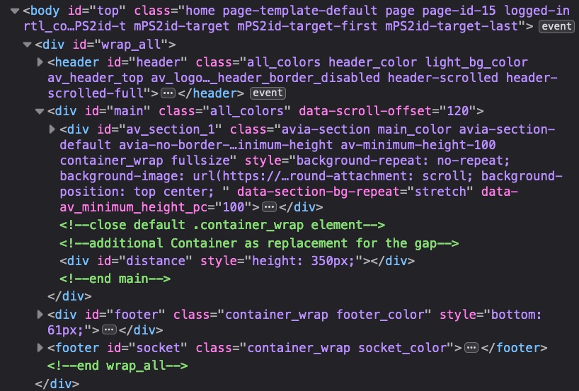
that is fast done .see here what i have done with footer i shifted the end main div to the top
see on top the extra container
and the commment at line 275the extra container gives me the possiblity to fill the gap that a fixed footer would create as fixed container.
It is like a spacer with variable calculated height – because we had to react to the variable footer/socket height.function add_curtain_footer_effect(){ ?> <script type="text/javascript"> (function($) { $(window).bind("load resize", function() { setTimeout( function() { var socketh = $('#socket').outerHeight(); var footerh = $('#footer').outerHeight(); var spacerh = socketh + footerh - 5 ; $('#distance').css('height', spacerh ); $('#footer').css('bottom' , socketh); }, 150) }); })(jQuery); </script> <?php } add_action('wp_footer', 'add_curtain_footer_effect');i did this only for home page on that example
/********* curtain effect***********/

.home #main > div  {
    z-index: 3 !important;
    position: relative !important;
}

.home #footer {
    left: 0;
    width: 100%;
    z-index: 2;
   position: fixed
}

.home #socket {
    bottom: 0;
    left: 0;
    width: 100%;
    z-index: 2;
    position: fixed
}

.home #main #distance  {
    clear: both;
    z-index: 0 !important;
}
the clearing on #distance is very important.
so this is then the Structure:
and the #distance height is calculated on load and resize-
This reply was modified 5 years, 7 months ago by
Guenni007.
August 5, 2020 at 2:04 pm #1235418EDIT : i try to find now a simpler solution. – As i studied your example page above – i checked another way.
Edit Edit: i did recognized now that the sections etc. are set to position static – with that it does not work
if you can live with a given height to your footer ( not calculated ) then this will be the easiest way:-
This reply was modified 5 years, 7 months ago by
Guenni007.
August 5, 2020 at 2:27 pm #1235431Cancel all said above and look to this solution:
here we go with your example page: https://tuddal.one/
put this to your quick css:
@media only screen and (min-width: 768px){
  #wrap_all {
      padding-bottom: 400px;
  }

  #main > div {
      z-index: 3;
      position: relative !important;
  }

  #main #vidde {
      position: fixed !important;
      bottom: 0;
      z-index: 0 !important;
      height: 400px;
      width: 100%;
  }
}
But
there are parts of the content ( grid rows ) where you have set to non full width – but there is a better way to have that – because you leave the space left and right to the grid row : transparent.If i use a grid-row and does not want to have a full-width grid-row – i have a little snippet on that !
( So remove your settings for those grid-rows f.e.: #av-grid-custom-width ) and put this to your child-theme functions.php )
and give to those grid-rows that should not be a fullwidth one the custom-class: grid-notfull/******** Gridlayout not fullsize - give a custom-class to the grid-row element: "grid-notfull" *********/ /**** adopt the 1310px to your setting on enfold - general Layout - dimensions ****/ function grid_layout_notfull(){ ?> <script> (function($){ $('.av-layout-grid-container.grid-notfull' ).wrap( '<div class="main_color notfullsize color1"></div>'); $('.notfullsize').css({"clear": "both", "width": "100%" , "float": "left" , "position": "static" , "min-height": "100px" }); $('.grid-notfull').css({"max-width": "1310px", "margin": "0 auto" , "padding": "0 50px"}); })(jQuery); </script> <?php } add_action('wp_footer', 'grid_layout_notfull');you see what the code above does: it will give the grid-row itself the styling of a
.main-color .containerand wrap it with a fullwidth container with styling of a color-section.August 5, 2020 at 3:48 pm #1235446Hi,
Thanks a lot all for input. I have now tried the latest one, but it still doesn’t take away the footer in the content regarding the gridrow. Tried this:
#grid-notful{
background-color: #ffffff: 1!important;
z-index: 9999999!important;
}
But it doesn’t work.
Is there anything I have forgotten?
Kindly regards, MathildeAugust 5, 2020 at 4:06 pm #1235450remove your css code please and change the rule to !imporant:
  #main > div {
      z-index: 3;
      position: relative !important;
  }
And look above on
#main #vidde {the width is not as on color sections. because you gave to the grid-cells a padding.
– the padding of the border cells should have no padding to the border:
left cell
padding: 0px 15px 0px 0 ;
right cell:
padding: 0px 0 0px 15px;August 5, 2020 at 4:46 pm #1235464Thanks a lot, now it’s removed, but now the bottom of the page effect doesn’t work anymore? Sorry….
Klndly regards, Mathilde :-)August 5, 2020 at 4:57 pm #1235466there is two ID’s on that rule:
  #main #vidde {
      position: fixed !important;
      bottom: 0;
      z-index: 0 !important;
      height: 400px;
      width: 100%;
  }
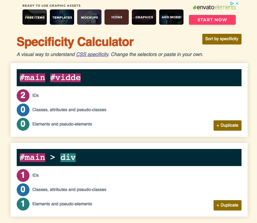
The reason is: #main > div is a rule with one ID and an additonal element
so it is more specific than a rule with only one ID – because #vidde is a #main > div ( it is a div that follows directly the #main container) – the postion : fixed could not overwrite the #main > div rule.
If an element fullfills more than one selector – the more specific will win that run !See here f.e. a specifity calculator: https://specificity.keegan.st/
 August 5, 2020 at 5:07 pm #1235468
just remove all you inserterd and copy again that corrected code here: https://kriesi.at/support/topic/fixed-background-color-section-doesnt-work/#post-1235431
remove the rule outside that media query: ( only the code above)
 #main > div {
      z-index: 3;
      position: relative !important;
  }
August 5, 2020 at 5:08 pm #1235469only this:
corrected code including the fix for the submenu@media only screen and (min-width: 768px){ #wrap_all { padding-bottom: 400px; } #main > div:not(.av-submenu-container) { z-index: 3; position: relative !important; } #main #vidde { position: fixed !important; bottom: 0; z-index: 0 !important; height: 400px; width: 100%; } }August 5, 2020 at 5:12 pm #1235471Hi,
Thanks a lot!! Now the bottom is okay!!!! You are the best!!
But something strange has happened to the menu under the slider?
Kindly regards, MathildeAugust 5, 2020 at 6:03 pm #1235483wait – there is a sub-menu – ok i look …
yes : change in the css code above ( inside the mediaquery – not as an addition – a substitue) :
#main > div:not(.av-submenu-container) {
    z-index: 3;
    position: relative !important;
}
so that there is only: https://kriesi.at/support/topic/fixed-background-color-section-doesnt-work/#post-1235469
The not rule excludes the submenu container from that.
August 7, 2020 at 7:13 am #1235924given up already?
see my comment that you only have to exclude from the divs the submenu. thats all insert that code – it is corrected allready – just copy & paste from here: https://kriesi.at/support/topic/fixed-background-color-section-doesnt-work/#post-1235469
all grid-rows that you like to have as no full-width elements give that custom-class to them: grid-notfull
August 7, 2020 at 11:12 am #1235970Hi, no I haven’t given up, just had to remove it while going thru the page with my client while the submenu didn’t behave :-)))) Now it looks much better with the code again! Thanks for your patience and help! :-) Very much appreciated!!!!
Kindly regards, MathildeAugust 7, 2020 at 6:03 pm #1236081Hi Mathilde,
Glad you got it working for you! with Guenni007’s help :)
If you need further assistance please let us know.
Best regards,
Victoria -
This reply was modified 5 years, 7 months ago by
-
AuthorPosts
- You must be logged in to reply to this topic.
