
-
AuthorPosts
-
July 8, 2022 at 11:10 am #1357667
Hi,
I have on every blog post a first color section with a background image, which should be fixed as the page moves. Unfortunately it scrolls with the page and is not fixed. These are my settings: https://imgur.com/kgF60dX It is not working on a single blog post.
Is there anything else I could try?
Thank you
Best,
VeronikaJuly 8, 2022 at 1:02 pm #1357688background-attachment: fixed is not supported by most of the mobile devices.
So Enfold turns that to background-attachment to : scroll – and a parallax container is generated.A position fixed is supported by mobile devices – the trick is to tranform that.
Important: so set the background-attachment on that color-section to scroll please!
give a custom class to that color-section : bg-fixed and put this to your quick css:.avia-section.bg-fixed { -webkit-clip-path: inset(0 0 0 0); clip-path: inset(0 0 0 0); background-size: 0 !important; overflow: hidden; position: relative !important; } .avia-section.bg-fixed:before { background-image: inherit !important; background-repeat: inherit !important; background-size: cover; background-position: inherit; content: ""; position: fixed !important; width: 100%; height: 100%; top: 0; left: 0; z-index: -1 !important; will-change: transform; pointer-events: none; }see f.e: https://webers-testseite.de/goodwave2/
PS: kanst du mal auf deiner Seite : was_mich_2_jahre_haarefaerbens_gelehrt_haben schauen, die Bilder sind eingeladen über:
i0.wp.com – war das deine Dev Seite, die du migriert hast? Jetzt hast du eine Rückbezüge auf diese Seite, das ist mixed Content bewertet – ausserdem ist die http – weshalb die Seite dann auch als nicht sicher eingestuft wird.July 9, 2022 at 6:57 pm #1357799Hi,
I added bg-fixed to the css class and the code to the quick css section. Unfortunately nothing happened. Any recommendations?
Ich verstehe leider nicht ganz, was meinst du mit:
“PS: kanst du mal auf deiner Seite : was_mich_2_jahre_haarefaerbens_gelehrt_haben schauen, die Bilder sind eingeladen über:
i0.wp.com – war das deine Dev Seite, die du migriert hast? Jetzt hast du eine Rückbezüge auf diese Seite, das ist mixed Content bewertet – ausserdem ist die http – weshalb die Seite dann auch als nicht sicher eingestuft wird.”Dev Seite?
Rückbezüge?das ist mixed Content bewertet
ausserdem ist die http – weshalb die Seite dann auch als nicht sicher eingestuft wird?Vielen Dank
Alles liebe,
VeronikaJuly 9, 2022 at 10:37 pm #1357821Hi,
Thanks for the login I found a few strings of dashes and extra backslashes that was breaking your css, I corrected and now on mobile the top image is fixed.

please clear your browser cache and check.Best regards,
MikeJuly 9, 2022 at 10:51 pm #1357833Hi,
oh yes, sorry, I used it as a separator.
When I use the Webbrowser to check it works. But on the phone it does strange things: https://imgur.com/cPxPqs8
Should I change anything else?
Thank you
Best,
VeronikaJuly 9, 2022 at 11:30 pm #1357837Hi,
Thanks for the feedback I see from your screenshot you are using an iPhone, I only have an Android to test with and it is working correctly with it and in the Chrome Dev Tools, as you pointed out.
I tried adjusting the css by adding !important; toposition: fixed !important;

see if this helps, Please note that testing with iPads & iPhones can be hard to clear the cache, often you need to also clear the history to fully purge the cache, following these steps for Safari and note Step 4 where you will Clear the History.
Perhaps @Guenni007 has an idea to address this for iPhones.Best regards,
MikeJuly 10, 2022 at 12:54 pm #1357871Hi,
I cleared the cache and the history on my phone and in my web browser, as you correctly pointed out I’m using firefox, safari and my phone, to make sure everything looks just fine.
Unfortunately nothing changed, the picture is fixed, but is overlapping everything else, f.e. screenshot
@guenni007, do you have any idea, what might help?Best,
VeronikaJuly 10, 2022 at 5:06 pm #1357882where can i see that page where you have changed it?
i do know your domain from former topics so if you like to say only the page i will find it.Here it works :
/biologique-recherche-und-warum-es-suchtig-macht
/was-mich-das-zusammenziehen-gelehrt-hat/i will now test it on real devices – but on all my browsers in mobile simulation it works.
July 10, 2022 at 5:24 pm #1357883da muss was anderes stören, – ich habe auf einem Iphone 8 auch dieses Ergebnis deines Filmes. Aber wenn ich meine Beispielseite auf dem gleichen Iphone ansehe, wird es korrekt angezeigt.
___________
there must be something else interfering, – I have on an Iphone 8 also this result of your movie. But when I view my example page on the same iphone, it is displayed correctly.And even this “hardcore” proof is o.k: https://webers-testseite.de/background-fixed/
July 10, 2022 at 8:41 pm #1357892Hi,
Thank you Guenni007 for testing and your example,
I believe the i0.wp.com in image links are from Jetpack’s built-in Image CDN that relies on WordPress.comBest regards,
MikeJuly 10, 2022 at 10:20 pm #1357893maybe it is the way of determine the av-minimum-height-100 and the calculation in shortcode js.
Can you try to set those color-sections to : no minimum height – and give another custom-class to it: fullheight
so there will be in the input field: bg-fixed fullheight
then add this to quick css :.avia-section.fullheight .container { height: 100vh; }this is the css way to do it. And lets see if it is a difference on mobile behavior.
July 10, 2022 at 10:41 pm #1357896Hi,
Thanks for your help @Guenni007,
On the page /biologique-recherche-und-warum-es-suchtig-macht/ I only found two color sections with the class bg-fixed and the minimum height set to 100%, so I added the class fullheight and changed to no minimum height and added the css as suggested.
Hopefully this will help on iPhone, but I can’t check.Best regards,
MikeJuly 11, 2022 at 9:46 am #1357911yes – on that page now – it works on my iphone.
Don’t know why the height calculation on shortcode.js hampered that fix.What is annoying is that the Apple navigation bar on the bottom and the url window on top is outside the height of the screen. So when they disappears with scrolling, the screen height gets greater, and this is of course taken into account by adjusting the container. The image enlarges accordingly.
July 11, 2022 at 10:11 am #1357913next – strange behavior: if i use the minimum-height option with 75% from enfold ( removed the custom-class : fullheight with its vh setting in quick css ) – it works too !
i only can reproduce the effect ( from your film on top ) that the last “fixed” pseudo-container is seen and background-colors of other containers – are gone when using that 100% setting.PS: even a minimum custom-height of 99% will do the job – without css height – only with bg-fixed substitution. ??? – why not the 100%
July 11, 2022 at 12:42 pm #1357931Hi,
Thanks Guenni007 for investigating, probably the easiest solution would be to advise using a minimum custom-height of 99% when using your iPhone solution above
it sounds like it is related to how the Apple navigation bar is calculated, from your comment above, and since it doesn’t occur on Android.
Veronika please try checking your other pages and the color sections you added the bg-fixed solution to try changing the minimum height from 100% to 99% and check on your iPhone.Best regards,
MikeJuly 11, 2022 at 1:40 pm #1357941yes
Or just set this in addition to the bg-fixed rules:
.avia-section.bg-fixed.av-minimum-height-100:not(.av-slideshow-section) .container {
       height: 100vh !important
}
so – you can use all the other minimum-height options on enfold – and if you use the 100% value the rule above does force the other setting.
July 12, 2022 at 2:34 pm #1358085Hi,
thank you very much for looking into this, appreciate it very much. I tried both options: added the class fullheight and changed to no minimum height and the second: 99% high and only bg fixed without full height. Unfortunately another strange behavior occurred: https://imgur.com/mjRQ9cn
it appears on some other pages like: /warum-weiss-die-ultimative-farbe-ist/ oder /sind-gesichtssprays-wirklich-hilfreich/
On the other hand, on this page it does not work at all /sonnenschutz_und_was_ihr_dazu_wissen_muesst/
Thank you for the support
Best,
Veronika
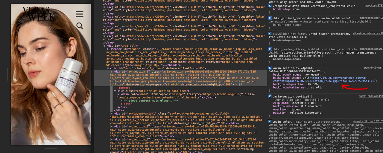
July 12, 2022 at 4:18 pm #1358097on that page: /sonnenschutz_und_was_ihr_dazu_wissen_muesst you got fixed setting – not scroll on attachment. !!!
Important: so set the background-attachment on that color-section to scroll please!
the same on /was-mich-das-zusammenziehen-gelehrt-hat with #av_section_3
on /warum-weiss-die-ultimative-farbe-ist and
/sind-gesichtssprays-wirklich-hilfreich/ i do not see your error.
What kind of iphone is it – is it realy older than the one i tested this for you: iphone 6s with iOs 15.5 ;)July 12, 2022 at 4:29 pm #1358099July 12, 2022 at 10:05 pm #1358130Hi,
so your recommendation is to use this setting:
at last 100% of browser height + set on scroll + bg-fixed. Did I get that right?
I added this link to my quick css: link
I´m using an iPhone 8 :) but I changed the settings and only a small movement is left. I can life with that.
Thank you very much for your advice
Best,
VeronikaJuly 12, 2022 at 11:26 pm #1358131yes you can use all the other settings on min-height option without that littel fix of Link
But for the 100% setting this seems to be the fix for it. Fortunately, this class (av-minimum-height-100) is added in that case.July 13, 2022 at 2:05 pm #1358206Thank you! You can close this now :)
July 13, 2022 at 3:34 pm #1358211Hi,
We are happy that @guenni007 helped!
Let us know if you have any other questions and enjoy the rest of your day!
@guenni007 thanks for your help as always :)Best regards,
Yigit -
AuthorPosts
- The topic ‘fixed back round image on mobile version’ is closed to new replies.