-
AuthorPosts
-
October 19, 2018 at 7:34 pm #1024183
Hi,
After updating Enfold the search and view box seems to be a little too long and a little too tall. See http://www.hikingwithdean.com/events. I already reached out to TEC support and they say “(Enfold) has some sort of configuration for the Events Calendar that includes some CSS code or settings that is causing the issues you’re seeing…I’m willing to bet that finding and removing that CSS code (or disabling the setting) will make things look right again.”
An observation: According to my recollection, the heading “Events for October 2018” was not there before the update. Strange.
My custom.css is the same before and after update (default). Where to look?
Thanks
October 22, 2018 at 3:38 pm #1024913Hey compudean,
Do you have an image what it is supposed to look like?
Could you please attach some screenshots of the issue?
Best regards,
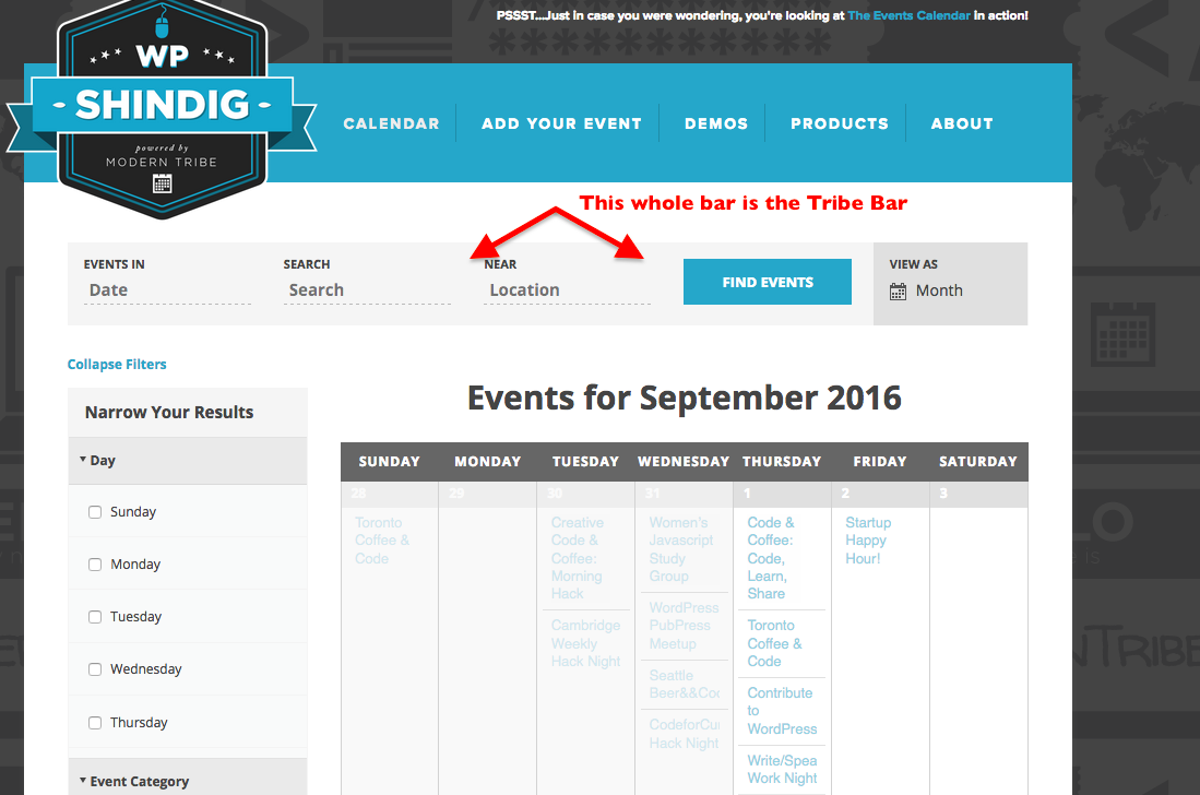
VictoriaOctober 22, 2018 at 4:28 pm #1024951I’ve attached one of Tribe’s screenshots. Notice the title is below the search bar on this. I am not too concerned with that — I have seen the title above and below search bar in screen shots. I don’t recall if the text boxes were white of same as bar background, but you can see how the ends and the vertical centering is off


Thanks
October 22, 2018 at 6:31 pm #1025041More info: When I updated I did so manually while renaming the 4.4 version folder enfold-old. When I switch back to that the bar is “normal” except it stretches the entire window width (the search fields and buttons are within calendar width) as before and no title.
October 24, 2018 at 3:10 pm #1025925Hi compudean,
Here is the code you can put in Enfold > General Styling > Quick Css, if it does not work, put into themes/enfold/css/custom.css
 #top .main_color #tribe-bar-form input[type='text'] {
   background: transparent;
 }
#top #main .tribe-bar-date-filter,
#top #main .tribe-bar-search-filter,
#top #main  .tribe-bar-submit {
   padding: 15px;
 }
 #top #main  .tribe-bar-submit {
   float: left;

 }
If you need further assistance please let us know.
Best regards,
VictoriaOctober 24, 2018 at 7:49 pm #1026071Thanks that looks much better. The submit button isn’t quite centered vertically but that is ok.
Related question: I am using a child theme. Where does the Quick CSS content go? Would it be better if I saved code to child theme custom.css?
October 26, 2018 at 11:59 am #1026737Hi compudean,
It’s ok, you can still put the code in the Theme options > General Styling > Quick Css, this should work fine.
Here is the code you can put in Enfold > General Styling > Quick Css, if it does not work, put into themes/enfold/css/custom.css
#top #main .tribe-bar-submit {
    margin-top: -5px;
}
body#top .datepicker.dropdown-menu {
  z-index: 999 !important;
}
If you need further assistance please let us know.
Best regards,
Victoria -
AuthorPosts
- You must be logged in to reply to this topic.
