
-
AuthorPosts
-
May 20, 2014 at 10:44 am #267193
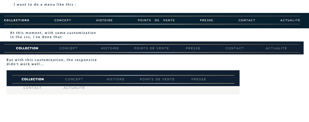
Hi everybody, and thanks for this amazing theme!
I would like to ask you two questions about menu & portfolio item.
1) For my menu, i would like to put some space between menu items.
More explicit
2) For my portfolio :
Thanks for your help!
Regards
May 20, 2014 at 11:25 am #267216I’ve solved my issue with portfolio’s items, with a simple border..
Now, i’m working on my menu items, still searching a solutions ^^
Thanks !
May 20, 2014 at 11:30 am #267220Hi!
Can you post the link to your Enfold website so we can inspect elements on it to provide you more accurate custom CSS code?
Best regards,
YigitMay 20, 2014 at 11:33 am #267222This reply has been marked as private.May 20, 2014 at 11:42 am #267229Hey!
Please add following code to Quick CSS in Enfold theme options under General Styling tab
@media only screen and (min-width: 1340px) {
.av-main-nav > li > a { padding: 0 40px; }}
@media only screen and (min-width: 1140px) {
.av-main-nav > li > a { padding: 0 29px; }}
@media only screen and (min-width: 990px) {
.av-main-nav > li > a { padding: 0 20px; }}
@media only screen and (max-width: 989px) and (min-width: 768px) {
.responsive .main_menu ul:first-child > li > a { padding: 0 4px; }}
Best regards,
YigitMay 20, 2014 at 11:49 am #267234Thanks Yigit, it works for the responsive, but, how can i do to put a larger space by default ? To align my “Collection” menu item at the left, and “Actualité” at the right ? You understand what I mean ?
May 20, 2014 at 11:57 am #267237Hey!
Please replace the code i posted with following one
@media only screen and ( min-width: 768px) {
li#menu-item-26 a { padding-left: 0 !important; }
li#menu-item-32 a { padding-right: 0 !important; }}
@media only screen and (min-width: 1340px) {
.av-main-nav > li > a { padding: 0 49px; }}
@media only screen and (min-width: 1140px) and (max-width: 991px) {
.av-main-nav > li > a { padding: 0 34px; }}
@media only screen and (min-width: 990px) and (max-width: 1139px) {
.av-main-nav > li > a { padding: 0 24px; }}
@media only screen and (max-width: 989px) and (min-width: 768px) and (max-width: 989px) {
.responsive .main_menu ul:first-child > li > a { padding: 0 5px; }}
Regards,
YigitMay 20, 2014 at 12:02 pm #267243Thanks Yigit !
You’re a star!
May 20, 2014 at 12:07 pm #267245 -
AuthorPosts
- The topic ‘Enfold space between menu items / and space between portfolio item’ is closed to new replies.