-
AuthorPosts
-
January 29, 2019 at 12:50 pm #1059974
Hi everybody,
I noticed a compatibility problem.
I have the last version of enfold and when I see my website on Ipad the menu doesn’t reduce when I scroll.
When I looked into the code I saw that the script who add the class “header-scrolled” does’nt work with the last version of Chrome and Safari ( I couldn’t test it on firefox).
Can some one help me whith that ?
ThanksJanuary 29, 2019 at 2:37 pm #1060004You got a shrinking header and wants that the header shrinks on ipad too?
that is in enfold/js/avia-snippet-sticky-header.js
on line 62 there is:
if(shrinking && !isMobile)
change it to:if(shrinking)if you have a child-theme it would be best derigester it on parent theme and load that script via child-theme
January 29, 2019 at 4:38 pm #1060084Thanks for your help Guenni007 but you didn’t understand my problem.
With old versions of browser my website’s header behave perfectly, it shrinks and changes the color of his background.
But when I see my website on the last versions of the browser and on an Ipad it behaves like the desktop version.
That’s why I want a quick fix from the technical support because I think there is compatibility problems between enfold and the last versions of Chrome and Safari.
ThanksJanuary 30, 2019 at 6:55 am #1060345but the thing you described above it the behavior on a shrinking header. On ipad the screen width is 1024px or more on landscape view.
So the normal navigation is shown.
And you like to have that shrinking behavior as well on ipad. What about my page here: does it shrink the header: https://guenterweber.com/ on your ipad?if you like to have the hamburger on screens that have less 1024px and not 990px:
try this to quick css:
@media only screen and (max-width: 1024px) {
  nav.main_menu {
    display: block !important;
  }
  #avia-menu .menu-item {
    display: none;
  }
  .av-burger-menu-main.menu-item-avia-special {
    display: block;
  }
}
January 30, 2019 at 9:18 am #1060386so post a link to your site , if it had to be not public just post the link in private content. Then you have to wait for a mod.
Without a link it is hard to reproduce the things you described and to understand the problem as well.January 30, 2019 at 10:33 am #1060415OK I will try to explain myself.
When I naviagte to my website with chrome version : 49.0.2623.112 on IPAD :
– > My Website is looking good and the header works properly.
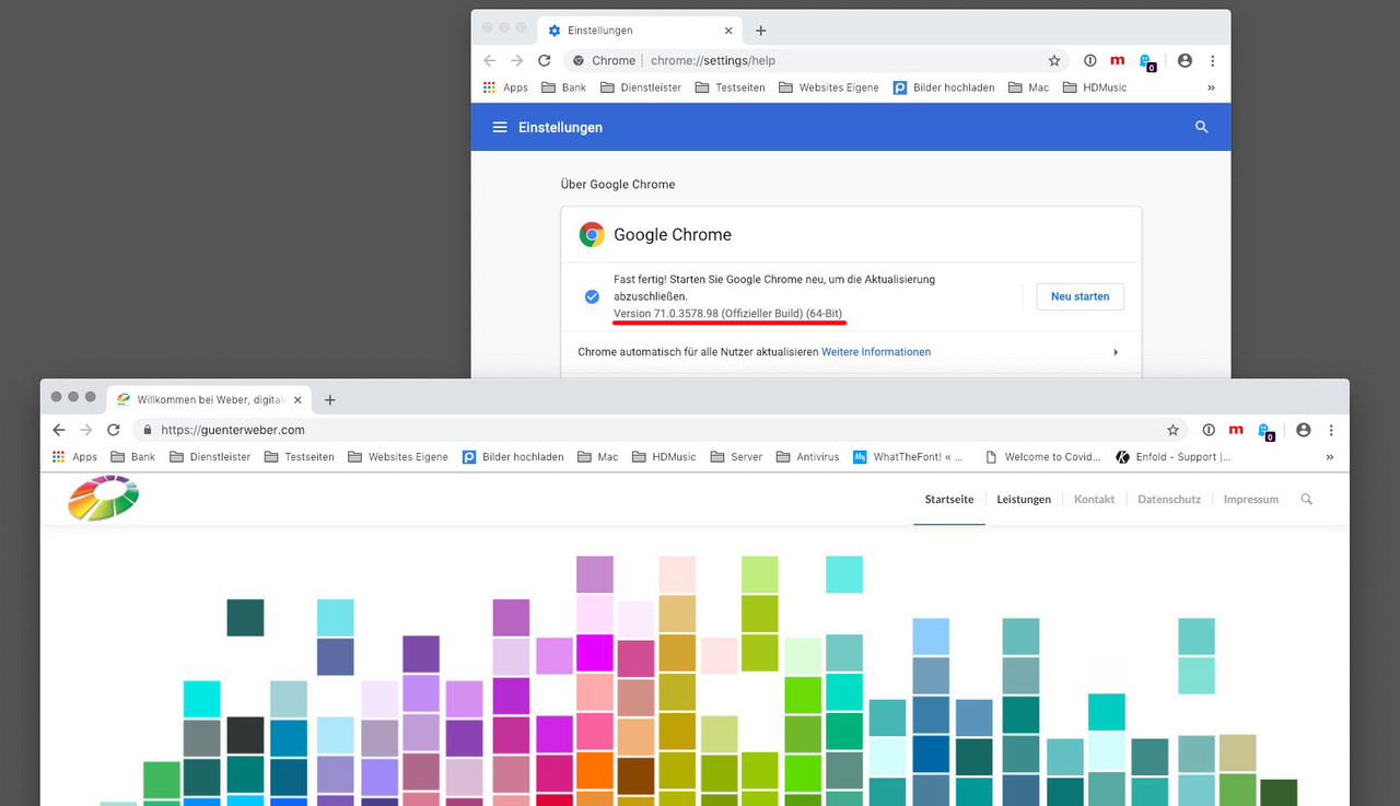
But If I navigate with the version : 71.0.3578.98 and on IPAD
the header doesn’t shrink, It is just fixed with a background transparent.Check the screenshot : https://imgur.com/a/3zgD0a9
I let my link to the website but accoding to me, the bug is on all the websites with enfold you can find.
January 30, 2019 at 11:04 am #1060422so again my question : does your devices show my website as it should?
Does the header shrink on my website with your devices?
My test with the same Chrome Version as you ( and btw: now it is Version 72.0.3626.81) and with newest Safari and with my ipad shows my page as it should.
It shows the normal Navigation Menu and is shrinking on that case and with all browsers and devices.
The code is in :
enfold/js/avia-snippet-sticky-header.js
on line 62 there is: if(shrinking && !isMobile) change it to: if(shrinking)The original code states that the shrinking is only performed if the shrinking has been selected in the options and it is not a mobile device.
In that function : function avia_header_size() from line 39 on there will be your classes header-scrolled and header-scrolled-full. It only happens to mobile devices if you get rid of that !isMobile condition.if this will solve your problem – we can go the next step to make it update independent with a child-theme file and a code to load the alternative file.
Do not forget to refresh merged files in Enfold and to clean all cachings on Safari and ChromeJanuary 30, 2019 at 11:34 am #1060434Your website works fine on my device.
I’ve made the modification you advice but it changes nothing.
Thanks for your timeJanuary 30, 2019 at 11:53 am #1060439Sorry, when I cleared the cache, your solution works.
I will integrate it in my child theme, thank you for your good advices.January 30, 2019 at 1:01 pm #1060461you know how to?
Because this script is also responsible for the amount of shrinkage, I wrote a tutorial here.https://kriesi.at/support/topic/shrinking-of-header-amount-an-info/#post-1044887
-
AuthorPosts
- You must be logged in to reply to this topic.
