
Tagged: header
-
AuthorPosts
-
January 28, 2025 at 6:55 pm #1475939
Hi there,
Please can i have some help with this.
I have followed the instructions but it does not seem to work correctly.
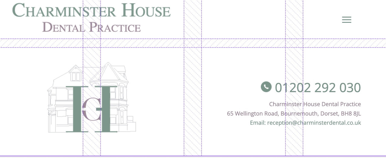
This is how i could like my website to display the header like this
Kind regards,
ChrisJanuary 29, 2025 at 1:36 pm #1475969Hey purplecloud,
Please try the following in Quick CSS under Enfold->General Styling:
#text-3 {
  position: absolute;
  left: 0;
}

#media_image-3 {
  position: absolute;
  right: 0;
}
Best regards,
RikardJanuary 29, 2025 at 3:25 pm #1475974Hi Rikard,
Thanks for this, this nearly worked but still something is a little off.
If you check out https://charminsterdental-co-uk.purplecloudstaging.com/You will see the logo in the middle is very small.
Also how does this then work on Mobile view?
January 30, 2025 at 12:51 pm #1476009Hi,
Thanks for the update. Do you have a screenshot highlighting what you would like to achieve?
Best regards,
RikardJanuary 30, 2025 at 12:56 pm #1476012its a rebuild of a current site so actually we just want to recreate the header they have on
they have an image left, logo centre and html text right. then the menu below.
I thought like this example would work:
January 30, 2025 at 7:23 pm #1476025Hi,
Please set a higher pixel value for the header height under Enfold->Header. If you want a menu like on the site you linked to, you might want to try the Fullwidth Sub Menu element instead of using the regular menu.
Best regards,
RikardJanuary 30, 2025 at 11:56 pm #1476047No that doesn’t help just makes it look worse by stretching the height of the main menu.
Can we just get the widgets aligning correctly?
so it is Widget left, Logo center, widget right
I have attached a screenshot showing the issue.
Many Thanks
ChrisFebruary 2, 2025 at 3:07 pm #1476178Hi,
Sorry for the late reply. The code in the demo doesn’t seem to work anymore unfortunately, we’ll have a close look at that. I’ve added CSS on your site for now, please have a look.
Best regards,
RikardFebruary 3, 2025 at 3:56 pm #1476239Thanks for this, it is showing as off centre on my screen, here is a screenshot
https://charminsterdental-co-uk.purplecloudstaging.com/wp-content/uploads/2025/02/site-screenshot.jpgAlso on mobile the menu has gone, how do we just display the logo and menu on mobile view only?
Thanks
February 4, 2025 at 10:19 am #1476304Hi,
I’ve edited the CSS a bit, please have a look again. Let’s do the mobile layout once you are happy with the desktop layout.
Best regards,
RikardFebruary 8, 2025 at 2:34 am #1476655Hi there,
Yes i think the desktop layout is now fine thank you, if the top right text could right align justify like the current https://www.charminsterdental.co.uk/ that would be great but if not i think it is okay.
With the mobile if it could have the same elements within the header as per the current https://www.charminsterdental.co.uk/ site
so phone number and email and logo and burger menu
I have a screenshot of both sites side by side to show the mobile layout differences issue
https://charminsterdental-co-uk.purplecloudstaging.com/wp-content/uploads/2025/02/site.jpg

thanks a lot,
ChrisFebruary 8, 2025 at 7:51 am #1476657replace these to rulesets:
#header_main {
	display: flex;
	flex-wrap: wrap;
	align-items: center;
	justify-content: space-around;
}

#header_main .widget {
	flex: 0 0 auto;
}

#text-3 {
  text-align: right
}
BUT: you will come to conflict if you go to responsive bahaviour, because the logo container is part of the flex items.
i would try to do that not by flex layout but by grid layout.February 8, 2025 at 9:07 am #1476659remove the flex settings given to you by docu.
maybe test these settings first on dev tools insertion:try:
/*** Naming of the Grid Areas ***/ #header_main #media_image-3 { grid-area: area1; } #header_main #media_image-4 { grid-area: area2; } #header_main #text-3 { grid-area: area3; text-align: right } #header_main div.av-logo-container { grid-area: area4; display: grid; justify-content: center } #header_main { margin: 0; display: grid; gap: 20px 40px; grid-auto-flow: row; grid-template-columns: 1fr 1fr 1fr; grid-template-areas: "area1 area2 area3" "area4 area4 area4"; justify-content: stretch; align-items: center; } #header_main > div { justify-self: center; align-self: center; padding: 0 30px; } @media only screen and (max-width: 1119px) { #header_main { grid-template-columns: 1fr 1fr; grid-template-rows: 0.5fr 1fr auto ; grid-template-areas: "area2 area2" "area1 area3" "area4 area4"; } #header_main #media_image-4 { transform:scale(1.2) } } @media only screen and (max-width: 989px) { #header_main { grid-template-columns: 1fr 1fr 1fr 1fr; grid-template-rows: 0.3fr 1fr; grid-template-areas: "area2 area2 area2 area4" "area1 area1 area3 area3"; } #header_main #media_image-3 { transform:scale(0.8) } #header_main #text-3 { transform:scale(0.8); padding: 0;} #header_main div.av-logo-container {display: grid; justify-content: center; background-color: transparent } #header_main div.av-logo-container { display: block ; } #header_main .av-main-nav-wrap { float: right; padding-right: 50px; } #top #av-burger-menu-ul { padding-top: 120px !important; } } @media only screen and (max-width: 767px) { .responsive #top #wrap_all .main_menu { position: relative; } #header_main #media_image-4 { transform:scale(1); justify-self: start; padding-left: 50px } .responsive #top .logo {display: none;} }February 8, 2025 at 9:08 am #1476660when on your example page the widgets contents change ( f.e. below 768px) we have to have that alternativ content.
so put in that widget areas that alternative content – and on wider screens we set them to display none – and on smaller screens vice versa.
by css.there had to be some fine-tuning on very small screens (mobile phones) . but we could do that later …
_____________________________
by the way – just for info – you see here on showing the grids in dev tools f.e. below 990px:

first you see the gaps ( 20px 40px)
then you see there are 4 columns and two rows ( all columns have the same width but different height – 1fr = one fraction)
first row: the 3 first grid-cells are filled with that area2 the 4th grid-cell is filled with area4 (“area2 area2 area2 area4”)
last row: first 2 cells filled with area1 – last 2 cells are filled with area3 (“area1 area1 area3 area3”)__________________
info – you do not need to fill every cell you could have f.e. here on first row: “area2 area2 . area4” the dot indicates an empty cell
see here a nice post: https://css-tricks.com/snippets/css/complete-guide-grid/
You do not need to always declare the grid areas – but if you want to change postion for different screensize – then this helps you to better address the different selectors.February 9, 2025 at 1:04 am #1476745This reply has been marked as private.February 9, 2025 at 12:54 pm #1476754February 9, 2025 at 1:17 pm #1476755Hi Guenni007,
Are you saying to remove all if the css added from the documentation on
With your proposed ccs?
Will that cancel out everything done so far by Rikard?
I appreciate the help with this, it’s very frustrating it is so difficult to have a layout like this that just works.
February 10, 2025 at 10:44 am #1476812Hi,
Sorry for the late reply. I’ve added some CSS for the mobile layout now, please have another look.
Best regards,
RikardFebruary 19, 2025 at 12:27 pm #1477379Thanks Rikard for this, this looks great.
Where did you add the CSS for this? If i want to adjust some sizing of the logo etc, where was the css entered to tweak if i need too?
Thanks,
ChrisFebruary 19, 2025 at 8:14 pm #1477407 -
AuthorPosts
- You must be logged in to reply to this topic.