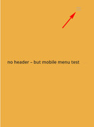
Step 01
I created page and select Template “Blank – No header,No footer”

Step 02
But i need to display hamberger menu in mobile version of this page
How can i do that ? could you please help me to fix this issue. actually i need to add CSS solutions
Currently i m using enfold child theme
Hey DDSameera,
Unfortunately by using the “blank” template you have no header, and no menu, so you can’t have a mobile menu.
To correct please use the “default” template and hide the “footer & socket”, hide the “title bar”, use “no sidebar” and choose a “transparent header”

then to hide the header on desktop screens add this css in the Quick CSS field:
@media only screen and (min-width: 768px) {
#header {
display: none !important;
}
}
and to show the mobile menu on mobile screens, add this css in the Quick CSS field:
@media only screen and (max-width: 767px) {
#header_meta, span.logo,#menu-item-search,#menu-item-shop {
display: none !important;
}
}
Here’s an example of how it will look:

You may need a little more customizing for your needs, just let us know and we can assist.
Best regards,
Mike
Thanks mike. !!!!
Hi,
Glad we were able to help, we will close this now. Thank you for using Enfold.
For your information, you can take a look at Enfold documentation here
For any other questions or issues, feel free to start new threads under Enfold sub forum and we will gladly try to help you :)
Best regards,
Mike
