
Tagged: iphone
-
AuthorPosts
-
March 9, 2026 at 6:01 pm #1495891
Hi,
I have a website which is fine on all devices, but not on the iPhone (tested with iPhone 13). I tried so many things/hacks, but I cannot get it done. Can you check and help me please?
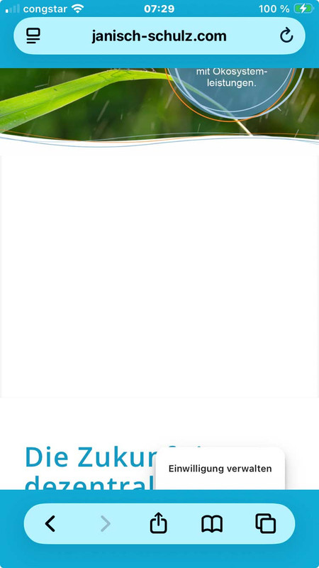
it shows an large white space on top and cuts content above the footer.
Let me know if you need more information or login data.
Thank you.
March 9, 2026 at 9:39 pm #1495901i guess you have a page with fixed header – even on mobile too?
The problem is that Safari shrinks the tab bar when scrolling, which changes the visible area. If your header is fixed with top: 0, but the calculation of the spacing is messed up by the changing browser UI, this ‘gap’ is created, through which the content flashes.
This is especially noticeable when you display the tabs at the top in iOS Safari. As these shrink when scrolling, the viewport height changes.
For me it would be nice to see the page. Then i can try to give you better advice.March 9, 2026 at 11:33 pm #1495904Danke für die Anwtort. Keine Ahnung wieso ich auf Englisch geschrieben habe, ich denke wir können auf Deutsch fortsetzen.
Ich habe tatsächlich eine fixierte Kopfzeile, aber da heißt es ja:
Aktiviert, fixiert die Kopfzeile am oberen Bildschirmrand (wird auf Smartphones ignoriert)Das Phänomen taucht z. B. hier auf:
March 10, 2026 at 5:41 am #1495905Hey cherrmann,
Thank you for the info.
We took a look at the page and found that there is an invisible Separator / Whitespace element just above the footer that has a height of 300px. This is what is causing the large gap on mobile view.
You can locate this element in the layout builder and either remove it or you can try this css to adjust its height on mobile view:
@media only screen and (max-width: 767px) {
  #top .hr.hr-invisible.av-mljdspyf-71312ddfce3302f17c1d53863ec1237a {
    height: 50px;
  }
}
Let us know if the issue persists.
Best regards,
IsmaelMarch 10, 2026 at 7:27 am #1495907Sicher, dass es nicht nur ein Caching ist? Du hast WP-Rocket am Start. Cleare mal den Cache dort. Und deaktiviere dann WP-Rocket temporär.
Dann – falls aktiv, mach noch einen Refresh der css und js files in Enfold ( Enfold-Child / Performance ) ganz unten “Delete Old CSS And JS Files?”Aus irgendeinem Grund ( und auch nur auf realen iPhones ) wird dieser full-width button den du am Desktop zeigst trotzdem mit berücksichtigt. Es wird nur der Anchor ausgeblendet – die Wrapper bleiben sichtbar. Daher:
Versuche mal folgendes : setze den Full-Width button in eine eigene Color-Section und blende diese dann für kleine Screens aus.
PS: das ganze ist übrigens auf allen seiten dann auch der Fall – wo du unterhalb der Slider auch immer einen Full-Screen Button setzt.dies wird auch auf realen iPhones gezeigt:
 March 10, 2026 at 3:42 pm #1495912
Hi Ismael, you’re right about the invisible separator. I added it so the content just above the footer will not be cut on the iPhone. There was even another invisible separator of 100px height just above the one you mentioned. When I delete those, the situation on the iPhone gets even worse. I now deleted both of them so they will not confuse our testing any longer.
Hallo Guenni007, danke, dass du dich der Sache annimmst.
Ich habe jetzt WP Rocket deaktiviert (vorher den Cache aufgefrischt). In Enfold ist und war die Optimierung von JS und CSS deaktiviert, von daher habe ich dort jetzt nichts weiter getan.
Eine eigene Color-Section möchte ich nicht, weil es dann nicht mehr full width ist.
Übersehe ich etwas, ist das nicht die einzige Seite mit dieser Art full width Button auf der Website?Mein Problem ist, dass ich leider kein iPhone zur Verfügung habe und nach jeder Änderung umständlich organisieren muss, dass es jemand testet. Bisher ohne Erfolg und ich fange an, den Leuten auf die Nerven zu gehen.
March 10, 2026 at 10:56 pm #1495932ok – man bekommt das wirklich nur raus, wenn man einen mac mit safari zur verfügung hat, und dort die XCode nebst iOS Simulatoren installiert.
Dann hat man nämlich dev Tools für die iPhone zur Verfügung ;)es ist ein spezieller Hack, der aber hier dazuführt, das dieser extreme Leerraum ensteht:
height: -webkit-fill-availableteste doch mal im Quick css:
zunächst mal nur für diese Selektoren:#top .av-minimum-height, #top .fullsize { min-height: 0 !important; }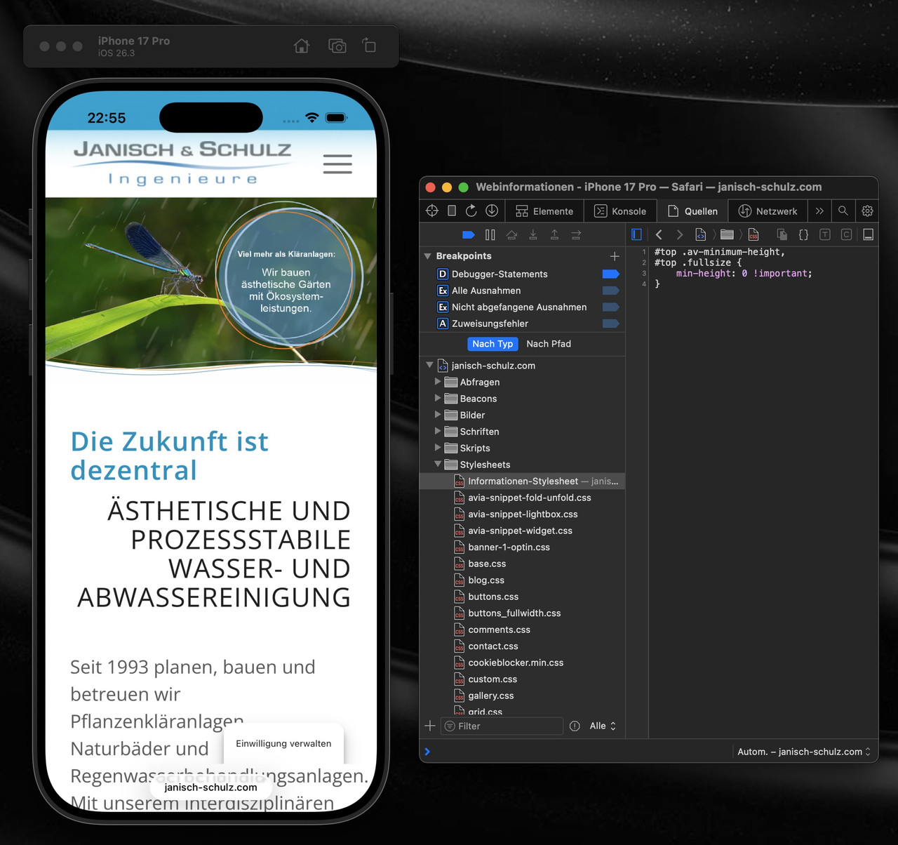
_____________
OK – you can only find this out if you have a Mac with Safari and have installed XCode and iOS simulators.
Then you have dev tools for an iPhone at your disposal ;)It’s a special hack, but it leads to this extreme empty space:
height: -webkit-fill-availableTry testing it in Quick CSS:
First, just for these selectors: see aboveMarch 11, 2026 at 6:21 am #1495937Hi,
Thank you for the update.
We are currently not able to reproduce the issue on our end. Could you please try the following before testing again:
1. Clear your browser cache.
2. Open the page in an incognito/private browsing window.
3. Purge the cache from your cache plugin (WP Rocket or any other active caching plugin).
4. Try testing on a different device or browser if possible.
Let us know the result after trying those steps.
Best regards,
IsmaelMarch 11, 2026 at 6:33 am #1495940ich frage mich nur woher dieses /wp-content/uploads/dynamic_avia/js.css kommt. Denn ich glaube nicht das es eine Enfold Datei ist. Eventuell gehört die zu einem Plugin? Vielleicht kann da einer der Mods näheres zu sagen.
du kannst auch nur diese Regel überschreiben ohne auf andere Devices Einfluss zu nehmen:
in das Quick css :
@supports (-webkit-touch-callout: none) {
    #top .av-minimum-height, #top .fullsize {
        min-height: 0 !important;
    }
}
_____________
I’m just wondering where this /wp-content/uploads/dynamic_avia/js.css comes from. Because I don’t think it’s an Enfold file. Maybe it belongs to a plugin? Perhaps one of the mods can say more about this.
You can also just override this rule in js.css without affecting other devices: see above
March 11, 2026 at 6:56 am #1495941Edit: OK now – i see that it is your Enfold file because you liked to reflect the Janisch & Schulz by js and renaming your child-theme to J&S ( or parared did it) –
so you can overwrite that rule inside quick css by the rule above – or find that rule inside your settings and remove it.March 11, 2026 at 7:05 am #1495942PS: fernab von deinem White Space on iPhone Problem – sehe ich das du oft diesen Trenner mit den drei linien einsetzt.
bist du eigentlich vertraut damit eigene svg Divider in Enfold zu haben?
dein Trenner mit den drei linien ließe sich gut umsetzten mit:

nicht wundern bei Enfold stehen die svg Trenner auf dem Kopf – der scharze Teil ist das was nachher durch die Anschlussfarbe ersetzt wird.
Großer Vorteil : responsiv sorgt vector-effect=”non-scaling-stroke” dafür das die Stroke-weite über alle screen-breiten gleich bleibt (also gut sichtbar ist) :
https://webers-testseite.de/j-und-s/March 12, 2026 at 5:37 pm #1495976[EDIT: I’m sorry I messed up, because I set the header image on button to not show on small devices, but still the following is valid:]
Applying https://kriesi.at/support/topic/display-issues-on-iphone-13/#post-1495940 this Is what I got (section above footer not fully visible):

The issue is only to see on a real iPhone unfortunately.
@Guenni007 – die svg-Trenner werde ich ausprobieren, danke für den Hinweis.March 12, 2026 at 8:19 pm #1495978Bitte lies auch mal was ich so schreibe!
Warum das CSS deine Seite zerstört:
Der “Sticky-Footer”-Killer: html, body { height: -webkit-fill-available } zwingt das gesamte Dokument dazu, genau so hoch wie der Bildschirm zu sein. Das bricht oft das natürliche Scrollverhalten.Die “Tab-Bar-Überdeckung”: Dass der Footer unten überdeckt wird, liegt am Konflikt zwischen -webkit-fill-available und 100svh. Das iPhone rechnet bei fill-available oft die untere Leiste (die Browser-UI) nicht korrekt ab, wodurch der Content “hinter” die Safari-Buttons rutscht.
Die Weißflächen: min-height: -webkit-fill-available !important in Kombination mit height: auto !important zwingt Sektionen, die eigentlich klein sein sollten, dazu, den gesamten Screen zu füllen – selbst wenn sie mitten im Content stehen.
Daher: notiere dir die bestehenden CSS Rules – und lösche diese:
html, body {
    height:-webkit-fill-available
}

#wrap_all {
    min-height:-webkit-fill-available
}

@supports (-webkit-touch-callout: none) {
    .av-minimum-height, .fullsize {
        min-height: -webkit-fill-available !important;
        height:auto !important
    }
}

@supports (-webkit-touch-callout: none) {
    .av-fullscreen, .av-minimum-height {
        min-height:100svh !important
    }
}
und versuche mal diese hier:
/* 1. Globalen Zwang für html/body nur auf Mobilgeräten aufheben */
/* Nur für Mobile + Safari (iPhone/iPad) */
.avia-safari.avia_mobile #wrap_all,
.avia-safari.avia_mobile html,
.avia-safari.avia_mobile body {
    /* Wir heben den globalen Zwang auf, der das Scrollen und die Footer-Sichtbarkeit stört */
    height: auto !important;
    min-height: 0 !important;
}

/* 2. Gezielter Fix für die Weißflächen und Footer-Überdeckung auf iOS Safari */
@supports (-webkit-touch-callout: none) {
    /* Nur wenn Enfold Safari und Mobile erkennt */
    .avia-safari.avia_mobile .av-minimum-height,
    .avia-safari.avia_mobile .fullsize,
    .avia-safari.avia_mobile .av-fullscreen {
        /* Nutze dvh (Dynamic Viewport Height) für korrekte Footer-Berechnung */
        min-height: 100dvh !important;
        height: auto !important;
        /* Verhindert den Geister-Weißraum durch fill-available */
        -webkit-fill-available: stretch;
    }
}

/* 3. Sicherstellen, dass der Footer nicht von der unteren Tab-Bar verdeckt wird */
.avia-safari.avia_mobile #main {
    padding-bottom: env(safe-area-inset-bottom) !important;
}
@supports (-webkit-touch-callout: none) {
    .avia-safari.avia_mobile #wrap_all {
        /* Erzeugt einen Puffer unten, damit der Content nicht unter der Leiste klebt */
        padding-bottom: env(safe-area-inset-bottom) !important;
    }
}
Ob du den fixierten “Einwilligung verwalten” da lassen solltest – oder lieber hinter dem Footer verschwinden lässt ist dir überlassen.
Setze mal :#socket{ z-index: 10005; }March 13, 2026 at 5:49 am #1495981theorie und praxis : mit Enfold gibt es doch noch Besonderheiten.
lass mal diese Rule weg (also löschen):
@supports (-webkit-touch-callout: none) {
    .avia-safari.avia_mobile .av-minimum-height, .avia-safari.avia_mobile .fullsize, .avia-safari.avia_mobile .av-fullscreen {
        min-height: 100dvh !important;
        height: auto !important;
    }
}
March 13, 2026 at 5:57 am #1495982Lass also nur noch als hack drin:
.avia-safari.avia_mobile #wrap_all,
.avia-safari.avia_mobile html,
.avia-safari.avia_mobile body {
    height: auto !important;
    min-height: 0 !important;
}

.avia-safari.avia_mobile #main {
    padding-bottom: env(safe-area-inset-bottom) !important;
}

.avia-safari.avia_mobile html {
    background-color: #11abd6 !important;
}

#socket {
    z-index:10005
}
die untere ist dafür, wenn man manchmal schnell wischt, und “überscrollt” zeigt sich hie und da der Hintergrund (meist weiß) um das zu verhindern auf deine Footer Farbe setzen.
March 15, 2026 at 1:41 pm #1496026Lieber @Guenni007, ich weiß deinen Einsatz sehr zu schätzen. Ich habe das versucht (vorausgesetzt ich habe nichts übersehen). Der Headerbereich sieht auch ok aus, aber nicht der Bereich über dem Footer, der ‘Senden’-Button ist nicht zu sehen.
Es kann sein, dass ich mir aufgrund der vielen Anpassungen, besonders Custom CSS, dieses Problem selbst geschaffen habe. Ich will niemandem die Zeit stehlen, wir können das Ticket pausieren. ich muss mir überlegen, was ich diesbezüglich noch an Aufwand reinstecke, denn ich kann es mir momentan nicht erlauben, andere Dinge dafür liegen zu lassen.
Ich habe auch deine Hinweise bzgl. svg-Trenner gelesen und versucht, umzusetzen, aber leider nicht zu 100% Zufriedenheit. Da dies aber nicht Thema dieses Tickets ist, danke ich dir an der Stelle für den Hinweis und den Code. Das wird sicher noch einmal nützlich sein.
March 15, 2026 at 4:01 pm #1496030warum hast du für #footer ein negatives margin-top definiert?
Du hast es an zwei Stellen so gesetzt:
#footer {
    padding: 0 0 190px 0;
    margin-top: -190px;
    background-image: url(//janisch-schulz.com/wp-content/uploads/2022/05/090-footer-wasser.jpg);
    background-size:cover
}

@media only screen and (max-width: 768px) {
    #footer {
        background: url(//janisch-schulz.com/wp-content/uploads/2022/05/090-footer-wasser-mobil.jpg);
        background-size: cover !important;
        margin-top:-360px
    }
}
lösche mal beide margin-top Werte – dann siehst du auch wieder deinen Submit Button.
March 16, 2026 at 6:02 am #1496048Hey cherrmann,
Thank you for the update.
The negative margin-top values in your custom css are pulling the footer upward and overlapping the content above it, which is why the submit button and other elements near the footer get cut off.
You have these rules defined in two places:
#footer {
    padding: 0 0 190px 0;
    margin-top: -190px;
    background-image: url(//janisch-schulz.com/wp-content/uploads/2022/05/090-footer-wasser.jpg);
    background-size: cover;
}

@media only screen and (max-width: 768px) {
    #footer {
        background: url(//janisch-schulz.com/wp-content/uploads/2022/05/090-footer-wasser-mobil.jpg);
        background-size: cover !important;
        margin-top: -360px;
    }
}
The negative margin-top on both rules is what pulls the footer up over your content. Remove both margin-top values and your submit button should become visible again. The padding-bottom on the desktop rule was likely added to compensate for the overlap, so you may want to revisit that value as well once the margin is removed.
Let us know if the issue persists.
Best regards,
IsmaelMarch 16, 2026 at 4:24 pm #1496066Thank you for not giving up on me. I thought it could be someting like this and to be honest, I don’t remember why I put those rules there. I deleted them and the result seems to be perfect now.
March 16, 2026 at 9:01 pm #1496079Hi,
Glad that Guenni007 & Ismael could help, if you have further questions please open a new thread and we will try to help. Thanks for using Enfold.Best regards,
Mike -
AuthorPosts
- The topic ‘Display Issues on iPhone (13)’ is closed to new replies.