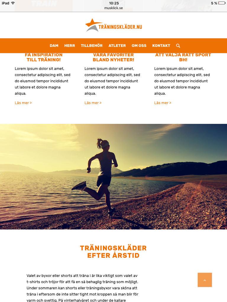
Hi! I have a site with the content placed within a 3/5 column to give it a nice space around. On standing tablet however the text block is a bit small. Is it possible to use 1/5 empty, 3/5 with content and 1/5 empty on desktop and have a different layout on standing iPad? On tablet I would like the content to extend further, and use more of the available space. On mobile it divides up into single columns which works fine for mobile. Only problem is with iPad portrait mode.
Best regards/
Michael
Hey musklick,
Please try the following CSS to hide 1/5 elements on ipad portrait only:
@media only screen and (min-device-width : 768px) and (max-device-width : 1024px) and (orientation : portrait) {
    .av_one_fifth {
        display:none;
    }
}
Best regards,
Rikard
Hi Rikard, the CSS hides the 1/5 column but since the text is in a 3/5 element it just moves the element to the left and results in 2/5 of empty space on the left. Maybe I’m using a backward solution to create the space around the textblocks? Do you have any ideas? Would it be better to use a 1/1 element and use different padding on portrait and landscape?
Best regards
/Michael

Hi,
Please refer to this post – http://kriesi.at/documentation/enfold/hide-menu-itemselements-on-mobile/
Best regards,
Yigit
