
Tagged: column width
-
AuthorPosts
-
December 18, 2019 at 3:23 am #1167075
Is there a way to control how wide each column of a table is?
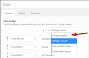
Here’s the default I’m getting now

Here’s the page so you see how much room there is to be filled up:
 December 21, 2019 at 2:38 pm #1168429
Hey Thomas,
Sorry for the late reply, there is not a setting to control this, but we can adjust with some css.
Please link to your page and explain how you would like it to look.
I assume that in mobile, the table should be full-width and centered, and the first column should be 25% and the second column should be 75% so the text is on one line?Best regards,
MikeDecember 22, 2019 at 10:32 pm #1168629Hi Mike,
Thank you. The website is https://jorvik.press.
Login credentials below.
Yes, I think 25% / 75% would work great, and once I see how you’ve done it I should be able to make any further adjustments.December 23, 2019 at 12:10 am #1168645Hi,
Thanks for the link, I see that your table is in a column that is 2/5 so that is why it is narrow, form the screenshot I thought it was on a mobile device, but that is ok.
So in the css I wrote it for your single product pages so it won’t change other tables you might have, and assuming they are all the same this should work for all of them:
Please try this code in the General Styling > Quick CSS field or in the WordPress > Customize > Additional CSS field:@media only screen and (min-width: 768px) { #top.single-product .avia-data-table .avia-desc-col { text-align: center !important; width: 100px !important; padding: 9px !important; } #top.single-product .avia-data-table .avia-highlight-col { width: 350px !important; } }Then clear your browser cache and any cache plugin, and check.
I used px widths instead of percentages because it is a small area, if you want the columns in the table larger please use a column larger than 2/5 as the container.
Please let us know if this is what you had in mind.Best regards,
MikeJanuary 22, 2020 at 11:34 pm #1177354Hi Mike,
Thank you for your help. I tried to write you back around year end, but you guys were closed for the holidays (which is great! – welcome back).
In the meantime, I’ve made a ton of changes (ditched WooCommerce for EasyCart, got that entirely configured, now am switching back – argh.)
At this point, the table is indeed wider, but that’s true whether or not your code is in General Styling > Quick CSS.
Here’s what I’m wanting it to look like ideally –

…specifically, with the first column narrower, and the second one to be wider to accommodate longer text.Thanks for your previous help, and in advance.
-
This reply was modified 6 years, 2 months ago by
steed. Reason: had the wrong password in there
January 23, 2020 at 11:35 am #1177551Hi,
For the table to have a max width of 270px (70px+200px) please try this css:@media only screen and (min-width: 768px) { #top.single-product .avia-data-table th.avia-desc-col { text-align: right !important; width: 70px !important; padding: 0px !important; } #top.single-product .avia-data-table .avia-highlight-col { width: 200px !important; } #top.single-product div .avia-table { width: 270px !important; } }but I find that the first column text is larger than 70px, you can change the values in the code to suit, perhaps to 100px for the first column, 300px for the second, and 400px for the total table width.
@media only screen and (min-width: 768px) {
#top.single-product .avia-data-table th.avia-desc-col {
    text-align: right !important;
    width: 100px !important;
    padding: 0px !important;
}
#top.single-product .avia-data-table .avia-highlight-col {
    width: 300px !important;
}
#top.single-product div .avia-table {
    width: 400px !important;
}
}
also if you want the rows in the second column to have the same background colors, the change the second column to default from highlight:
Best regards,
MikeJanuary 23, 2020 at 10:02 pm #1177909Hi Mike,
Thanks again. I apologize for keeping after this, but I’m still not seeing much difference (except for the background color change – that worked like a charm!)
I did the change you suggested (using the 400 pixel width, good call). I put the second quickCSS block in. Now what I see after cache clearing in all three browsers (Safari, Firefox, Chrome on Mac) is a table that seems like it’s about 400px wide, with columns equally split at 200px.
What am I missing? Are you seeing it differently on Windows?
January 24, 2020 at 10:33 am #1178064Hi,
I see that you were using HTML inline commenting in your css:<!-- Table styling -->
so I corrected to css inline commenting:/* Table styling */
and now your css is working, please clear your browser cache and check.Best regards,
MikeJanuary 24, 2020 at 12:38 pm #1178097This reply has been marked as private.January 24, 2020 at 2:04 pm #1178113Hi,
No, it’s fine, just glad we could help, unless there is anything else we can help with on this issue, shall we close this then?Best regards,
MikeJanuary 30, 2020 at 8:59 pm #1180075Hi Mike. Yes, thank you again.
January 31, 2020 at 5:37 pm #1180304Hi steed,
Great :) We are closing the thread.
Best regards,
Victoria -
This reply was modified 6 years, 2 months ago by
-
AuthorPosts
- The topic ‘Custom Table Column Width’ is closed to new replies.