
-
AuthorPosts
-
April 7, 2021 at 3:48 pm #1293092
Hi @yigit,
we set the custom header height on 70px.
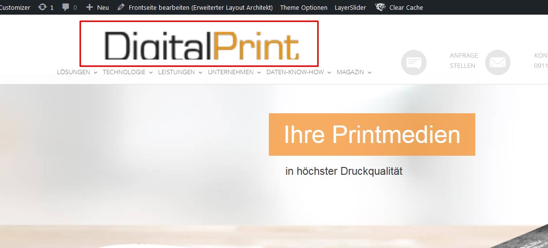
The logo we added has 250 x 65px but is has been blowed up/scaled up to 340×156
https://digital-print-group.de/screenshots/logo.jpg(I know that 340×156 is the standard sice for a standard header size but why is there a custom header size option when the native ratio is not been respected??)
Even this does NOT help:
.logo img {
width: 250px !important;
height: 65px !important;
}How do i make the website show the logo in its normal/native ratio & size??
kind regards Max
April 7, 2021 at 3:55 pm #1293094you set the height to 150px and !important
twice on line 134 and 145 and a few other settings are not set very well.first get rid of the whole setting: height, max-height, width on both settings.
then we have a look what to do with the other parts.look to your header widget settings and replace or add :
#header .widget_text {
  top: 50%;
  padding: 0 !important;
  -webkit-transform: translateY(-50%);
  transform: translateY(-50%);
}
April 7, 2021 at 4:03 pm #1293095you had to make a decision what to do with this header widget on responsive case.
Maybe the setting on header – header behavior – “Let logo and menu position adapt to browser window” is a first good option for you?
you had to look where the second inactive hamburger icon comes from.
Maybe a non shrinking header would be a good alternative for you ?April 7, 2021 at 4:14 pm #1293096where does these “advanced_menu_toggle” and “advanced_menu_hide” come from? do you need them? they have a 30px height in the header without content!
April 7, 2021 at 4:23 pm #12930971: The settings you mentioned are about .addheader and .addheader2 – not about the logo dimensions
2: These settings have been given to us from another Enfold-Mod when we asked a while ago for adding another header element-
This reply was modified 5 years ago by
digitalprint2222.
April 7, 2021 at 4:28 pm #1293101…as we found out right now it was a “stubborn” CDN-Cache.
Now it looks as wanted.What does that mean?
The CSS you told us to be wrong is correct?April 7, 2021 at 4:54 pm #1293106please scroll your site.
the header widgets overlap the header borders, and the logo is obscured by the navigation.and narrow the screenwidth of your browser
overlapping widgets and menu – after hamburger is present – two burger icons – one inactiveApril 8, 2021 at 5:30 pm #1293354such a font logo just demands to be represented by an svg
April 9, 2021 at 9:43 am #1293461the header widgets overlap the header borders, and the logo is obscured by the navigation.
I dont see what you mean, sorry.overlapping widgets and menu – after hamburger is present – two burger icons – one inactive
I know, there is already another thread – older than this one – about that.kind regards
MaxApril 9, 2021 at 10:02 am #1293467on a shrinking header they overlap after scrolling.
But now you set the header to non-shrinking. ( ok that problem is solved by this )shrink the browser window ( make it narrower ) or look to your page on a mobile device:
the left hamburger overlapping slider is the active one – the right one is without function ( twice hamburgers )

Ipad view: ( all tablets ):
overlapping navigation etc ( both navigation list points are not clickable anymore by the overlapping header widget area )
 April 9, 2021 at 10:13 am #1293469
Both are solved now. If you still see the issues its because of our CDN-cache.
(It takes some hours)The only thing left is the overlapping of the grey icons on smaller screen sizes.
This needs to be solved and i will open another thread for it
thanks
MaxApril 9, 2021 at 1:37 pm #1293505i wouldn’t do that with header widget area. these are links that seems to be part of a navigation but only with icons in front and with two line labels.
So why not use the menu and to have those menu points with a custom-class. Your normal menu floats left – these two menu-points float right. Thats all.
the icons can be placed in pseudo-containers – and the two line label can be inserted by a label with a span inside – f.e.:
Anfrage<span class="menu-break">stellen</span>the rest is quick css – and what is very nice – the shrinking is included – and the links are in hamburger too from the beginning.
see: https://webers-testseite.de/weber/sollte dich das interessieren sag einfach Bescheid. Dann versuche ich es hier zu beschreiben.
April 9, 2021 at 3:04 pm #1293527I asked a while ago how we can add additional elements in the header – and the mods here told us to do it in this way.
(Ja, das interessiert mich sehr denn wie man sieht war der Vorschlag den ich damals erhielt – auch das CSS war Teil der Empfehlung – nicht sonderlich effektiv. Wenn Du das hier erklären möchtest würde ich mich sehr freuen – bin aber nur ein Angestellter der dazu verdonnert wurde die Website zu betreuen. Der Einäugige unter Blinden also. Ich tu mein Bestes um Dir folgen zu können)Gruß
MaxApril 9, 2021 at 3:13 pm #1293530That’s o.k. ; but some mods here don’t work daily with customer requests in real wordpress life. I just know that all very well; in the time where I was intensively occupied with jQuery and further education I tried to realize everything via scripts.
Since one has already times a few standard answers, which are not always the optimal way.
You have to have understanding for that, because with the abundance of questions here they hardly have more time than 5-10min to find an answer.But if it is o.k. here now for the other participants I answer now in German. If someone needs the instructions in English please write here.
April 9, 2021 at 3:27 pm #1293533erstmal mache das mit dem Header Widget Area rückgängig!
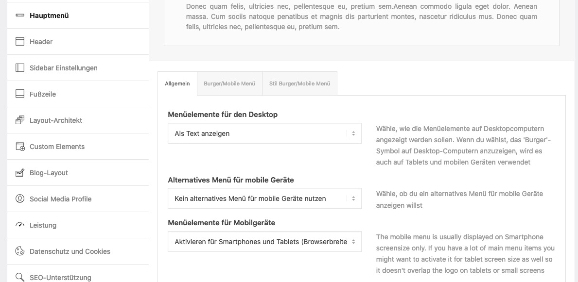
Also auch aus der funkions.php den entsprechenden Eintrag entfernen, und bei Widgets das Widget-Area löschen.Dann ist es wohl für dein Menü günstiger den Responsiven Fall bei 990px eintreten zu lassen:
Enfold (Child) – Hauptmenü – “Menüelemente für Mobilgeräte” dort für mobil und tablets wählen.__________
zunächst musst Du wissen, wie man einzelnen Menupunkten eine benutzerdefinierte Klasse gibt:
im Dashboard – Design – Menüs
gibt es ganz oben im Fenster diesen Tab : “Ansicht anpassen” ( fly out button)
nachdem du das gedrückt hast, siehst du( alle bilder kannst du durch klicken vergrößern)
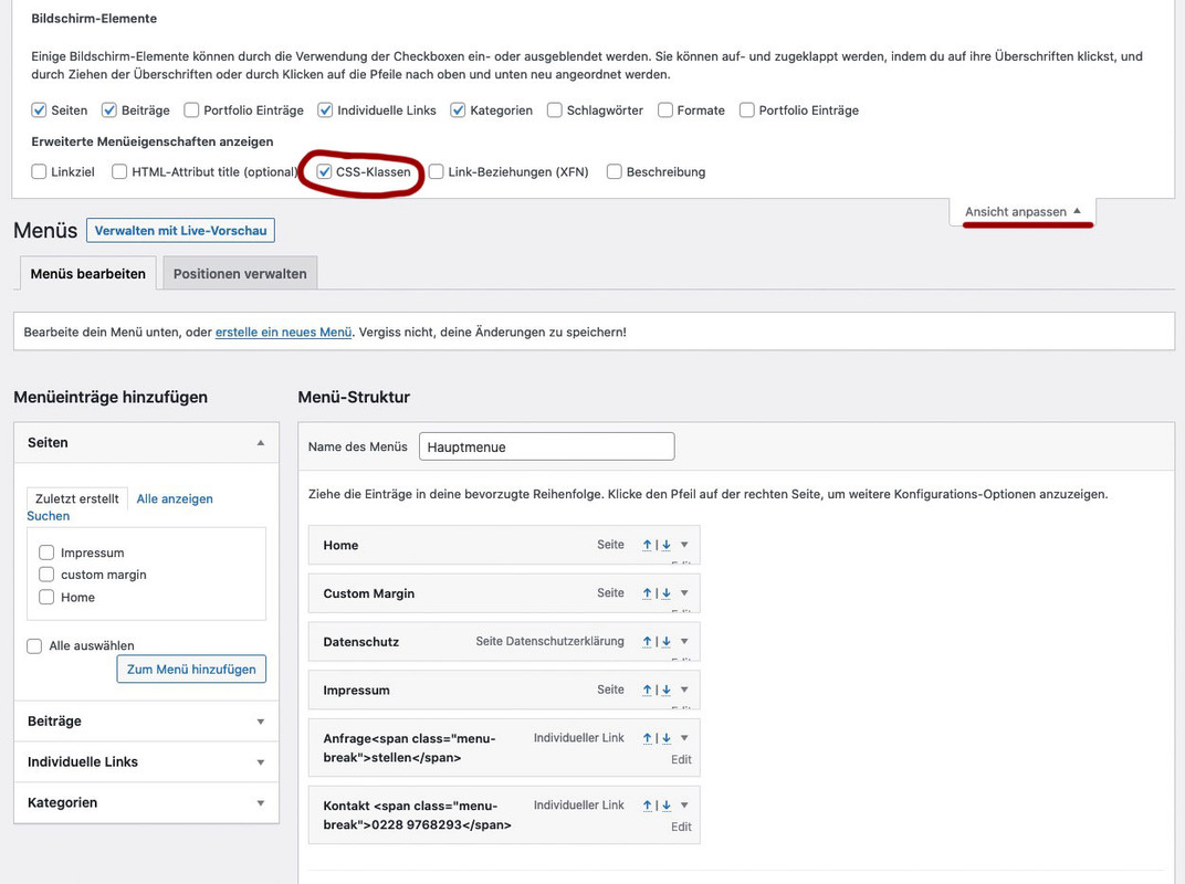
mach den Haken bei CSS-Klassen.Jetzt kannst du neben jedem Menupunkt den Edit Button Klicken und du hast dann die Möglichkeit diesem eine Klasse zuzuordnen.
also z.B: rechstbuendig besser ist für nachher aber hier auch schon zu unterscheiden also Klassen anfrage und telefon
Bei “Angezeigter Name” ( engl: Label ) gibst du in einem “Individuellem Link” ein
a)Anfrage<span class="menu-break">stellen</span>b)
Kontakt <span class="menu-break">0911-4771800</span>bei b) gibst du als Link an:
tel:+499114771800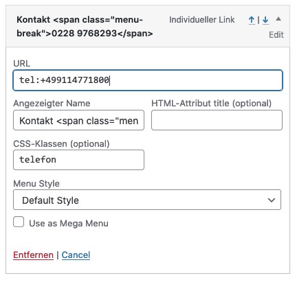
gleich geht es weiter: …
April 9, 2021 at 3:36 pm #1293534Nun : das hier in das Quick CSS einfügen.
.anfrage a:before {
  content: "\e805";
}
.telefon a:before {
  content: "\e83c";
}

@media only screen and (min-width: 990px) {
  #header_main_alternate {
    border-top: none;
  }

  span.menu-break {
    display: block;
    line-height: 60px;
    bottom: 35px;
    position: relative;
  }

  .anfrage, .telefon {
    text-align:left;
    float: right !important;
    top: -15px;
    margin-left: 60px
  }

  .anfrage a:hover:before ,
  .telefon a:hover:before {
    background-color : #aaa !important;
  }

  .anfrage a:hover .avia-menu-fx ,
  .telefon a:hover .avia-menu-fx {
    display : none !important;
  }

  .anfrage a:before, .telefon a:before {
    display: table;
    font-family: entypo-fontello;
    font-size: 30px;
    color: #fff;
    position: absolute;
    left: -50px;
    top: 0;
    padding: 5px 10px;
    background-color: #ddd;
    width: 40px;
    height: 40px;
    border-radius: 50%;
    text-align: center;
    vertical-align: middle;
  }
}

@media only screen and (max-width: 989px) {
  #av-burger-menu-ul .anfrage a:before,
  #av-burger-menu-ul .telefon a:before {
    font-family: entypo-fontello;
    font-size: 30px;
    color: #ddd;
    position: absolute;
    left: 0;
    top: 10px;
    padding: 5px 10px;
    width: 40px;
    height: 40px;
  }
}
du siehst hier tauchen die benutzerdefinierten Klassen auf: anfrage und telefon
diese Menüpunkte floaten jetzt rechts. Wenn du die Positionen tauschen willst, dann ziehe im Menu die Positionen an die richtige StelleApril 9, 2021 at 3:45 pm #1293535btw: here is your logo as svg file: https://webers-testseite.de/weber/DigitalPrint.svg
if you need it.
To use it on WordPress you had to allow that mime type via functions.php child-theme.April 9, 2021 at 4:29 pm #1293542sorry – my imagehoster is temporarily down. – in the text there are a few images
April 10, 2021 at 4:46 am #1293589April 10, 2021 at 3:55 pm #1293640Hallo @Guenni007
WOW, Vielen Dank für die präzise Anleitung & Hilfe.
Habe nun (allerdings erstmal auf unserer staging. ) alles umgesetzt.
Funktioniert prima3 Fragen hätte ich noch:
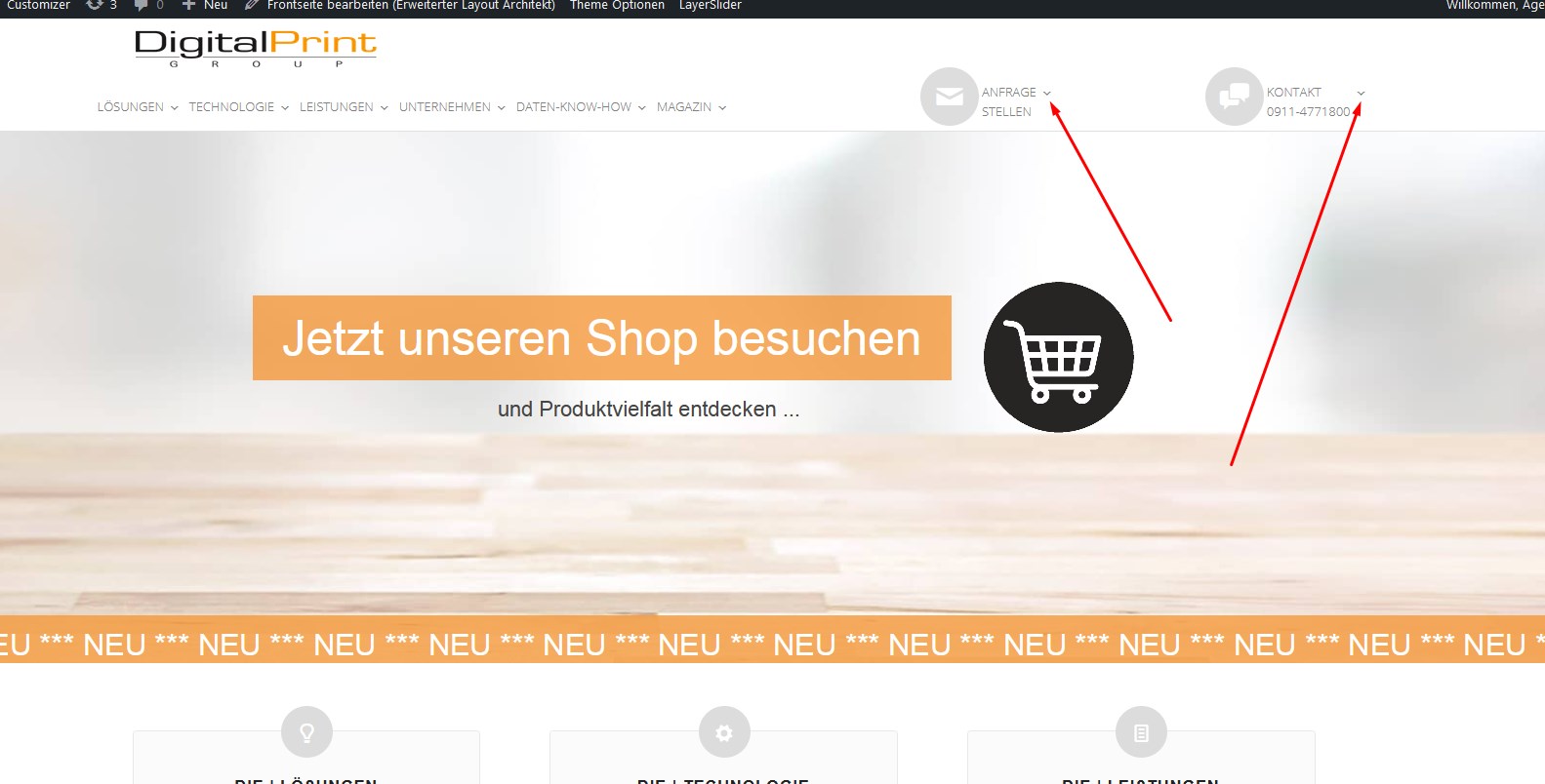
1: Falls ich beide Elemente insgesamt (also quasi als Block) weiter nach links schieben wollte, welche Klasse / welches Attribut müsste ich verändern?
2: Was muss ich notieren um bei “telefon” und “anfrage” die beiden Pfeilchen wegzukriegen die auf den anderen Menupunkten durch “content: “\f107″” erzeugt werden?
https://digital-print-group.de/screenshots/menu.jpg
3: Zwischen 990px und ungefähr 1100px schieben sich die Elemente übereinander. Ist das egal weil es solche Screengrössen nicht gibt oder solte ich dafür besser eigene Regeln schreiben?Viele grüße & schönes wochenende
MaxEDIT
Frage 1 hat sich geklärt.
Du hast ja die Klassen telefon und anfrage zusammengefasst.
Ich werde sie also vermutlich trennen müssen, das float:right gegen ein float:left: ersetzen und dann die Margins anfassen müssen.
Korrekt?-
This reply was modified 5 years ago by
April 12, 2021 at 9:29 am #1293875ohne die Seite zu sehen ist es quasi unmöglich dir exakte Tips zu geben.
April 12, 2021 at 10:17 am #1293884Ok, dann melde ich mich sobald ich die Änderungen live gebracht habe.
Bis dahin,
MaxApril 12, 2021 at 10:20 am #1293885Gerne auch via E-Mail wenn du die Seite nicht öffentlich machen möchtest.
April 12, 2021 at 11:36 am #1293905Hallo Guenni
so, ist nun auch auf der Live-Site Online:
digital-print-group.de/Und noch eine Frage:
Wenn man sich hier beindet digital-print-group.de/unternehmen/anfrage/ hat das Element “Anfrage” einen orangefarbenen Unterstrich.
Das ist “a active”, oder?
Wenn ich den wegmachen will dann muss ich das notieren?
.anfrage a active {text-decoration: none !important;}Grüße
MaxApril 12, 2021 at 3:37 pm #1293962zunächst sollten die ja keine Untermenupunkte haben diese beiden Individual Links. Daher sollten die Pfeile auch nicht da sein.
Hast du im Menu eventuell die als MegaMenu Punkte gesetzt?
Standardmäßig sind da bei Enfold keine “Arrows” – also wie hast du Sie eingebunden?
doch mit dem Pseudocontainer after – also nimm sie dort wieder raus:
besser hinter der ursprünglichen Anweisung im css platzieren..html_header_top .av_bottom_nav_header #header_main_alternate .main_menu ul:first-child > li.anfrage > a::after, .html_header_top .av_bottom_nav_header #header_main_alternate .main_menu ul:first-child > li.telefon > a::after{ content: ""; }der Unterstrich:
.anfrage.current-menu-item > a > .avia-menu-fx,
.telefon.current-menu-item > a > .avia-menu-fx {
    display: none
}
es ist bestimmt für deine Konstellation besser, wenn du zunächst mal den Umbruchpunkt wann der Hamburger auftaucht auf die “Mobile/Tablet” Option einstellst: ( Menuelemente für Mobilgeräte )
wenn das nicht reichen sollte, dann kann man das auch per css beeinflussen.
April 12, 2021 at 3:49 pm #1293963wenn du das Logo lieber bündig mit der Navigatin haben möchtest:
#header_main .av-logo-container {
    padding: 0 5px;
}
April 12, 2021 at 7:42 pm #1293991Das ist ja mal ein toller Support. Hab da gleich mal was von übernommen. Hoffe das ist erlaubt und in Ordnung
ChristianApril 12, 2021 at 8:12 pm #1293994@DouPaule – natürlich ist es erlaubt.
@digitalprint2222 : sollte die Farbe nicht ganz stimmen im svg. Dann kannst du das svg mit einem guten Texteditor der keinen zusätzlichen meta Mist mit in die Datei schreibt öffnen ( Windows: notepad++ ; Mac : Sublimetext )Oben in deinem Logo siehst du dann ganz ähnlich wie in einem html code einen style bereich:
<style type="text/css">
	.dpg0{fill:#333333;}
	.dpg1{fill:#F4983B;}
	.dpg2{fill:#000000;}
</style>
die dpg steht für digital print group dpg1 ist das Orange – wenn du hier einen andere Farbe einträgst, das ganze abspeicherst, dann hast du die Veränderung auch schon gemacht.
PS : was wohl passieren würde wenn da stünde:<style type="text/css"> .dpg0{fill:#333333;} .dpg1{fill:#F4983B;} svg:hover .dpg1 { fill: #990000;} .dpg2{fill:#000000;} </style>April 12, 2021 at 9:04 pm #1293996Hallo Guenni
Alle deine Anweisungen umgesetzt.
Alles tadellos, bestens, großartig.
VIELEN DANK nochmal…..Du solltest Mod werden! ;-)Grüße
MaxApril 15, 2021 at 7:31 am #1294501Hi,
Glad it is fixed. Thanks to @Guenni007! Let us know in another thread if you need anything else.
Have a nice day.
Best regards,
Ismael -
This reply was modified 5 years ago by
-
AuthorPosts
- The topic ‘Custom header height distorts logo’ is closed to new replies.