Tagged: Fullwidth Easy Slider
-
AuthorPosts
-
September 28, 2022 at 9:28 pm #1366807
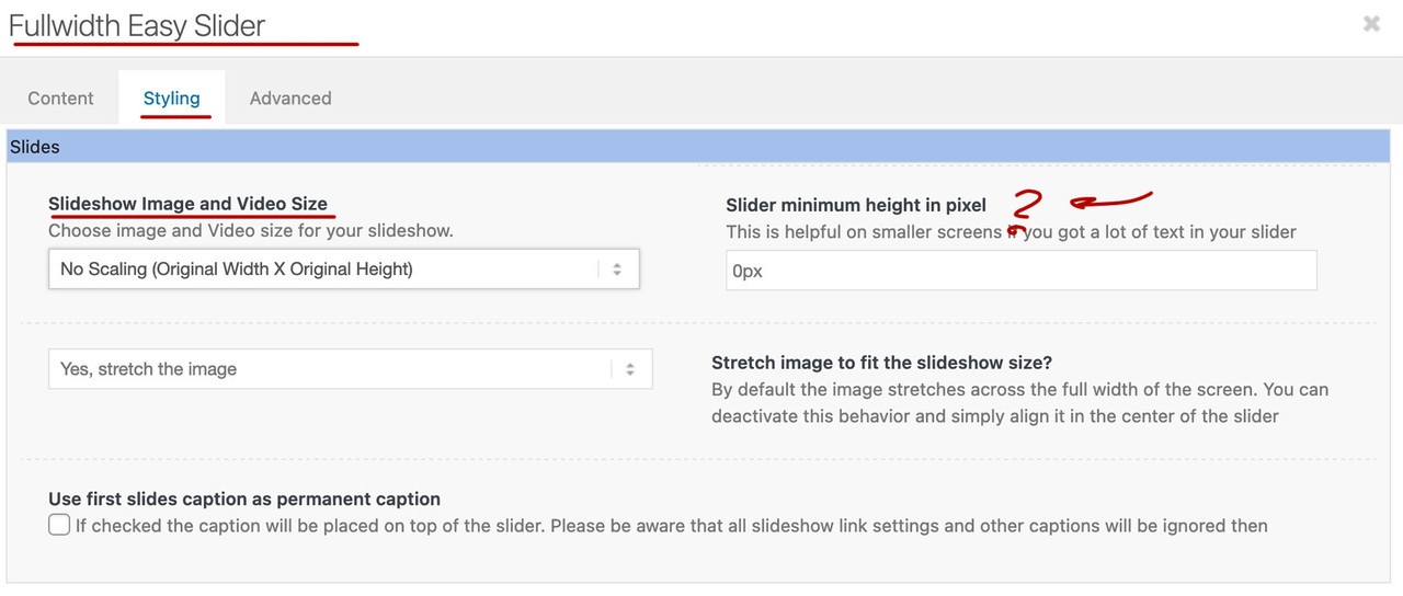
I would like to have the entire image fit in a fullwidth easy slider. I currently (after much experimentation) have an image that is 1900×710 (I’ve tried many other sizes). My site’s general layout is set to Responsive at 1900px width (I’ve tried 100%). I also currently have it set to no scaling and yes, stretch the image. I’ve tried setting minimum slider height as well to no avail.
Is there an aspect ration and suggested settings in both the general layout and fullwidth easy slider to make it so the entire contents of an image show responsively? How do I direct a client providing slider images as to what size (HxW) to provide for a site that is 100%/responsive?
Thanks!
September 29, 2022 at 9:20 am #1366855The fullwidth easy slider is on default responsive. But you had to pay attention on the settings that you do not use cropped variants of your image. Therefore, if you leave the setting to Original image size in the settings – these should also be displayed.
Of course, this can lead to the fact that possible contents (headlines and buttons) do not find enough space on very small screens. For this case the Min-Height option is available. Then, however, the background image is no longer displayed in its entirety.
September 29, 2022 at 9:41 am #1366861Hey lzevon,
Thank you for the inquiry.
Have you tried setting the Styling > Slides > Slideshow Image and Video Size settings to the first option (No Scaling)? This will display the source image in the slides with the original size and aspect ratio. Slider image should be at least 1600px in width and image height depends on the desired layout.
Best regards,
IsmaelSeptember 29, 2022 at 3:44 pm #1366927Thanks @Guenni007 and @Ismael. As I mentioned in my original post I did try setting No Scaling, see where I wrote “I also currently have it set to no scaling and yes, stretch the image. I’ve tried setting minimum slider height as well to no avail.”
I have built many sites using the theme and Fullwidth Easy Slider, but these slides are taller than most and have content close to the edges and so I notice the cropping a lot more. I wasn’t sure if there were standard aspect rations X:X vs fixed image sizes to maintain the image’s aspect ratio. For example 3:1 for 1920×640 would seemingly display the whole image on a desktop viewport and then the theme would scale the slider for other viewports such as (only referencing width) 1680, 1440, etc.
I have a separate slider for tablet/phone and am playing around with the images to try to get the desired result.
September 30, 2022 at 1:04 pm #1367093without seeing the page it concerns – it is hard to give advice.
September 30, 2022 at 5:14 pm #1367140I provided the link in the private window, but @Guenni007 you are a wealth of knowledge and I was surprised to see you’re a Participant and not a Moderator. I believe I figured out the issue. I had a larger logo area set to 130px to accommodate a sqaure-ish logo and when I reduced it down to 110px it resolved the issue with the slider image being cut-off ¯\_(ツ)_/¯
October 2, 2022 at 1:38 am #1367247Hi,
Glad to hear that you have this sorted out, if you have any further questions please create a new thread and we will gladly try to help you. Thank you for using Enfold.Best regards,
Mike -
AuthorPosts
- The topic ‘correct aspect ratio for fullwidth easy slider’ is closed to new replies.

