-
AuthorPosts
-
January 24, 2025 at 5:40 pm #1475740
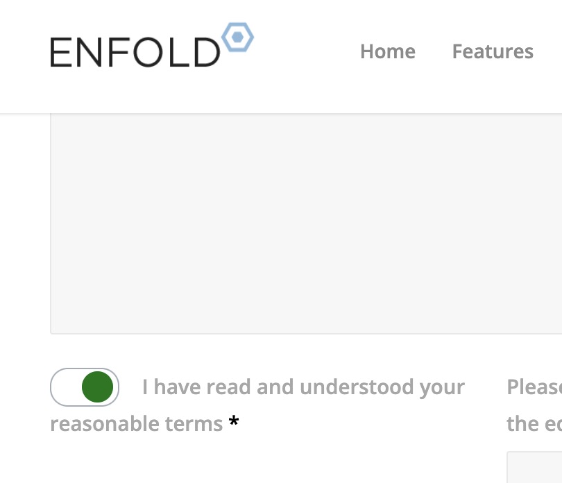
Hi, How can I center the submit button of a form (in CSS)? How can I style a checkbox (Form element: Checkbox)? I’m interested in its size and the background color when selected. Thanks. Tom
January 24, 2025 at 6:03 pm #1475751these settings are all browser controlled.
There is only the way to have a background-color from external css – see: https://kriesi.at/support/topic/info-about-radios-or-checkboxes-background-color/Styling the radios or checkboxes could be achieved – if you put the f.e. checkbox to opacity : 0 and then place a styled version to replace it:
see : https://webers-testseite.de/kontakt/or see: https://www.w3schools.com/howto/tryit.asp?filename=tryhow_css_custom_checkbox
you see this is always based on :
input {
  opacity: 0;
  cursor: pointer;
  height: 0;
  width: 0;
}
you find different solutions in the internet – f.e. on https://getcssscan.com/css-checkboxes-examples
January 24, 2025 at 9:20 pm #1475761Hi,
Thanks for helping out @guenni007. Did that answer your questions @tczubkowski_priv?
Best regards,
RikardJanuary 25, 2025 at 9:40 pm #1475792f.e.:
input[type="checkbox"]:not(:checked),
input[type="checkbox"]:checked {
    position: relative;
    pointer-events: none;
    opacity: 0;
    width: 3.4rem !important
}

.input_checkbox_label .required {
    position: relative !important;
    left: 0 !important;
}

input[type="checkbox"] ~ label {
    position: relative !important;
    display:  block;
    min-height: 2rem !important;
}

input[type="checkbox"] ~ label::before {
    position: absolute ;
    display: block !important;
    content: "";
    top: 0;
    left: 0 !important;
    width: 3.0rem !important;
    height: 1.6rem !important;
    pointer-events: all;
    border-radius: 0.8rem;
    background-color: #fff;
    border: #adb5bd solid 1px;
}

input[type="checkbox"] ~ label::before {
    transition: background-color .15s ease-in-out,border-color .15s ease-in-out,box-shadow .15s ease-in-out;
}

input[type="checkbox"]:checked ~  label::before {
    color: #fff;
    border-color: #adb5bd;
    background-color: #fff;
}

input[type="checkbox"]  ~ label::after {
    content: "";
    position: absolute !important;
    display: block;
    width: 1.4rem !important;
    height: 1.4rem !important;
    top: 0.16rem;
    left: 0.25rem;
    background-color: #832c32 !important;
    border-radius: 50%;
    transition: background-color .15s ease-in-out,border-color .15s ease-in-out,box-shadow .15s ease-in-out,-webkit-transform .15s ease-in-out;
    transition: transform .15s ease-in-out,background-color .15s ease-in-out,border-color .15s ease-in-out,box-shadow .15s ease-in-out;
    transition: transform .15s ease-in-out,background-color .15s ease-in-out,border-color .15s ease-in-out,box-shadow .15s ease-in-out,-webkit-transform .15s ease-in-out;
    background: no-repeat 50%/50% 50%;
}

input[type="checkbox"]:checked ~ label::after {
    background-color: #00841b !important;
    -webkit-transform: translateX(1.2rem);
    transform: translateX(1.2rem);
}
PS: on that demo page this is working on the scratch – but it might be necessary to adjust display option and left positioning. Depends on setup.
January 31, 2025 at 8:33 pm #1476114Thanks for answering me. Understand now checkbox styling. What about centering form submit button?
-
This reply was modified 1 year, 2 months ago by
tczubkowski_priv.
February 1, 2025 at 6:09 pm #1476149Hi,
Thanks for the update. Could you post a link to where we can see the element in question please?
Best regards,
RikardFebruary 1, 2025 at 10:37 pm #1476153try :
#top .button[type="submit"] {
  position: relative;
  left: 50%;
  transform: translateX(-50%)
}
February 3, 2025 at 10:15 pm #1476270Thank you, you are great.T.
-
This reply was modified 1 year, 2 months ago by
-
AuthorPosts
- You must be logged in to reply to this topic.
