-
AuthorPosts
-
September 6, 2020 at 2:46 pm #1243739
Hi Guys,
Link1: https://ibb.co/fDv8zgV – This link shows how the background for a colour section should look. The element is setup as “scale to fit” and seems to work fine using a desktop browser. I have a different image for desktop dimensions and mobile dimensions, and this works using a desktop browser too.
Link 2: https://ibb.co/NY4q92V – When I view this section on mobile however, the image seems to not ‘scale to fit’, and zooms in?
Where am I going wrong guys? I would like the image to scale to fit, like in link 1.
Thanks
September 8, 2020 at 7:05 am #1244177Hey islandcommunityhaven,
Thanks for the screenshots, could you post a link to where we can see the actual element as well please?
Best regards,
RikardSeptember 8, 2020 at 10:05 am #1244228Image 1: I have used colour sections for desktop view, and then hidden the element for mobile, then underneath a colour element for mobile and hidden it from desktop. I have repeated this several times on the page, for every time there is a background fixed picture. Is there a better way to achieve what I’m trying to do here? https://ibb.co/7vhsdc7
Image 2: Shows the settings for the colour element for the mobile element.https://ibb.co/KWqtPcF
It’s strange how this works for chrome when I make the width small like a mobile, or view in mobile view within Enfold, but then not on actual mobiles. I have used several mobile devices to check this out too.
Thanks in advance.
September 11, 2020 at 10:14 am #1245087September 15, 2020 at 12:04 pm #1246006Guys,
I’ve patiently waited for 9 days now. Can someone help me please?
Thank you.
September 16, 2020 at 11:15 am #1246267I’d really like some help on this please guys?
September 16, 2020 at 12:00 pm #1246292I would not realize it with two color sections.
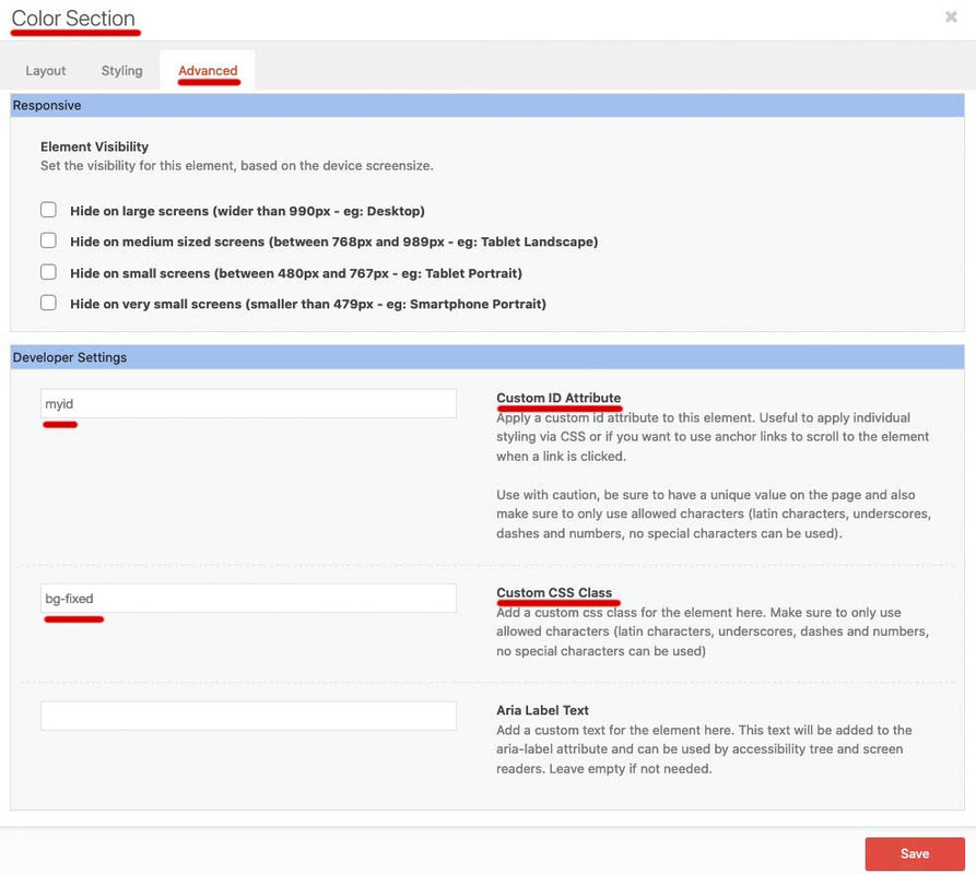
e.g. if you want to navigate to it using anchor link.just create one color-section – give a unique ID to it ( f.e: myid ) and a custom-class : bg-fixed
this custom-class is for all those backgrounds the same only the ID should be unique.
and for your smaller screens set a css to your quick css to change the background images.
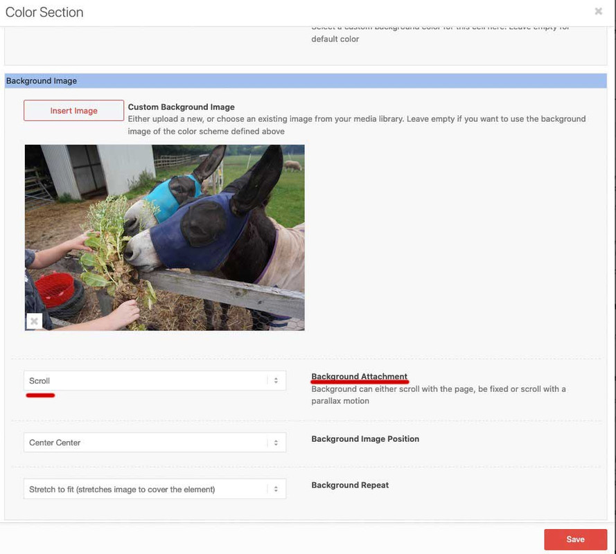
Set the background-image to scroll !!! to avoid the parallax extra container.( PS: Google search on : background-attachment:fixed and mobile browsers – especially IOS ( iphone, ipad etc).
My solution to this problem circumvents the background-attachment : fixed by creating a pseudocontainer with a fixed position.:
This goes to quick css:.bg-fixed { -webkit-clip-path: inset(0 0 0 0); clip-path: inset(0 0 0 0); background-size: 0 !important; overflow: hidden; position: relative; } .bg-fixed:before { content: ""; position: fixed; width: 100%; height: 100%; top: 0; left: 0; background-image: inherit !important; background-repeat: no-repeat !important; background-size: cover; /** or contain - what you need **/ background-position: inherit; /** will-change: transform; - only if you have less then 3 images like that ***/ }this also goes to the quick css:
now you only have to set for smaller screens a different background-image by using the unique ID:@media only screen and (max-width: 767px) { #myid.bg-fixed:before { background-image: url(/wp-content/uploads/alternative-image.jpg) !important; } }see result: https://webers-testseite.de/donkey/
INFO: will-change usage
September 18, 2020 at 11:26 am #1246737Hi Guenni007,
Thanks for your reply. I checked on my mobile and desktop and your fix seems to work when I visit https://webers-testseite.de/donkey/.
When I tried to do this myself however I couldn’t get it to work on my site. I am not a CSS expert and need some help with this!
I added all of that code go into Enfold -> General -> Quick CSS. And then I add an ID to my colour element, and this didn’t work.
Would you be able to make a short support video to help? That would be amazing if so.
I appreciate your time to reply.
Thanks
September 18, 2020 at 11:56 am #1246750Hi islandcommunityhaven,
Can you give us temporary admin access to your website in the private content box below, so that we can have a closer look?
Best regards,
VictoriaSeptember 18, 2020 at 12:17 pm #1246769This reply has been marked as private.September 19, 2020 at 7:52 am #1246973just create one color-section – give a unique ID to it ( f.e: myid ) and a custom-class : bg-fixed
there was a unique ID and a custom-class.The background should be set to scroll
– this avoids the creating of an extra parallax container on mobile devices.
On inserting the custom-class to that input field do it without a dot infront.The class is for creating that pseudo container and could be used for different color-sections even on one page.
The ID is only needed if you want to have different background-images for different screen-width.
the code above is not for the input filed on that alb.
It goes to the quick css from Enfold Options Dialog “General Styling”September 20, 2020 at 12:50 pm #1247094Hi islandcommunityhaven,
I see two sections with parallax and one is empty. Is this on purpose? I do not see the css added. Where are you adding it?
Best regards,
VictoriaSeptember 20, 2020 at 5:27 pm #1247158Hi Victoria,
Considering all the information already provided in this thread and the fact my original message was over 2 weeks ago that was hardly a helpful answer.
I’ve expressed what I would like to happen in previous posts, and it isn’t working, can you help me fix this?
September 20, 2020 at 5:28 pm #1247159Thanks, i’ll try again.
September 21, 2020 at 8:15 am #1247276It is described above and again in the second part:
Id and class,

and especially the background had to be set to scroll.

.bg-fixed { -webkit-clip-path: inset(0 0 0 0); clip-path: inset(0 0 0 0); background-size: 0 !important; overflow: hidden; position: relative; } .bg-fixed:before { content: ""; position: fixed; width: 100%; height: 100%; top: 0; left: 0; background-image: inherit !important; background-repeat: no-repeat !important; background-size: cover; /** or contain - what you need **/ background-position: inherit; /** will-change: transform; - only if you have less then 3 images like that ***/ } @media only screen and (max-width: 767px) { #myid.bg-fixed:before { background-image: url(/wp-content/uploads/alternative-image.jpg) !important; } }There is nothing more I can do than to give a detailed instruction and also show a working test page. If not read carefully, then unfortunately I cannot do more. I will only make instructional films if there is no other way to create clarity.
September 22, 2020 at 1:18 pm #1247611Hi,
This is nice. Using a pseudo element as the background container. Thank you for the info Guenni.
Best regards,
IsmaelNovember 23, 2020 at 9:17 am #1262283an additional setting is needed for safari browsers – that the text in content stayes selectable and clicks are all valid: pointer-events on the before container had to be set to none:
.bg-fixed {
  -webkit-clip-path: inset(0 0 0 0);
  clip-path: inset(0 0 0 0);
  background-size: 0 !important;
  overflow: hidden;
  position: relative;
  top: 0;
}

.bg-fixed:after {
  content: "";
  position: fixed;
  width: 100%;
  height: 100%;
  top: 0;
  left: 0;
  background-image: inherit !important;
  background-repeat: no-repeat !important;
  background-size: cover;
  background-position: inherit;
  pointer-events: none;
  z-index: -1;
  visibility: visible !important;
  /** will-change: transform;    - only if you have less then 3 images like that    ***/
}
PS: sometimes it is good to preserve an existing :before container – then you can use the after pseudo-container.
-
AuthorPosts
- You must be logged in to reply to this topic.
