Hi,
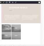
i use 4 columns av_on_fourth in one row. On desktop and mobile it looks good. But on tablets the columns get very small and are positioned on the left (see Screenshot)

Is it possible to get a better responsive Design for that?
best regards
Chris
no idea?
Hi,
Sorry for the late reply!
Please try adding this code to the Quick CSS section under Enfold > General Styling or to your child themes style.css file:
@media only screen and (max-width: 769px) {
.flex_column.av_one_fourth {
width: 100% !important;
margin-left: 0 !important;
}}
Best regards,
Yigit
Hi Yigit
thanks for your answer. i also had your css code. But is it possible to have on tablets two images side by side?
best regards
Chris
