on my site – http://balrajt9.sg-host.com/community/ – can the order of the columns be different on mobile?
I understand that on the desktop version we have some boxes on the left and some on the right. However on mobile we don’t but for the boxes that are in the middle, the image shows below the text. Can this be changed for the mobile version so it is always image first then text below for each color section?
Mockup – https://ibb.co/9HJ3Pvx
see last hint on : https://kriesi.at/support/topic/change-responsive-behavior-collumns/#post-1352986
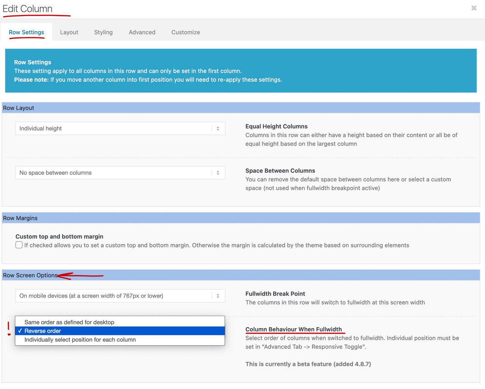
Go to each first column in your Layout where you got the image on the right side ( if you only got 1/2 columns ) the reverse order is what you looking for.
then the right column will be on top on responsive case.

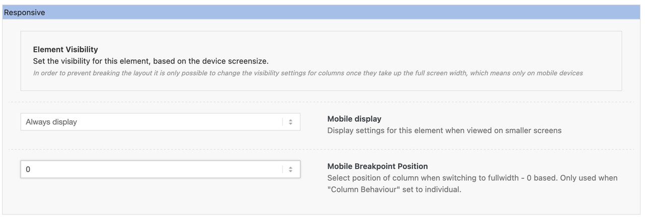
the last option there : “individually select position …” is for column-rows with more than 2 columns – you can set then on advanced tab an order-number of the column.

you had to open then each column of the row to set the position.
Hi,
Thanks for the info @guenni007. The feature is still in beta, so expect a few hiccups here and there, but the responsive options should work well for basic use. We didn’t encounter any issues with it so far.
Best regards,
Ismael
