-
AuthorPosts
-
October 28, 2024 at 9:05 am #1469972
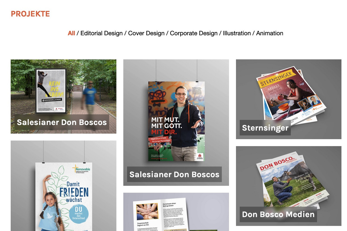
Hi – I want to change the color of the rollover text on the images. It is orange at the moment and it should be white. Please send CSS.
October 28, 2024 at 9:06 am #1469973Also I want the grey shading on mouse over to be a bit stronger .
October 28, 2024 at 10:16 am #1469980Wenn Du selektiver ( und nicht bei allen masonries ) das ändern möchtest musst du eventuell mit custom classes arbeiten.
ja – du könntest den dunklen overlay dunkler machen, oder du entscheidest dich – das Bild bei hover zu soften:
_______If you want to change this more selectively (and not for all masonries), you may need to work with custom classes.
Yes – you could make the dark overlay darker, or you could decide to soften the image on hover:#top #wrap_all .all_colors .av-masonry-entry h3 { color: #FFF; } #top .av-caption-style-overlay .av-masonry-item-with-image .av-inner-masonry-content { background: rgba(0,0,0,.35); -webkit-backdrop-filter: blur(3px); backdrop-filter: blur(3px); }October 28, 2024 at 12:41 pm #1469995Ok super danke. Das hat geklappt
October 28, 2024 at 12:51 pm #1470000Hi,
Thanks for the update. Please let us know if you should need any further help on the topic, or if we can close it.
Thanks @guenni007 for helping out :-)
Best regards,
RikardOctober 28, 2024 at 4:00 pm #1470015Habe grad gesehen, dass in der mobilen Ansicht die Überblendung und der Titel immer da sind. Geht das auch anders?
October 29, 2024 at 4:09 am #1470060Hi,
Thank you for the update.
We adjusted the css a bit so that it only applies on desktop view. Please make sure to purge the cache or remove the browser history before checking.
@media only screen and (min-width: 768px) {
	/* Add your Desktop Styles here */
	#top #wrap_all .all_colors .av-masonry-entry h3 {
		color: #fff;
	}

	#top
		.av-caption-style-overlay
		.av-masonry-item-with-image
		.av-inner-masonry-content {
		background: rgba(0, 0, 0, 0.35);
		-webkit-backdrop-filter: blur(3px);
		backdrop-filter: blur(3px);
	}
}
Best regards,
IsmaelOctober 29, 2024 at 1:31 pm #1470112Sorry misunderstanding. This is not what I meant. Of course the lettering should remain white also on small screens on roll over.
The problem is another. On Mobile view, the title of the image and the masked black blurred background are there from the beginning. Not on rollover. So on mobile one never gets to see the normal image. Only with the writing on top. This is not good.
Please send solution for that.October 29, 2024 at 2:33 pm #1470119sorry – i did not think of that. But – there is no hover style on mobile devices!
So that is normal behaviour for mobile devices – if you do not want that blur and that darker overlay – change the offered rule to:.responsive.avia_desktop #top .av-caption-style-overlay .av-masonry-item-with-image .av-inner-masonry-content { background:rgba(0,0,0,.5); -webkit-backdrop-filter:blur(3px); backdrop-filter:blur(3px) }because mobile devices have on html the class: avia_mobile the default enfold setting will work instead.
October 30, 2024 at 9:46 am #1470218Does not work :( Still the same on mobil.
October 30, 2024 at 12:06 pm #1470232because: there is no hover style on mobile devices!
what did you expect to see? What is what you like to see?f.e.:
.responsive.avia_mobile #top .av-masonry-entry .av-inner-masonry-content { padding: 10px; } .responsive.avia_mobile #top .av-caption-style-overlay .av-masonry-item-with-image .av-inner-masonry-content { background: rgba(0,0,0,.01); } .responsive.avia_mobile #top .av-caption-style-overlay .av-masonry-item-with-image .av-inner-masonry-content-pos, .responsive.avia_mobile #top .av-fixed-size .av-masonry-entry.av-masonry-item-no-image .av-inner-masonry-content-pos { text-align: left; } .responsive.avia_mobile #top #wrap_all .all_colors h3 { font-size: 18px; text-align: left; } .responsive.avia_mobile #top #wrap_all .all_colors .av-masonry-entry h3 { padding: 5px; font-size: 18px; background: rgba(0,0,0,0.3); -webkit-backdrop-filter: blur(3px); backdrop-filter: blur(3px); position: relative; width: auto !important; text-transform: none; } .responsive.avia_mobile #top .av-inner-masonry-content-pos-content { display: inline-block !important; position: absolute; top: auto; bottom: 10px; }November 6, 2024 at 10:19 pm #1470790Ok that worked. Somewhat.
1. After i put in your css, the background image of the top colorsection disappeared. Why might this be? Please can I have it back.
2. the titels of the images in the masonry gallery are aligned to the left. I tried to align them to the center by changing the css but then they moved to the right. Is it possible to have them centered?Best
November 7, 2024 at 9:41 am #1470827Otherwise great. Fantastic, all the things that are possible with CSS. Its just the top image that needs to come back. See my message above. Otherwise its great.
November 8, 2024 at 8:31 am #1470887Hi,
Thank you for the update.
The background image is visible when we checked as shown in the screenshot (see private field). Please try to remove the browser history completely or check the page on a different browser.
Best regards,
IsmaelNovember 8, 2024 at 10:09 am #1470889i can see that too! So must be a caching problem.
By the way: if you do not need bigger menu-items in hamburger menu – you can make that overlay smaller ( goto Main Menu – Burger/Mobile Styliing : “Flyout Width”) try 200px
-
AuthorPosts
- You must be logged in to reply to this topic.

