Tagged: grid_row
-
AuthorPosts
-
June 3, 2023 at 1:02 am #1409455
I can’t try the way to align vertically to bottom some buttons on a grid row

Can someone help me please?
June 3, 2023 at 6:24 am #1409459is there a link to your site?
Or better make a screenshot of the layout you have. From the frontend screenshot we could not see if the content inside the grid-cells is in one container or more than one container etc.June 3, 2023 at 7:44 am #1409460Of course!
The website is https://nireproiektuak.eu/
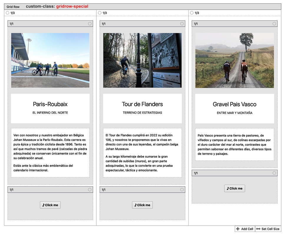
Inside the grid cells are not any container. In each column are: an image, a headline, text area and a button.
I attached the image of backend to see it.
Thanks in advance
 June 3, 2023 at 6:20 pm #1409489
the problem with it is the flex_cell_inner container – it hampers the absolute positioning of the button-wrapper.
if you need this more than once – give a custom-class to those grid-rows – i now adjusted the code to that page only by ID.
so to get rid of that container under preserving the child elements put this to your child-theme functions.phpfunction get_rid_of_flex_cell_inner(){ ?> <script type="text/javascript"> window.addEventListener("DOMContentLoaded", function () { (function($) { $('#top.home #av-layout-grid-1 .flex_cell_inner > *').unwrap(); })(jQuery); }); </script> <?php } add_action('wp_footer', 'get_rid_of_flex_cell_inner');put this to your quick css:
@media only screen and (min-width: 768px) {
  .responsive #top.home #wrap_all #av-layout-grid-1 .flex_cell {
    padding-bottom: 100px !important
  }
  #top.home #av-layout-grid-1 .avia-button-wrap {
    position: absolute;
    top: calc(100% - 80px);
    width: 33%;
  }
}
EDIT: – sorry i see that you got a lot of translations – so best ist to give a custom-class to that grid-row ( on all translated pages )
e.g. : gridrow-special and use thatIf it is only that page – it is on all translations the home page – so #top.home will be a good selector for it – see above
June 3, 2023 at 6:36 pm #1409490btw: for your language switcher it might be better if you have a bit more distance between each other and to better have contrast to the background – so give it a try:
.gt_switcher_wrapper {
  padding: 5px;
  background-color: rgba(255,255,255,0.5);
  border-radius: 5px;
  -webkit-backdrop-filter: blur(3px);
  backdrop-filter: blur(3px);
}

.gt_switcher_wrapper a {
  margin-right: 5px
}
and try:
#titulo_portada .av-special-heading-tag {
  text-shadow:
   -1px -1px 0 #000,
    1px -1px 0 #000,
    -1px 1px 0 #000,
     6px 6px 10px #000;
}
June 4, 2023 at 9:53 am #1409520Thanks for all the details.
It works perfectly.
YEs, I need to use this grid in various pages. You explained to used gridrow-special as class for the grid.
But I try to used like that changing the code default but can’t obtained the results.
June 4, 2023 at 6:23 pm #1409555So you don’t have to set this class for all home pages, just leave the lines included.
For the other grid-row elements you then have to set the custom-class gridrow-specialfunction get_rid_of_flex_cell_inner(){ ?> <script type="text/javascript"> window.addEventListener("DOMContentLoaded", function () { (function($) { $('#top.home #av-layout-grid-1 .flex_cell_inner > *').unwrap(); $('#top .gridrow-special .flex_cell_inner > *').unwrap(); })(jQuery); }); </script> <?php } add_action('wp_footer', 'get_rid_of_flex_cell_inner');@media only screen and (min-width: 768px) { .responsive #top.home #wrap_all #av-layout-grid-1 .flex_cell, .responsive #top #wrap_all #main .gridrow-special .flex_cell { padding-bottom: 100px !important } #top.home #av-layout-grid-1 .avia-button-wrap, #top #wrap_all #main .gridrow-special .avia-button-wrap { position: absolute; top: calc(100% - 80px); width: 33%; } }It goes without saying that if you take 4 grid cells you have to adjust the width of the button-wrapper to 25%.
If you switch at 989px – you need to change the media query to that as well.June 4, 2023 at 6:44 pm #1409559Whereas I actually like the use of columns within grid cells. Then I would put the element which should be placed at the bottom in the same height in an extra 1/1 column – the rest doesn’t matter.
In that case the snippet for functions.php would stay the same, but the css would now refer to the last column instead of the button-wrapper.@media only screen and (min-width: 768px) { .responsive #top #wrap_all #main .gridrow-special .flex_cell { padding-bottom: 100px !important } #top #wrap_all .gridrow-special .flex_cell .flex_column:last-of-type { position: absolute; margin-top: 0px; top: calc(100% - 80px); width: 33%; } }in the case that on the last 1/1 container is more content – you had to adjust those shift values of padding-bottom and top: calc … !
The height of that last 1/1 container had to be at least the padding-bottom on the cellsBut: if you got troubles on that – just get back to me ;)
June 7, 2023 at 10:40 pm #1409921This reply has been marked as private.June 9, 2023 at 5:11 pm #1410085 -
AuthorPosts
- You must be logged in to reply to this topic.

