
Tagged: Button Row, length, style bzttons
-
AuthorPosts
-
September 8, 2025 at 7:26 am #1489045
Hello everyone,
First of all, kudos for the support and theme development.
I probably only have a minor problem.
On the test page, I:1) created a row of buttons. However, for some reason, I can’t control them properly with CSS.
2) More importantly, although I managed to limit the maximum size of the buttons, this also applies to mobile devices. A width of 100% would definitely be useful here.
The idea is that the buttons should also be a kind of text cloud, so that I have both buttons and text content.
Is there a simple solution here? Attached is the code I’ve put together, but it’s not working properly.
Many thanks.
Matthias
My Code:/* buttonrow max width of Buttons*/
#top .avia-buttonrow-wrap a {
  max-width: 50% !important;
  font-weight: 500!important;
}
@media only screen and (max-width: 767px) {
.avia-buttonrow-wrap a {
max-width: 100% !important;
font-weight: 500!important;
}
}/* buttonrow Font size on desktop */
#top .textcloud .avia-button
{text-align:left!important;
font-weight:500!important;
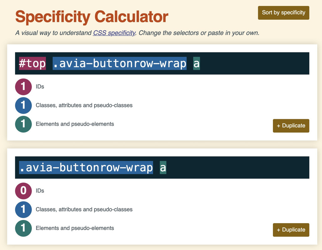
}September 8, 2025 at 12:38 pm #1489053your rule:
#top .avia-buttonrow-wrap a { max-width: 50% !important; font-weight: 500!important; }the selector is more specific because it has one ID that counts much more than classes.
thats the reason why the selector : .avia-buttonrow-wrap a does not win the race ;)so try:
#top .textcloud .avia-button {
  text-align:left!important;
  font-weight:500!important;
}

#top .avia-buttonrow-wrap a {
  max-width: 50% !important;
  font-weight: 500!important;
}
@media only screen and (max-width: 767px) {
  #top .avia-buttonrow-wrap a {
    max-width: 100% !important;
  }
}
https://specificity.keegan.st/
 September 8, 2025 at 1:07 pm #1489054
Thank you Guenni007, perfect work!
-
AuthorPosts
- The topic ‘Button row length of the buttons’ is closed to new replies.