
-
AuthorPosts
-
January 15, 2025 at 9:40 am #1475134
Hello,
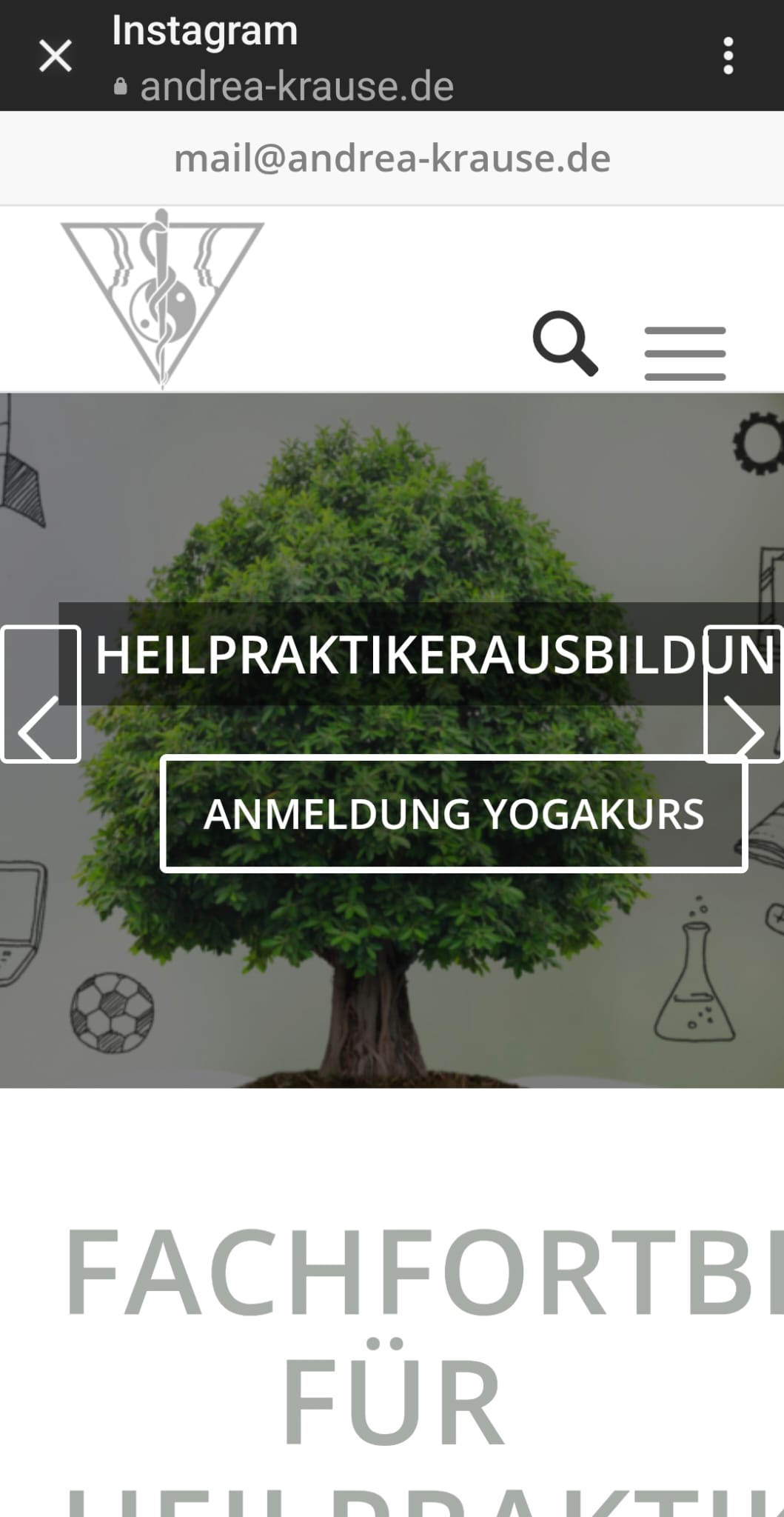
I added a button to my homepage that appears wonderfully in the middle of large screens. When I look at it in cell phone size, the two buttons are not in the middle and are offset. It would be very nice if I could get help on how to get the two link buttons in the middle in the hand view. Thank you very much for your help.January 15, 2025 at 12:42 pm #1475142Hallo,
i have seen in Phone size the footer image not in the middle too….
best regards und thank you for your answer
A. Krause
January 15, 2025 at 4:48 pm #1475159Hi,
Did you try to set a smaller font size for the heading on mobile sizes? You can do so in the Styling tab once you click into each slide.
Best regards,
RikardFebruary 20, 2025 at 9:32 pm #1477502426 / 5.000
Hello Rikard,sorry, a bit late – thanks for your answer.
I had already tried your suggestion. It looks very good on iPhones; but unfortunately on Android phones I saw this distorted image.
Everything is great on the desktop and on the iPad; I also adjusted the tab for the different devices.
Do you perhaps have another idea for me??
Thanks for your effort and kind regards
Andrea
February 21, 2025 at 1:47 pm #1477553Hi,
Thanks for the update. Could you post a screenshot highlighting the problem, and how to reproduce it please?
Best regards,
RikardMay 25, 2025 at 4:47 pm #1484652Hi Rikard,
sorry i’m very late for answering your Question.
here is a photo of my page on an Android phone – unfortunately, everything is misaligned. On Apple phones, tablets, and desktops, everything works perfectly.”https://www.andrea-krause.de/wp-content/uploads/2025/05/Android.jpeg
thank you for your help and
Best regards,Andrea
June 1, 2025 at 5:02 pm #1484939 -
AuthorPosts


- You must be logged in to reply to this topic.