-
AuthorPosts
-
July 5, 2022 at 5:27 pm #1357302
Hi,
On the web page supplied, I have 3 x Columns that have header/text/button. The text various in length which makes the buttons out of alignment when viewing on a desktop.
Is there a way to align the buttons, regardless of the text length? I was thinking of putting in a Grid and setting the height as fixed but that would not align the buttons at the bottom of each column?
Your advise would be appreciated.
Thanks
MarcusJuly 6, 2022 at 3:16 am #1357343Hey woogie07,
Thank you for the inquiry.
This is possible but you have to create a custom script that specifies the height of the columns based on the tallest one. You can also apply a minimum height to the content or text block, but this will have to be adjusted on different screen sizes using css media queries. Applying a custom css class name will definitely be necessary in either of the cases above.
// https://kriesi.at/documentation/enfold/add-custom-css/
Best regards,
IsmaelJuly 6, 2022 at 9:02 pm #1357451Hi,
If I only want to apply to the 3 columns with text and buttons, what would the css code and css class name be?
Thanks
MarcusJuly 7, 2022 at 7:00 am #1357493Hi Marcus,
Please try adding this CSS code in Enfold > General Styling > Quick CSS:
/** Desktop **/
@media only screen and (min-width: 1200px) {
  .page-id-9 #after_grid_row_2 .av_one_third .avia_textblock {
    min-height: 248px;
  }
}

/** Tablet: Landscape **/
@media only screen and (min-width: 980px) {
  .page-id-9 #after_grid_row_2 .av_one_third .avia_textblock {
    min-height: 300px;
  }
}

/** Tablet: Portrait **/
@media only screen and (min-width: 768px) {
  .page-id-9 #after_grid_row_2 .av_one_third .avia_textblock {
    min-height: 390px;
  }
}
Best regards,
NikkoJuly 7, 2022 at 10:35 am #1357506Thanks
There is still a large gap between the text and button when I apply.
Can this be reduced by adjusting pixels?Thanks
MarcusJuly 7, 2022 at 12:48 pm #1357524Hi Marcus,
I apologize I put it in the wrong order, please replace the code I gave with this and adjust the values as you see fit:
/** Tablet: Portrait **/
@media only screen and (min-width: 768px) {
  .page-id-9 #after_grid_row_2 .av_one_third .avia_textblock {
    min-height: 390px;
  }
}

/** Tablet: Landscape **/
@media only screen and (min-width: 980px) {
  .page-id-9 #after_grid_row_2 .av_one_third .avia_textblock {
    min-height: 300px;
  }
}

/** Desktop **/
@media only screen and (min-width: 1200px) {
  .page-id-9 #after_grid_row_2 .av_one_third .avia_textblock {
    min-height: 248px;
  }
}
Best regards,
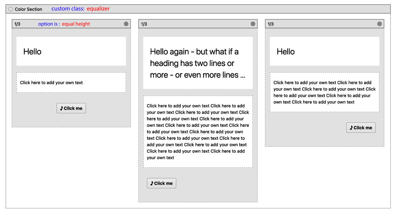
NikkoJuly 7, 2022 at 8:33 pm #1357604mayby this is an option : https://webers-web.info/woogie/
__________________________
Testpage Layout is:

to quick css:
.equalizer .flex_column {
  padding-bottom: 60px !important;  /*** depends on your button dimensions ***/
}

.equalizer .av-special-heading {
  min-height: 80px;  /*** maybe you have to adjust it for responsive case - when more lines will be present ***/
}

.equalizer .flex_column .avia-button-wrap {
  position: absolute;
  bottom: 10px;
  left: 0;
  width: 100%;
  padding: 0 20px; /*** synchronize the 20px value  with your column setting padding ***/
}
July 15, 2022 at 7:46 pm #1358534it is so simple – but my dear participants are not really interested in a good solution ;) very sad!
July 15, 2022 at 8:20 pm #1358550November 17, 2022 at 1:32 pm #1372941But I am, @Guenni007 !
Your participation and solutions are very much appreciated.Thanks!
Karin -
AuthorPosts
- You must be logged in to reply to this topic.
