
-
AuthorPosts
-
December 11, 2025 at 2:29 am #1492377
Hi – I added a logo to my burger menu, but it is also showing in my main navigation and my footer menu.
I have added this to my Quick CSS:
/* Burger Menu Logo */
.only_mobile { display: none; }@media only screen and (max-width: 989px) {
/* Add your Mobile Styles here */
.only_mobile { display: block; }
}And my menu item is set up like this:
https://q12.6af.myftpupload.com/wp-content/uploads/2025/12/Screenshot-2025-12-11-at-02.00.32.pngHow do I hide the logo from my main navigation and my footer menu widget?
Thank you for your help : )December 11, 2025 at 9:32 am #1492394Hey envisageiam,
Thank you for the inquiry.
Did you remove the logo menu item? We’re not seeing it at all on the front end, neither in the desktop nor the mobile menu. Please add the menu item again so we can check it properly.
Best regards,
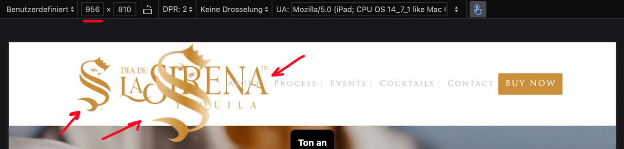
IsmaelDecember 11, 2025 at 12:28 pm #1492411Yes it is still there. In the burger menu it is showing correctly:
https://q12.6af.myftpupload.com/wp-content/uploads/2025/12/IMG_9758.pngBut, in the main navigation on desktop it is showing like this:
https://q12.6af.myftpupload.com/wp-content/uploads/2025/12/Screenshot-2025-12-11-at-12.17.58.pngAnd all the pages on desktop and only some of the pages on mobile it is showing in the footer like this:
https://q12.6af.myftpupload.com/wp-content/uploads/2025/12/IMG_D04AFBB70D96-1.jpegI have tested on multiple devices and platforms and I am getting the same error. I have included a login for your review.
Thank you so much. I’m very grateful for your help.December 12, 2025 at 7:48 am #1492444Hi,
Thank you for the screenshots.
There was an invalid line (———) in the Quick CSS field that prevented all css below it — including the menu item logo styling — from working correctly. We removed the line. Please make sure to purge the cache before testing.
Best regards,
IsmaelDecember 12, 2025 at 8:08 am #1492450and do not rule it by media query but only with the different selectors:
#avia-menu .only_mobile {
  display: none;
}
and for the footer:
#menu-main-menu .only_mobile {
  display: none;
}
/ *** or ***/
#footer-page .only_mobile {
  display: none;
}
because the menu on desktop got an ID and the burger menu is inside .av-burger-overlay and got the id: av-burger-menu-ul
by the way: I can understand it in the case of the hamburger menu, because here it is a copy of the main menu.
But you must have created your footer menu as an extra menu. Why did you put the logo there?December 12, 2025 at 9:27 am #1492459Ok thank you. Everything looks great on desktop, but on mobile the logo is still showing in the footer menu.
In regards to your question, the only logo in the footer should be in column 1. There should not be a logo in the footer menu.
December 12, 2025 at 9:42 pm #1492471please do clear all cachings
do not rule it by media query but only with the different selectors
you have still this inside your css: – please remove it
@media only screen and (max-width: 767px) {
  .responsive #top .av-main-nav .menu-item {
    display: none;
  }
}
this works great on DEV Tools for your staging page – if you got different selectors or settings for the page itself – then you have to give us the final link
#avia-menu .only_mobile {
  display: none;
}
#footer-page .only_mobile {
  display: none;
}
December 13, 2025 at 4:35 pm #1492483Hi,
When I check it looks correct now on mobile & desktop, if this is solved please let us know so we can close this thread.Best regards,
MikeDecember 13, 2025 at 4:49 pm #1492485The logo is still showing in the footer navigation under the word “Explore”. I tried adding the suggested styling but that didn’t work. Please share a screen shot of what you are viewing to make sure we are looking at the same thing.
This is not in my CSS, I dont know where you are seeing this:
@media only screen and (max-width: 767px) {
.responsive #top .av-main-nav .menu-item {
display: none;
}
}
I tried adding the suggested code but it didn’t work : (December 13, 2025 at 5:13 pm #1492487Hi,
For your footer on mobile you have this css:@media only screen and (max-width: 989px) { .only_mobile { display: block; } }I changed to:
@media only screen and (max-width: 989px) {
    .only_mobile {
        display: block;
    }
   #footer-template .only_mobile {
        display: none;
    }
}
Now it only shows in the mobile menu & not the footer. Please clear your cache and check.
Best regards,
MikeDecember 15, 2025 at 8:51 am #1492514there is still something wrong:
I’ll try again – please read it carefully
The menu you see above as a text menu and the menu you see in the hamburger menu have the same source but different selectors. So you don’t need to set up a media query to hide the logo in the top text menu. This is particularly advantageous in your case, as given the nature of your text menu, it would certainly be better to display the hamburger menu earlier (1085px) than would be possible at 768px. Your text menu overlaps the main logo long before it displays the hamburger icon.for having an earlier hamburger icon you only need here a media query setting:
@media only screen and (max-width: 1085px) {
    #top #header .av-main-nav > li.menu-item  {
        display: none !important;
    }
    #top #header .av-burger-menu-main {
        cursor: pointer;
        display: block !important;
    }
}
Remove all media query settings for your only_mobile logo from your Quick CSS, with the exception of the existing global rule.
(This is why it already works for the footer area.).only_mobile { display: none; }you now only have to show it again for the hamburger menue:
#av-burger-menu-ul .only_mobile {
  display: block;
}
thats all.
btw: here are the selectors for your logos inside your menues:
top text menue: #avia-menu .only_mobile
hamburger menue: #av-burger-menu-ul .only_mobile
footer menue: #menu-main-menu .only_mobileDecember 15, 2025 at 9:03 am #1492515btw. with your semi-transparent flacon at the bottom – maybe it is nice to have the burger overlay semi-transparent.
.html_av-overlay-side #top .av-burger-overlay-scroll {
  background-color: rgba(255,255,255,0.7);
  backdrop-filter: blur(10px)
}

#av-burger-menu-ul .only_mobile img {
  filter: drop-shadow(1px 1px 2px #aaa)
}
December 15, 2025 at 9:14 am #1492518next hint:
you can have it for smaller screens this way – and only for very small screens in a single row.
@media only screen and (max-width: 767px) {
  #footer-template .entry-content-wrapper {
    display: flex;
    flex-flow: row wrap;
    justify-content: space-between;
    gap: 20px 0
  }
  #footer-template .entry-content-wrapper:before,
  #footer-template .entry-content-wrapper:after {
    display: none;
  }
  #footer-template .entry-content-wrapper .flex_column {
    flex: 0 1 48%;
    width: unset !important;
    margin: 0;
  }
  #footer-template .entry-content-wrapper .flex_column.first {
    flex: 1 1 100%;
  }
}

@media only screen and (max-width:449px) {
  #footer-template .entry-content-wrapper .flex_column {
    flex: 1 1 100%;
  }
}
December 15, 2025 at 1:22 pm #1492529Ok great, everything is showing correctly now.
Thank you very much for your help on this. I am grateful for your time.
I hope you have an amazing day!December 15, 2025 at 9:51 pm #1492542Hi,
Glad that Guenni007 could help, thank you Guenni007, if you have further questions please open a new thread and we will try to help. Thanks for using Enfold.Best regards,
Mike -
AuthorPosts
- The topic ‘Burger Menu Logo Showing In Main Navigation/Footer Menu’ is closed to new replies.