
-
AuthorPosts
-
May 17, 2022 at 11:02 am #1352045
Hello,
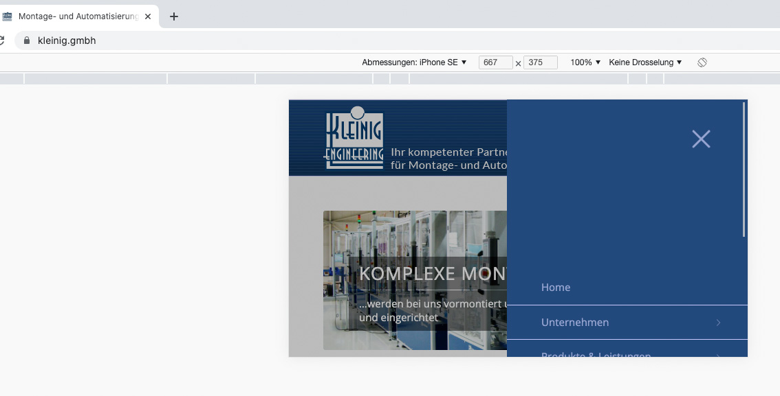
I keep having the problem with the menu display on the smartphone in landscape. For example, on the page https://kleinig.gmbh/ with smartphone across, the content is cut off at the bottom. A different display of the menu as on the page https://lackpoint-triebes.de/ does not help either, it is also cut off.
I also once managed to keep the menu up with a code. But then it looks silly on an iPad, for example. Then it hangs at the top, which looks wrong. What could one do there?regards,
MartinMay 17, 2022 at 12:40 pm #1352061Hi Martin,
I’m not sure that I fully understand the problem you are having, could you share screenshots highlighting it please? If you could let us know in which browser and screen dimension it happens on as well, then that would be helpful.
Best regards,
RikardMay 17, 2022 at 1:29 pm #1352072Just call up the pages on the smartphone and turn it sideways. Then click on the menu. It’s barely visible. You can scroll it up, but there has to be a better way.
I would like the menu to be fully visible when I view the page like this.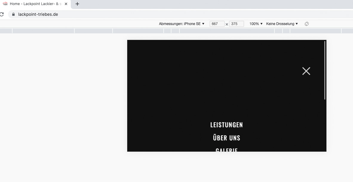
 May 17, 2022 at 5:20 pm #1352099
Hi,
Please try the following in Quick CSS under Enfold->General Styling:
@media (orientation: portrait) and (max-width: 1024px) {
#top #av-burger-menu-ul {
    vertical-align: top;
}
}
Best regards,
RikardMay 18, 2022 at 10:20 am #1352160Hello Ricard,
thank you very much, but this is not a good solution. I don’t want the menu to be at the top all the time. Only if it is truncated horizontally like on a smart phone. For me this is a bug and should be fixed by Kriesi.
regards,
MartinMay 18, 2022 at 2:42 pm #1352185Hi Martin,
Please try this CSS instead:
@media (orientation: landscape) and (max-width: 1024px) {
#top #av-burger-menu-ul {
    vertical-align: top;
}
}
Best regards,
RikardMay 24, 2022 at 9:41 am #1352733Thank You Rikard, it works!!!!
May 24, 2022 at 12:24 pm #1352752Hi,
Glad Rikard could help, if you have any further questions please create a new thread and we will gladly try to help you. Thank you for using Enfold.Best regards,
Mike -
AuthorPosts
- The topic ‘Burger menu incorrect on smartphone across’ is closed to new replies.