Tagged: bug, color section, Short Separator
-
AuthorPosts
-
August 30, 2018 at 7:22 pm #1003751
I have two color sections. Both have no padding and no borders.
I end up with too much of a gap when viewing on mobile (trying to work with Enfold and mobile layout is getting too much like hard work guys!)I insert a Short Separator between the color sections and my top section decides it will have a bottom 1px border :(
Please try it before asking for a link to a website you can’t get to as it is under development.
Thanks,
August 31, 2018 at 4:53 am #1003895Hey Heathcliffe,
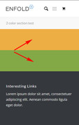
I tried to duplicate what you explained above, but I made my color sections have a background color so I could see the space in mobile. Here is my results with just the two color sections:

and here is when I added a a short separator between the color sections:

So as you see in the first screenshot the two color sections have no gap, and in the second screenshot the short separator has a top & bottom padding of 50px, giving a gap.
Is this what you mean?Best regards,
MikeSeptember 3, 2018 at 11:00 pm #1005220@Mike
Forget mobile. This is not a mobile issue, sorry for the confusion. (I am creating the short separator because of limitations, but that’s a whole other issue with Enfold).If you create two colour sections (but do not fill them with a background color or you will not see the issue).
My content for Colour Section1 is 2/3 Easy Slider 1/3 Header + Custom Separator (fat 50px, 10px top margin, 15px bottom margin, no icon) + Text Box
My content for Colour Section2 is 2/3 Text Box 1/3 Easy Slider.No Borders or padding.
Now if you add a short separator between the two color sections the bottom of the Section 1 has a bottom border.Has Enfold support considered taking an active role in the Facebook Groups (or created their own where they can help their user base) this would be most useful where it is much easier to paste screenshots etc and involve many other people?
September 4, 2018 at 12:29 pm #1005480Hi,
Thank you for the clarification. I have checked the color section as you mentioned and I’m unable to reproduce the gap you mentioned.
If you still have any issue please upload a screenshot/mockup to one of the below sites and share the link here so we can help you better :)
https://snag.gy/
https://ctrlv.cz/en/
https://imgur.comBest regards,
VinaySeptember 14, 2018 at 1:49 am #1009748Hi @Vinnay,
Thanks for the reply. The issue is not a “gap”, the issue is the color section displays a border at the bottom ONLY when you insert a short seperator between the two color sections. Remove the short separator and it goes. put it back again, and the border comes back.
Both color sections are defined as having NO border or padding.
I made a workaround, but went back to reproduce it so you can take a look.This is before I insert the short separator: https://imgur.com/a/4WGLNDn
This is after I insert the short separator: https://imgur.com/a/4WGLNDn
I hope this helps. I know it seems a real small issue, but it is a huge issue when trying to get a clean page with whitespace ;)
September 17, 2018 at 5:27 am #1010555Hi,
You can actually replace the separator with another color section if the intention is to create space between two color sections. The theme automatically wraps any elements situated outside a parent container inside a color section. This section has a default top border which can be easily removed with css. I’m sure you’ve already figured out the required css.
Best regards,
IsmaelSeptember 18, 2018 at 2:57 pm #1011323Thanks @Ismael,
Surely if this is the case, you would not expect the theme to add styling and instead use a parent container set to NO border.
Yes, I figured it out, but not with CSS.
Thanks for the reply. Hope the comments goes back to development ;)
September 19, 2018 at 3:54 am #1011595Hi,
I don’t really think this can be considered as a bug because that is the default style of the generated color section. If you don’t want to see that border, wrap the separator inside a color section and then disable the top and bottom border style.
Best regards,
IsmaelSeptember 20, 2018 at 1:02 am #1012074ah gotcha!
Sorry @Ismael, yes, now I understand the cause and how to avoid.
Many thanks,
HSeptember 20, 2018 at 8:48 am #1012169 -
AuthorPosts
- The topic ‘bug with insert short separator’ is closed to new replies.
