-
AuthorPosts
-
November 10, 2020 at 11:29 pm #1259699
I am an experienced Enfold user, but I cannot figure out how to do one thing right now ….
I want to place a text box inside of a 1/2 box, which is inside of a color section. The 1/2 box would have a semi-transparent background. What I want to do is have the semi-transparent background bleed to the screen. Is there any way to do this?
Here is a picture of what I want to accomplish: https://www.dropbox.com/s/tog2cb06xeh56s9/Hero%20impage%20example.png?dl=0.
See the white box? I want it to go to the far left of the screen.Thank you.
November 11, 2020 at 9:35 am #1259797Hey rmatus,
Thanks for the screenshot. Could you post a link to where we can see the actual element on your site as well please?
Best regards,
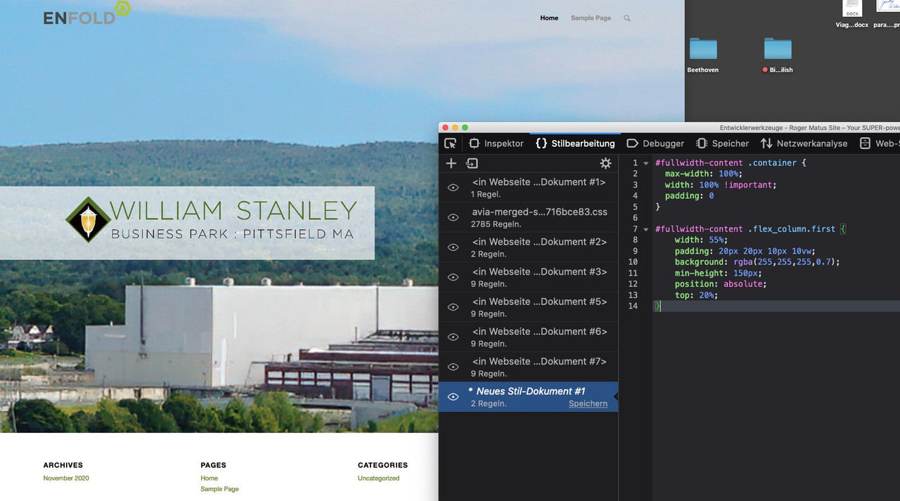
RikardNovember 11, 2020 at 10:46 am #1259816give a custom class or in my case a unique ID to the color-section: fullwidth-content
then to quick css:#fullwidth-content .container { max-width: 100%; width: 100% !important; padding: 0 } #fullwidth-content .flex_column.first { width: 55%; padding: 20px 20px 10px 10vw; background: rgba(255,255,255,0.7); min-height: 150px; position: absolute; top: 20%; }see example page: https://webers-testseite.de/rmatus/
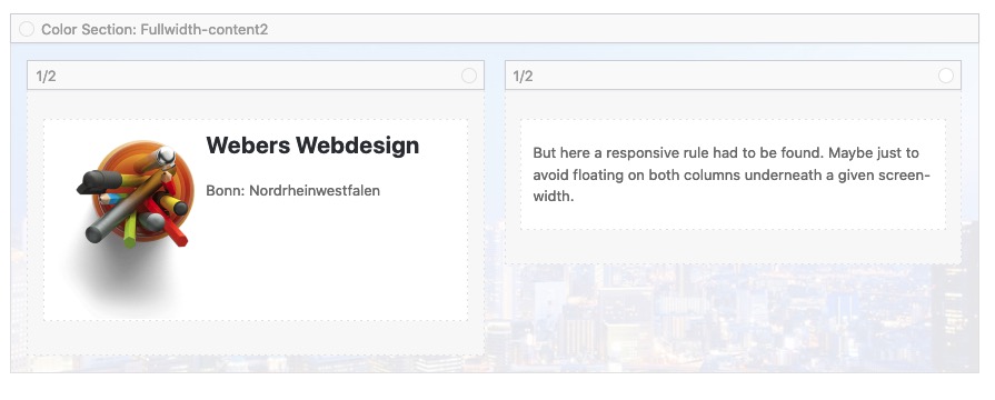
November 11, 2020 at 10:57 am #1259819this is css for the possibility to have a neightbour container to that “flag” on the left
second color-section got a unique ID : fullwidth-content2

#fullwidth-content2 .container .content {
  vertical-align: top !important;
}

#fullwidth-content2 .post-entry {
    position: relative;
    top: 20%;
}

#fullwidth-content2 .container {
  max-width: 100%;
  width: 100% !important;
  padding: 0
}

#fullwidth-content2 .flex_column.first {
  width: 55%;
  padding: 20px 20px 10px 10vw;
  background: rgba(255,255,255,0.7);
  min-height: 150px;
  position: relative;
  float: left;
}

#fullwidth-content2 .flex_column.avia-builder-el-last {
  position: relative;
  float: left;
  width: 30%;
}

@media only screen and (max-width: 767px) {
  #fullwidth-content2 .flex_column.avia-builder-el-last {
    float: none;
    width: calc(100% - 100px) !important;
    margin: 0 50px !important;
  }
  #fullwidth-content2 .flex_column.first {
    float: none;
    width: calc(100% - 50px) !important;
    margin-right: 50px
  }
}
November 11, 2020 at 10:04 pm #1259972Hi rmatus,
Did you get it working for you with Guenni007’s suggestion or do you need more help?
Best regards,
VictoriaNovember 11, 2020 at 11:34 pm #1260002Yes, I tried Guenni007’s suggestion and I just got it to work.. Thank you so much!
-
This reply was modified 5 years, 4 months ago by
rmatus.
November 11, 2020 at 11:52 pm #1260013November 11, 2020 at 11:56 pm #1260017but please try the second solution. It seems the better one for responsive case:
#fullwidth-content .container .content {
  vertical-align: top !important;
}

#fullwidth-content .post-entry {
    position: relative;
    top: 5%;
}

#fullwidth-content .container {
  max-width: 100%;
  width: 100% !important;
  padding: 0 !important;
  margin: 0 !important;
}

#fullwidth-content .flex_column.first {
  width: 55%;
  padding: 20px 20px 10px 10vw;
  background: rgba(255,255,255,0.7);
  position: relative;
  float: left;
}

#fullwidth-content .flex_column.avia-builder-el-last {
  position: relative;
  float: left;
  width: 30%;
}

@media only screen and (max-width: 767px) {
  #fullwidth-content .flex_column.avia-builder-el-last {
    float: none;
    width: calc(100% - 100px) !important;
    margin: 0 50px !important;
  }
  #fullwidth-content .flex_column.first {
    float: none;
    width: calc(100% - 50px) !important;
    margin-right: 50px
  }
}
November 12, 2020 at 3:51 am #1260038Oh, this is so much better. Thank you!
November 12, 2020 at 2:02 pm #1260130Hi,
Great, I’m glad that you got it working and thanks @guenni007 for helping out. Please let us know if you should need any further help on the topic or if we can close it.
Best regards,
Rikard -
This reply was modified 5 years, 4 months ago by
-
AuthorPosts
- You must be logged in to reply to this topic.


