
-
AuthorPosts
-
July 6, 2025 at 3:38 pm #1486373
Hi,
I’ve put a header photo on top of the page here https://www.thevelvetvampire.de/
First it looks fine scaling, but on iPhone (14pro) and I think in general on mobile, there is a blank space at some time.
How can I get rid of it?
Thank you in advance for your help.
Kind regards,
VeronikaJuly 7, 2025 at 5:06 am #1486381Hey Loveronika,
Thank you for the inquiry.
Try to add this css code to adjust the size of the slider image.
@media only screen and (max-width: 489px) {
  /* Add your Mobile Styles here */
  .avia-slideshow li img {
    width: 100%;
    background-size: cover;
    height: 300px;
    object-fit: cover;
  }
}
Please toggle or temporarily disable the Enfold > Performance > File Compression settings in order to make sure that the changes take effect.
Let us know the result.
Best regards,
IsmaelJuly 7, 2025 at 9:16 am #1486389Hi Ismael,
thank you for the code. But now part of the picture left and right is not visible. What can I do?
Kind regards,
VeronikaJuly 8, 2025 at 6:58 am #1486440Hi,
Yes, that’s the drawback of using the css rule. You can set the background-size to contain to make the image fully visible, but that would bring back the original issue.
Another option is to decrease the height of the slider so that its aspect ratio matches the slider image. Please remove the previous css code and replace it with:
@media only screen and (max-width: 489px) {

  /* Add your Mobile Styles here */
  .avia-slideshow li img {
    width: 100%;
    background-size: cover;
    height: 200px;
    object-fit: cover;
    left: 30px !important;
    position: relative;
    overflow: visible;
  }

  .home #full_slider_1,
  .home #full_slider_1 .avia-slideshow,
  .home #full_slider_1 .avia-slideshow-inner,
  .home #full_slider_1 .avia-slide-wrap {
    min-height: 200px;
  }

  .home #full_slider_1,
  .home #full_slider_1 .avia-slideshow,
  .home #full_slider_1 .avia-slideshow-inner,
  .home #full_slider_1 .avia-slide-wrap {
    min-height: 200px;
    height: 200px !important;
  }
}
Best regards,
IsmaelJuly 8, 2025 at 9:22 am #1486443on default the fullwidth-slider is responsive. I am not aware that this behavior should not apply to mobile devices.
I guess you have entered a min-height option on styling tab: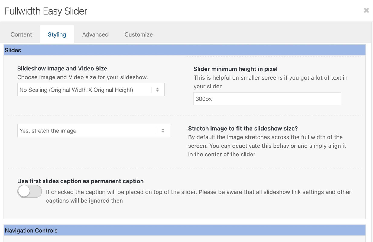
You have already ensured that the font is hidden on very small screens. But you could just as easily make them smaller.
July 9, 2025 at 2:00 pm #1486514Hi Isamel,
for mobile view the picure is still cropped left and right und now there’s a blank space on the left.Hi Guenni,
yes there was a slider minimum height set, I have removed it now.Kind regards,
VeronikaJuly 9, 2025 at 6:18 pm #1486524All you need is to get rid of the min-height option – the fullwidth slider is a responsive slider !
for the caption it might be neccessary to have for very small screens smaller font-sizes – or to set a part (f.e. the avia-caption-content to display:none )
you got a rule :
@media only screen and (max-width: 489px) {
  .avia-slideshow li img {
    width: 100%;
    background-size: cover;
    height: 200px;
    object-fit: cover;
    left: 30px !important;
    position: relative;
    overflow: visible;
  }
}
Remove the rules given to you by ismael first because …
remove the left position – and height – otherwise you will have a gray bar on the left ;)
then there are some min-height properties:
inline-styles
@media only screen and (max-width: 489px) {
  .home #full_slider_1, .home #full_slider_1 .avia-slideshow,
  .home #full_slider_1 .avia-slideshow-inner, .home #full_slider_1 .avia-slide-wrap {
    min-height: 200px;
    height: 200px !important;
  }
}
and enfold css:@media only screen and (max-width: 479px) { .home #full_slider_1, .home #full_slider_1 .avia-slideshow, .home #full_slider_1 .avia-slideshow-inner, .home #full_slider_1 .avia-slide-wrap { min-height: 300px; } }don’t know where they come from. But if you like to see the full width of the image – these settings are suboptimal.
July 9, 2025 at 6:28 pm #1486525and after doing that – try:
@media only screen and (max-width: 479px) { .html_header_transparency #top .avia-builder-el-0 .container, .html_header_transparency #top .avia-builder-el-0 .slideshow_caption { padding-top: 25px; } @media only screen and (max-width: 476px) { #top .avia-caption-content { display: none!important } } }July 10, 2025 at 8:46 am #1486577Hi Guenni,
thank you.
Picture left and right is now good, but the blank box underneath the picture is back on mobile view.July 10, 2025 at 9:53 am #1486579Hi,
Try adding this css code:
@media only screen and (max-width: 489px) { /* Add your Mobile Styles here */ .home #full_slider_1, .home #full_slider_1 .avia-slideshow, .home #full_slider_1 .avia-slideshow-inner, .home #full_slider_1 .avia-slide-wrap { min-height: 158px; height: 158px !important; } }Result:
Best regards,
IsmaelJuly 10, 2025 at 10:07 am #1486585any height and min-height is not necessary here – remove everything that is noted in your CSS regarding this slider; or is set in the element itself!
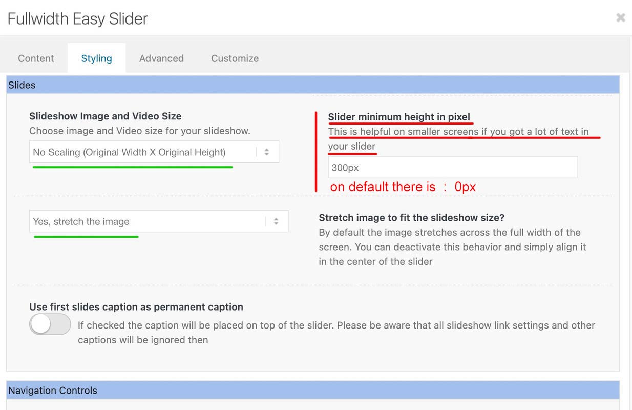
This setting only exists because the background must fulfill the height of the content. See the comment next to the min-height setting:Slider minimum height in pixel
This is helpful on smaller screens if you got a lot of text in your sliderHowever, this is not the case here, which is why you can drive responsively up to very small screens.
you got still in – i guess quick css:
@media only screen and (max-width: 479px) { .home #full_slider_1, .home #full_slider_1 .avia-slideshow, .home #full_slider_1 .avia-slideshow-inner, .home #full_slider_1 .avia-slide-wrap { min-height: 300px; } }and an inline svg for that element:
is setting it to :Element { padding: 0px; height: 300px; transition: none; transform: translateZ(0px); }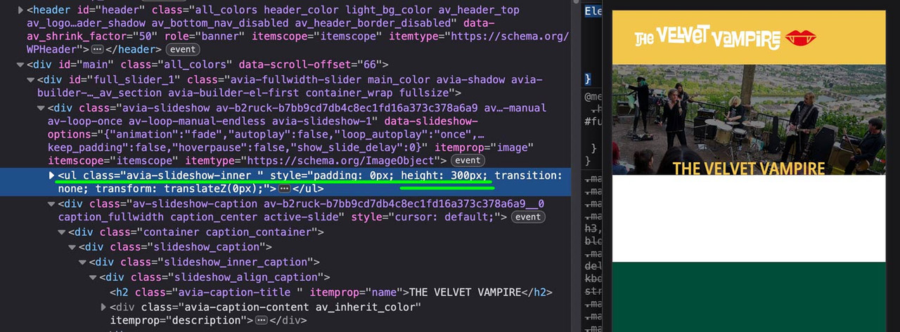 July 10, 2025 at 10:42 am #1486587
See what happens – when i switch off these height / min-heigt settings in dev-tools :
July 10, 2025 at 12:20 pm #1486593Thank you very much, Ismael, now it works.
@Guenni, thank you. Do you think I can still remove code? and where would I find the settings for Element?
July 10, 2025 at 4:14 pm #1486603Obviously, you have more faith in a moderator than in an experienced participant. There is no danger of trying one of them – and if that doesn’t work, testing the other solution.
A full-width slider is responsive by default, so there’s no reason to define heights or minimum heights here. Only if the content of the color section gets bigger in height than the height of the background-video (or background-image). See here for example – there a min-height would be nice: https://kriesi.at/themes/enfold-wedding/I can’t provide any more proof of this than the video, which shows a screen width of 320px.
So if you say that you have removed this minimum height from the color section, and have removed this one rule from the quick css; have saved everything, then it can actually only be due to a caching tool or to the Enfold own (merged or minified css) settings that I still see these settings in your source code.
I’m going to take a break from here.
Last hint – you can force my results if you place inside your quick css instead:
#top.home #wrap_all #full_slider_1,
#top.home #wrap_all #full_slider_1 .avia-slideshow,
#top.home #wrap_all #full_slider_1 .avia-slideshow-inner,
#top.home #wrap_all #full_slider_1 .avia-slide-wrap {
  min-height: unset !important;
  height: unset !important;
}
July 11, 2025 at 6:05 pm #1486667Hi Guenni,
thanks so much for your reply and help. I just had no time to read it all carefully and try it. I will do it as soon as it is possible for me. -
AuthorPosts
- You must be logged in to reply to this topic.