-
AuthorPosts
-
June 18, 2018 at 7:01 pm #974417
Hello,
I have a form on each of my pages that looks too large when I look at it on phones. Is there any way to resize it for mobile? I’ve attached my website link in the ‘only visible for moderator section’.
Thanks!June 18, 2018 at 7:34 pm #974429Hey Cynthia45,
Can you provide a screenshot of how you view it on your phone?
Best regards,
Jordan ShannonJune 18, 2018 at 8:25 pm #974460Hey Jordan,
Sure. How do I add an image to the reply?June 18, 2018 at 8:34 pm #974463June 18, 2018 at 8:39 pm #974464OK
Here’s the screen capture.
https://snag.gy/0fyOFW.jpgJune 18, 2018 at 8:43 pm #974465Hi,
Thank you. So are you just looking to shrink the button and make the fields full width?
Best regards,
Jordan ShannonJune 18, 2018 at 8:51 pm #974467Hi Jordan,
I’d like it to look more like this.
https://snag.gy/AFjrJX.jpgJune 18, 2018 at 8:53 pm #974469I’d also love it if there was a way to make my image different? or Shrink? on mobile so the text could be read easier (like on the 2nd screenshot I sent)
June 18, 2018 at 9:36 pm #974480Hi,
Add this to quick css:
@media (max-width: 667px) and (min-width: 320px){
#_form_13_ ._inline-style{
float:left!important;
display:inline!important;
width:50%!important;
}
._button-wrapper._inline-style #_form_13_submit{
width:100%!important;
padding-bottom:20px!important;
}}
Best regards,
Jordan ShannonJune 19, 2018 at 1:38 am #974557Thanks Jordan.
That put the name and email side by side but everything else is the same. The button is to the left and not full width and it’s overlapping the text below.
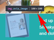
I’ve also decided to add an image, which I can’t seem to get to fit in properly. I’ve picked 80×80 as a size but it’s a little too small. Is it possible to do 100×100? (it’s not in the options to choose from)
I’d like it to fit within the blue bar on desktop and to be on the left in mobile. I’ve added screenshots for both.https://snag.gy/aeoCjn.jpg
https://snag.gy/aFj2Wp.jpgThanks!
June 19, 2018 at 8:00 pm #974908Hi Cynthia45,
This code is making the button to to be 50%.
#_form_13_ ._inline-style{ float:left!important; display:inline!important; width:50%!important; }And this code added
#_form_13_ ._button-wrapper._inline-style {
  width: 100%!important;
}
If you need further assistance please let us know.
Best regards,
VictoriaJune 19, 2018 at 8:13 pm #974921Thanks Victoria.
With the image, I’ve selected the 80×80 size because that’s the smallest to choose from. But it’s a little too small.
Is there a way to make it a little bigger so that it’s not cut off?June 20, 2018 at 1:16 pm #975276Hi,
Try this code in the General Styling > Quick CSS field:#top.home #av_section_1 .avia-builder-el-2 .avia_image { height: 100px !important; }Best regards,
MikeJune 20, 2018 at 1:40 pm #975291Hi Mike,
I added that to the quick css and the image didn’t change.
Is there something else I need to tweak?June 20, 2018 at 1:51 pm #975294June 20, 2018 at 3:34 pm #975352I cleared my cache and it looks like the image you sent.
It’s still cut off though so maybe it needs to be larger? I’d like it to be able to show the whole image and center it within the blue space.
Is that possible?
Thanks!June 21, 2018 at 1:02 am #975591 -
AuthorPosts
- You must be logged in to reply to this topic.


