Tagged: mobile
-
AuthorPosts
-
April 11, 2018 at 1:45 pm #940492
Hi,
I was wondering if we can manually adjust the collapse order of rows (columns) on mobile platforms.
I know it normally goes from left to right, unless you’ve got a RTL site, but is it possible to manually make some rows collapse Right to Left and other Left to Right?TIA.
April 12, 2018 at 1:43 pm #940939Hey NMRelations,
I haven’t tried it out myself but this might work? https://www.w3schools.com/cssref/css3_pr_order.asp
Best regards,
RikardApril 12, 2018 at 2:50 pm #940987Tried it, but doesn’t seem to do anything. I was thinking maybe I can use
flex-direction: row-reverse;orflex-direction: column-reverse;but so far no luck either… any other tips?-
This reply was modified 7 years, 11 months ago by
NMRelations.
April 13, 2018 at 12:38 pm #941453Hi NMRelations,
Could you please give us a link to your website, we need more context to be able to help you.
Could you please attach a mockup of what you’re trying to achieve?
Best regards,
VictoriaApril 13, 2018 at 4:27 pm #941590Hi Victoria,
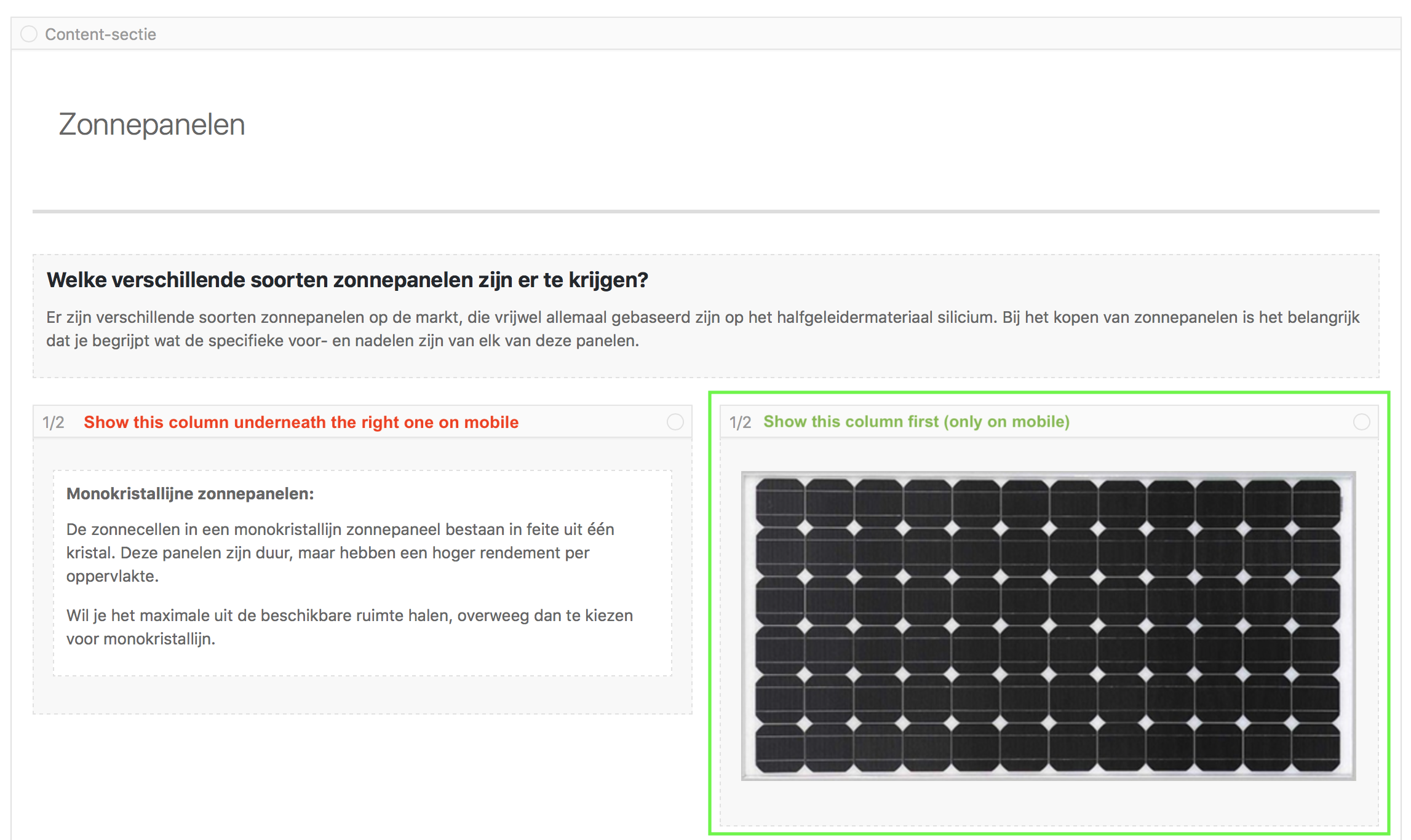
I’ve drawn out what I want to achieve in the image below:

Basically I want the ‘green box’ to appear first on mobile devices and the left column (with the red text) underneath that one.
Awaiting your response.
Best,
NMRelations
April 14, 2018 at 6:14 am #941817Hi,
Thanks for that, I’m not sure we can help you with this but if you send us a link to the page in question then we can at least have a look at it.
Best regards,
RikardApril 14, 2018 at 10:32 am #941864Hi Rikard,
I added the link to the page in question.
April 17, 2018 at 3:21 am #942874Hi,
This is possible with flex but it will affect all divs or columns inside the container. You can create a duplicate of the same section and then reverse the order of the columns. Toggle the screen options of both sections.
Best regards,
IsmaelNovember 10, 2020 at 11:41 pm #1259703I found this post in a search and thought it would solve my problem – however there is an option to hide on mobile but not the reverse. On another theme I use there is a row by row reverse option.
So, on a bigger screen, it’s nice to alternate image left, text right and the other way – but on mobile it makes sens to collapse text first image after – or the other way. Reversing the collapse order of alternate rows.
It does seem like a missing option in an otherwise amazing theme!November 15, 2020 at 5:14 am #1260546Hi,
Yes, this is not possible using the default options but as we mentioned above, we could create a duplicate of the same section and adjust the order of the columns so that the text is placed before the image. Or use css and css media queries to reverse the order of the columns inside the same section only on mobile view.
If you need further assistance, please do not hesitate to open a new thread with the site details. We will close this one for now.
Have a nice day.
Best regards,
Ismael -
This reply was modified 7 years, 11 months ago by
-
AuthorPosts
- The topic ‘Adjust Collapse Order on Mobile’ is closed to new replies.
