
-
AuthorPosts
-
February 9, 2018 at 3:50 pm #910288
Hallo,
ich habe folgenden Seitenaufbau
Wenn ich nun mit einem Tablet die Seite besuche, so springt das obere Menü über die Seiten Navigation.
Kann ich das umgehen? Das er hier entweder schneller das mobile Menü zeigt oder eine zweite Reihe macht?
Vielen lieben Dank vorab für die Antwort.
Gruß Heiko
February 10, 2018 at 6:39 am #910482Hey heikonet,
Please try the following in Quick CSS under Enfold->General Styling:
@media only screen and (max-width: 1300px) {
  nav.main_menu {
    display: block !important;
  }
  #avia-menu .menu-item {
    display: none;
  }
  .av-burger-menu-main.menu-item-avia-special {
    display: block;
  }
}
Best regards,
RikardFebruary 10, 2018 at 11:12 am #910506Thanks for the help.
This works, but for the visitor it’s hard to see that there is a menu up there.
Is there another way to make two rows with a smaller view? Or write “MENU” where the three lines for the menu are?February 10, 2018 at 5:00 pm #910559Hi,
What do you mean two rows in smaller view? Perhaps adjusting the color of the three lines so they stand out more?
Best regards,
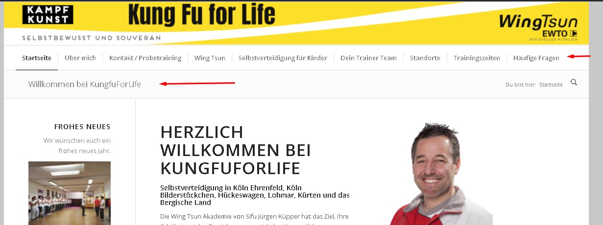
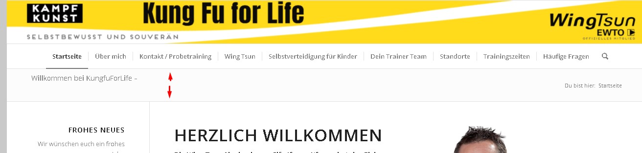
Jordan ShannonFebruary 11, 2018 at 11:17 am #910732This is what it looks like with normal width

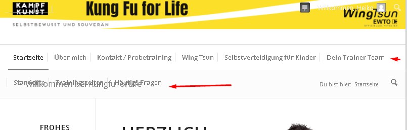
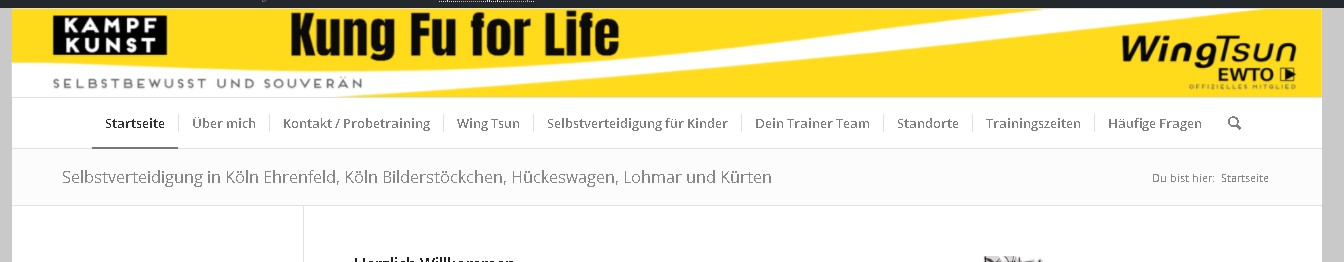
This is how it looks in the smaller window
The menu goes in a second row. The page title stays where it is. It overwrites the second row.
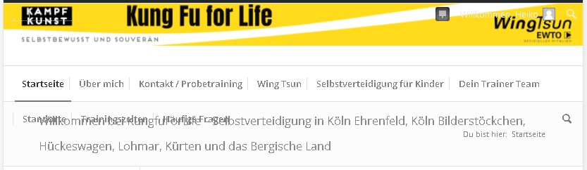
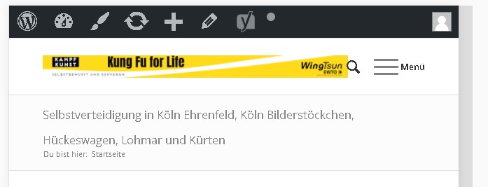
That’s what it should look like:
What do I have to set so that it jumps down one line when displaying a second row of the page title?
With the previous solution, the menu bar appears earlier.
This would also work if the word “Menu” were used instead of the three lines.
Because many of our visitors don’t know that there is a menu behind it.Thank you for your help.
I hope I was able to express myself correctly. I am writing about a translation machine (deepl) or should I continue writing in German?
February 12, 2018 at 11:17 am #911016Hi heikonet,
Here is the code you can put in Enfold > General Styling > Quick Css, if it does not work, put into themes/enfold/css/custom.css
.title_container .main-title {
    font-size: 14px;
    line-height: 1.3em;
    width: 76%;
    margin-bottom: 10px;
}
If you need further assistance please let us know.
Best regards,
VictoriaFebruary 21, 2018 at 9:41 am #915328Hello,
sorry for the late response, I have become a father again in the meantime;)
Unfortunately, this doesn’t work either.
With the code line it only makes the distance of the title bar wider.
When I zoom out the view, it still slides the menu into the title.

Thank you very much in advance for your help.
February 22, 2018 at 5:57 am #915887Hi heikonet,
Congratulations! :)
Your menu is too long, and so it should turn to burger once it breaks into two lines. It is the best solution for such cases. I believe you have the code for that above.
Let me know what you think.
Best regards,
VictoriaFebruary 22, 2018 at 5:30 pm #916185Hello and thank you;)
Is it possible to write the text menu instead of the hamburger menu there or next to the menu?
February 22, 2018 at 7:46 pm #916235Hi,
I’m not quite understanding what you mean. Do you have an example?Best regards,
Jordan ShannonFebruary 22, 2018 at 9:26 pm #916347Please excuse my bad English. If the three lines appear, it is not obvious to everyone that there is a menu behind them.
Is it possible to make the word “menu” out of the three lines?
Entschuldige bitte mein schlechtes English. Wenn die drei Striche erscheinen, so ist das nicht für jeden ersichtlich das sich dahinter ein menü befindet.
Kann man aus den drei Strichen das Wort “Menü” machen?February 23, 2018 at 6:24 am #916521Hi,
Please try the following in Quick CSS under Enfold->General Styling:
.av-burger-menu-main a:after {
  content:'menu';
}
Best regards,
RikardFebruary 23, 2018 at 9:40 am #916559Hello, thank you.
Another problem occurs which I have not seen before.
When I insert the code above:@media only screen and (max-width: 1300px) {
nav. main_menu {
display: block! important;
}
AVIA-menu. menu-item {
display: none;
}
. av-burger-menu-main. menu-item-avia-special {
display: block;
}
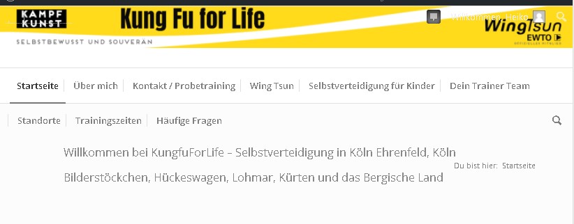
}the menu appears twice up to a certain size.
Desktop view – everything ok
Tablet View – Double menu. In the middle and top right.

Mobile view – everything is fine.
Excuse me for stopping you guys for so long.
Greeting Heiko
February 23, 2018 at 12:55 pm #916627Hi Heiko,
This code hides the menu on the right for tablet screen sizes.
Here is the code you can put in Enfold > General Styling > Quick Css, if it does not work, put into themes/enfold/css/custom.css@media only screen and (max-width: 767px) { .responsive .logo img { width: 90%; } .responsive #top #wrap_all .container { width: 95%; max-width: 95%; } } @media only screen and (min-width: 768px) and (max-width: 1024px) { .container.av-logo-container .main_menu { display: none !important; } }If you need further assistance please let us know.
Best regards,
VictoriaFebruary 23, 2018 at 1:28 pm #916656Thanks a lot, it works fine.
Packed it in quick. css.Thank you for the effort, patience and time!
February 23, 2018 at 1:45 pm #916674Hi heikonet,
Glad we finally got it working for you! :)
If you need further assistance please let us know.
Best regards,
Victoria -
AuthorPosts

- You must be logged in to reply to this topic.